Add a Control: Combo Box
We will add a combo box to the right-hand cell of the table you created in the previous section. We will then define the properties of the combo box. A combo box needs two important property definitions:
•The combo box values: These values will populate the dropdown list of the combo box and provide the options the user can choose (visible entries). Each visible entry will have a corresponding XML value that will go into the associated XML node.
•The associated XML node: This page source node is synced with the combo box selection. It receives its value from the combo box selection. Its initial value determines the initial combo box selection.

|

Add a combo box
Add the combo box and define its properties as follows:
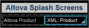
1.From the Controls Pane, drag and drop the Combo Box control into the right-hand cell of the table (see screenshot below).
2.Drag the Product node from the Page Sources Pane, and drop it on to the combo box. This associates the Product node with the combo box, and creates what we call a source node (or page source link). When the end user selects an option from the combo box, the XML value of the selected option will be passed to the Product node and will become the Product node's content.
3.To define the dropdown list items of the combo box, select the combo box, and, in the Styles & Properties Pane, click the Additional Dialog button of the Combo Box Entry Values property. The Edit Combo Box dialog (screenshot below) appears.
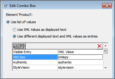
4.Select Use list of values, and then Use different text and XML values. Enter values for the visible entry (which is what will appear in the dropdown list of the combo box) and for the corresponding XML value (which is what will be written into the Product node). When we add the Image control, you will find out why we want the XML values lowercased. (Hint: The image names are lowercased, for example, xmlspy.bmp.) You can add up to nine Altova products to this list in any order you like: XMLSpy, Authentic, StyleVision, MapForce, DiffDog, DatabaseSpy, MobileTogether, SchemaAgent, UModel.
5.Select the Sort values check box at the bottom of the dialog to sort the list when it is displayed, and click OK to finish.
When the completed solution is executed or a simulation of the completed project is run, the dropdown list of the combo box (screenshot below) will display the values listed in the Visible Entry column definitions (see screenshot above).
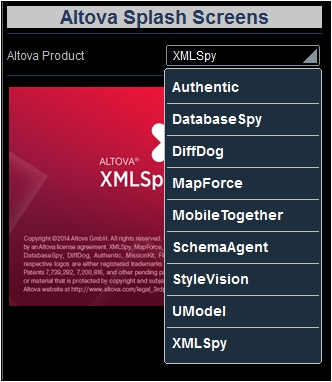
The objective of our project is this: When the end user selects an entry from the dropdown list, the XML value corresponding to that entry (see screenshot of the combo box definition above) will be passed to the Product node of the page source. Note that the default content of Product is xmlspy (defined when the node was created). We can then use the value in the Product node to build the URL of the splash screen image to display. We will do this in the next part of the tutorial, Add a Control: Image.