Border Settings
The Border Settings command opens the Border Settings dialog (screenshot below), in which you can set border properties for the selected table item/s and related table items (for example, the table items that are related to a cell are the rows, columns, row groups, and table that contain the cell).

The mechanism to set border styles works as follows:
1.In the design, select the table item or multiple table items that you want to style: cell/s, row/s, column/s, row-group/s, table.
2.In the Line Settings pane, define the three border properties: width, color, and style that you want to apply.
3.The Border Level combo box of the Borders pane displays table items according to the table item you selected in Step 1. In the combo box, choose the selected table item or one of the options for related table items. The style will be applied to the table item/s that you select in the combo box.
4.Apply the border styles to one or more individual borders (top, right, bottom, left) of the currently selected table items. Use the Presets pane and/or Borders pane to apply styles. Note that the buttons in these two panes are toggles; they apply/remove styles to the respective border.
5.To set new border styles (for non-styled borders or already styled borders), repeat Steps 1 to 4.
6.Click Close to finish.
These steps are explained in more detail below.
Selection of table item/s
Select table items in the design as follows:
•Cell: Click inside the cell.
•Multiple cells: Click the first cell; keep the Ctrl key pressed and click the other cells that you want to make part of the selection.
•Row, column, row-group: Click inside a cell of the respective item. Alternatively, click the border of the item.
•Multiple rows, columns, row-groups: Select the first item; keep the Ctrl key pressed and click the other items.
•Table: Click inside a cell of the table. Alternatively, click the border of the table.
After the table item is selected in the design, go to the Border Level combo box and choose the context-relevant items to which the styles should apply.
Line settings
Borders have three properties: width, color, and style. You can select the value of each property from its combo box. Alternatively, you can enter an XPath expression to select the value of a property.
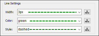
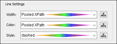
The resulting border style is displayed as a preview. In the screenshot above left, for example, the preview line is green, dashed, and has a width of 3px. If a property is specified as an XPath expression, then this is indicated by Pooled XPath, and, since the property value is not known till run time, the property is indeterminate in the preview. (An example of such a preview is the screenshot above right, where the style property is dashed (and shown as such), whereas the width and color are indeterminate.) At run time, the evaluated values will be applied to the respective border properties.
Border level
In the Borders pane, the Border Level combo box enables you to select items that are related to the table items currently selected in the design (see screenshot below).
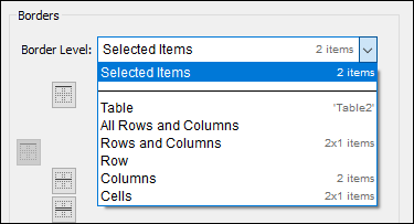
The combo box items from which you can choose are contextually related to the table item/s currently selected in the design. To the right of each item in the combo box, additional information provides detail about the table structure. For example, we can see that, in the screenshot above, the items that are selected in the design are two adjacent cells in a row of Table2. The information in the last line, 2x1 items, indicates that the two cells are each in a separate column but in a single row. If the two cells were in one column and in two rows, the information would read 1x2 items. (The first number is the number of columns, the second is the number of rows.) Note that the Rows and Columns item also shows information in the column x row format.
In the combo box, select the table item/s to which you want to apply the style you have defined in the Line Settings pane. If, for example, you select Row, then the style will be applied to the border/s of the currently selected row. If you select Cells, then the style will be applied to the border/s of the currently selected cells, individually.
Applying styles to (individual) borders of selected table items
The style that is currently defined in the Line Settings pane can be applied in two ways to borders of the table items selected in the Border Level combo box:
•By selecting one of the presets in the Presets pane
•By selecting a combination of individual borders in the Borders pane
The options provided by the two panes are described below.
Note: The application options in both panes are toggles. This means that, if the current style (exactly as defined in the Line Settings pane) has not been applied, then clicking an option applies the current style; if the current style has been applied (exactly as defined in the Line Settings pane), then clicking an option removes the current style.
Presets pane
Three preset options (see screenshot below) are available, and are described below. Note that only applicable options are enabled.
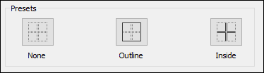
•None: This preset option is always enabled. It removes all border styles from the selected table item. If you want to remove border styles from any table item, this option is the best way to do it.
•Outline: This preset option is always enabled. It applies the current style to the outer border of the selected item (on all sides). If the selected item is a table, then the table border gets the style. If two cells are selected, then both cells, individually, get a border in the current style.
•Inside: This option is enabled only when at least two adjacent cells/rows/columns are selected; it is not applicable to tables. For example: (i) if applied to two columns, then the current style is applied only to the inside vertical borders of all cells in the column; (ii) if applied to two horizontally adjacent cells, then the inside vertical borders of both cells get the style; (iii) if applied to two vertically adjacent cells, then the inside horizontal borders of both cells get the style.
Borders pane
Options in the Borders pane enable you to apply the current style to individual borders of a table item (that is, top, right, bottom, left borders separately). Each individual border has its own icon. Click an icon to apply the current style to that border.
Note the following points:
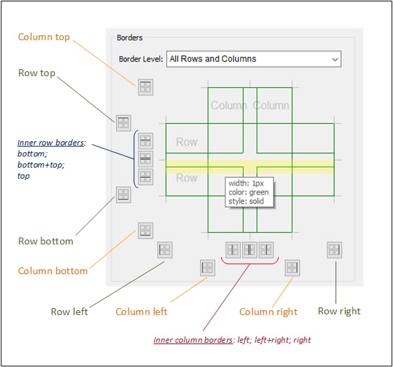
•For each table item selected in the Border Level combo box, a relevant set of icons is enabled. For example, if a single cell is selected, then only four icons will be enabled (corresponding to the top, right, bottom, and left borders). If, on the other hand, however, All Rows and Columns is selected, then all 14 icons in the pane are enabled (see screenshot below). Note that the inner borders can be styled separately (for example: bottom or top inner row borders) or together (bottom and top inner row borders). Also note that, strictly speaking, columns themselves are not given a top or bottom border; it is the topmost cell in the column that is given a top border and the bottom-most cell of the column that is given a bottom border. This works analogously for the left and right borders of rows.
•Cells of a column or row will inherit the style of that column or row, respectively.
•Individual table borders can also be applied by moving the mouse, in the Borders pane, over the location of the border you want to style. When the border becomes highlighted in yellow (see screenshot above), click to apply the current style. If you move the mouse over the intersection of two borders, then both borders become highlighted (see the first screenshot at the top of this page), and you can apply the current style to both borders at once.
•After a style has been applied to a border and you move the mouse over the border, in addition to the border becoming highlighted in yellow, the border's properties are displayed in a popup (see screenshot above).
•When you click an icon or a highlighted border, the current style is applied if that border does not have the same style as the current style. If the border already has the current style and you click the border or its icon, then the current style is removed from that border.