Sizes: Pixels, DPI, DP, SP
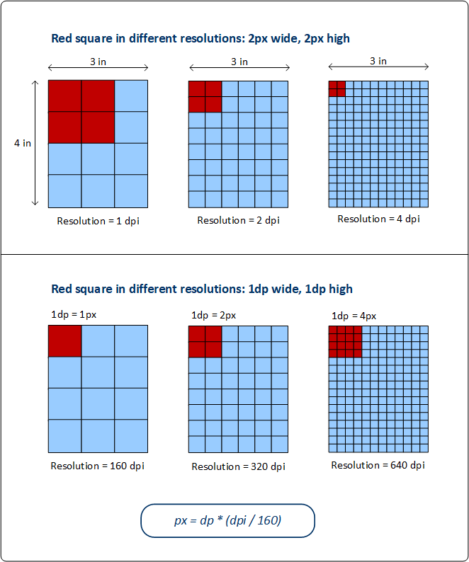
The size of objects and text in the design can be specified in pixels (px). However, the display on the client device depends not only on the specified pixel size but also on the device resolution, and, in the case of text, additionally on the text size selected by the device user. See the first row of the diagram below.
The new units of device-independent pixels (dp) and scale-independent pixels (sp), however, enable you to obtain a display of the same size across devices that have different resolutions. The diagram below shows how resolution affects pixel sizes and dp sizes.
Pixels and resolution
The resolution of a screen is the number of pixels in an inch of screen length; its unit is ppi (pixels per inch), more commonly referred to as dpi (dots per inch). So if the pixel density of a screen (its dpi) is high, then an object with the same pixel size will be displayed smaller on higher resolution screens. This can lead to the same object being displayed in different sizes on screens that have the same dimensions but different resolutions. In the top row of the diagram above, for example, all the rectangles (representing devices) have the same width and height, but different resolutions. As a result, the red square (width=2px and height=2px) is progressively smaller in the higher resolution rectangular screens. For example, the rightmost screen has a resolution of 4 pixels per inch; as a result, the red area of 2x2 pixels covers a smaller area of this screen. This difference in area size can be overcome by using device-independent pixels (dp) as the unit of length.
Device-independent pixels (dp)
If device-independent pixel (dp) is used as the unit of length, then the operating system of the device maps the dp value to a corresponding number of pixels based on the resolution of the device screen. For this mapping, 1 dp is considered to be equal to 1 pixel on a 160 dpi resolution screen. The corresponding number of pixels can be calculated with the formula px = dp * (dpi/160). By using device-independent pixels, you will have better control over your design across devices of differing resolutions.
Scale-independent pixels (sp)
A scale-independent pixel (sp) is the same as a device-independent pixel (dp), with an additional scaling factor that is based on the font size that the user selects in the device's system settings. Scale-independent pixels should be used only as a unit for text. Avoid using sp as a unit for non-text components.
Note: DP and SP sizes in the designer's device simulations will not exactly match sizes on the actual client devices.
XPath extension function: mt-convert-units
MobileTogether has a built-in XPath extension function, which you can use for converting between the three values:

mt-convert-units(Size as xs:string, TargetUnit as xs:string) as xs:string Converts the length value specified in the Size argument to an equivalent value in the unit specified by the TargetUnit argument. You can convert between any two of the following units: px, dp, and sp. Both input arguments, as well as the output value, are strings. For more information about units and conversion between them, see Sizes: Pixels, DPI, DP, SP.
|
