Button
Buttons can be used to execute an action when the button is clicked. The name of the button can be static text (entered as the value of the Text property; see below) or a dynamic value obtained from a page source node (by dragging the node onto the button). You can also alternatively or additionally select an icon from the options available in the Button Image property combo box. The height of the button is determined by (i) the height of the button icon or text, whichever is greater, and (ii) the vertical padding set on the button. The OnButtonClicked event is associated with the button control. To define an action for this event, click the Additional Dialog button of the Control Action property. This displays the Control Actions dialog, in which you can specify the required action.

•When the control is associated with a data source node (page source link), placing the mouse over the control (in Page Design View) displays the associated node in a popup. •All page source links in the page source tree are displayed in a bold font. Tree nodes that are not page source links are displayed in normal font. •Placing the mouse over the page source link in the design tree displays information about the associated control. •To remove a data-source node association (and therefore the data in the control), right-click the control (in Page Design View) and click Unassign Page Source Link <NodeName>. •To reset a style or property (in the Styles & Properties Pane), select the property and click Reset in the pane's toolbar. •The values of several properties can be set by using XPath expressions. This allows values to be dynamic: that is, generated via calculations, or from data source nodes, at runtime. To set an XPath expression, click Edit XPath in the toolbar of the Styles & Properties Pane. •To edit the XPath expression of a style or property (in the Styles & Properties Pane), select the style or property, and click Edit XPath in the pane's toolbar. •To copy a control to another location in the design, press Ctrl and drag-and-drop the control to the desired copy location. •To assign specific properties for a control, define one or more classes for the control (via the Browser CSS Class property), and then assign rules for the class/es in an external CSS file (that you specify in the Browser Settings dialog). •A control's CSS properties can be defined in the Styles & Properties Pane and/or in an external CSS file. Those defined in the Styles & Properties Pane have priority. |
Button events
The OnButtonClicked event is available. To define actions for the button's OnButtonClicked event, right-click the button and, from the context menu that appears, select Control Actions for OnButtonClicked. This displays the Actions dialog for button events. For a description of the actions that can be defined for this event, see the Actions section.

The end user can click the control in one of two ways: a short tap (On Click) or a longer press (On Long Click). A sequence of different actions can be specified for each type of click (see screenshots at left and middle below). The sequence that will be executed depends on the type of click that the end user performs. You can also define that additional actions be executed after those of the end-user click; these actions are defined after the On Long Click event (see screenshot below right).. 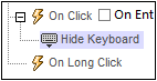 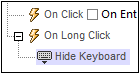 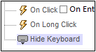 •On Click: The action/s to perform when the control is tapped (see screenshot above left). •On Long Click: The action/s to perform when the control is pressed for a longer time than a tap (see screenshot above center). •Additional actions: The action/s to perform after the On Click or On Long Click actions have been executed (see screenshot above right). If no action has been set for the On Click or On Long Click events, then the additional action/s are performed directly on a click or long-click.
You can combine actions for the different click events. The example in the screenshot below shows how this is done for the Button event, but it works in the same way for other controls as well. 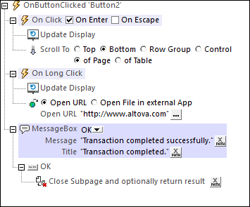 The screenshot above shows that the On Click and On Long Click events each has a sequence of actions defined for it. An additional MessageBox event is defined after the On Long Click event. This MessageBox event will be executed after the On Click or On Long Click sequence of actions has completed.
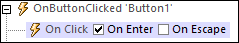
On Enter/EscapeIf the control's On Enter or On Escape check box is selected, then the control's actions are executed when the respective key (Enter or Escape) is tapped. The key-tap (Enter or Escape) serves as an alternative to the On Click event, and will work additionally to the click. The screenshot below shows the On Enter and On Escape check boxes of the Button event. Other controls that provide this option look similar and work similarly.
This setting can also be accessed via the control's On Enter/Escape property, which is described below.
Note: If you select the Page | Show/Define Tab Order menu command, then controls that have been assigned an Enter or Escape key-tap are marked with a symbol of the respective key.
Note: This feature is available on Web clients and Windows clients, and in simulations of all clients.
|
Button properties
The control's properties are available in the Styles & Properties Pane, and are listed below in the order in which they appear.
The name is used to reference the control from elsewhere in the page or project. Double-click inside the value field to edit.
|
The All Styles property becomes visible if the All Styles setting of the More Project Settings dialog has been set to true. (The default of this setting is false.)
The property enables you to set all the component's styles that you want to set via a single XPath map expression. See the two map expressions below for examples of how to do this. A map consists of a sequence of key–value pairs, where the key is one of the MobileTogether styles and the value is one that is valid for that property. What properties and values are allowed are shown in the Styles & Properties pane. For example, in the listing below, we see that the first style is Bold Text, which, according to the dropdown list of this property in the Styles & Properties pane, can take a value of either true or false. In the map expression, the value $XML1/R/@bold = "1" returns a Boolean value (true() or false()) depending on whether the attribute node R/@bold contains the string 1. In this way, we have set the Bold Text property dynamically: it will change according to the content of the R/@bold node. In a similar manner, the Background Color property is set dynamically.
map{ "Bold Text" : $XML1/R/@bold = "1", "Italic Text" : true(), "Text" : "hello", "Text Color" : "red", "Background Color" : $XML1/R/@background, "Text Size" : $XML1/R/@textsize }
map{ "Style Sheet" : "Sheet-1" }
Note the following points:
•When you enter a value for the All Styles property—even if it is not a map—all the styling properties of the current component in the Styles & Properties Pane will no longer be visible . •This is an advanced feature, so you must ensure that your XPath map expression is correct, both syntax and values. •You can enter the key–value pairs of the map in any order. •The key names are the names of style properties (or styles). In the first map above, for example, Bold Text and Text Size are style names. All styles and their available values are indicated under each component in the Styles & Properties Pane. •You can also specify a style sheet to use, as shown in the second map above.
|
The Text property takes as its value one of the following:
•A fixed value text string to be displayed in the control •An XPath expression that retrieves data from a node in a page source and displays this data in the control
Double-click inside the value field to edit, or click the XPath toolbar button and enter an XPath expression that generates the required text. Alternatively, right-click the property and select the entry method you want from the context menu (fixed-value or XPath).
Note: In the Rich Text control, you can enter an XPath expression that is an HTML-encoded string. If styles for HTML elements have been defined in the active Rich Text style sheet, then the text value of this property will be displayed with the appropriate formatting. See the Rich Text section for more information.
Note: The $MTControlValue variable is not available for the generation of the value of the Text property. If used, then a validation error results.
|
Sets multiline input/display on or off (true/false). The default is false. If the text of the control is longer than a single line, and the value is true, then the text will wrap to a new line; if the value is false, then the text will be truncated at the end of the first line.
Note •If this property is set to true, and if the Text Size Auto-Fit property is enabled, then the text will not wrap to multiple lines; line break characters in the text would, however, create new lines. •If this property is set to true on a label control, the Max Number of Lines property becomes available. •Check boxes with multilines can be vertically aligned via the Vertical Alignment property.
|
Click the Additional Dialog button and enter a number format in the Format dialog that appears (screenshot below). 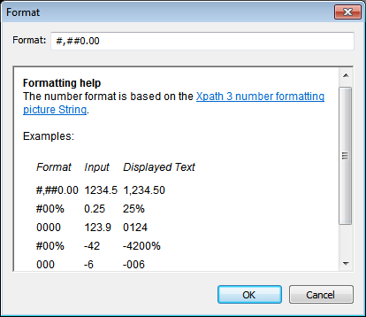 The formatting will be applied to the control's content if the content is numeric, and will be displayed in the solution, not in the design.
|
Click the Additional Dialog button and enter a date, time, or date-time format in the Format dialog that appears (screenshot below). 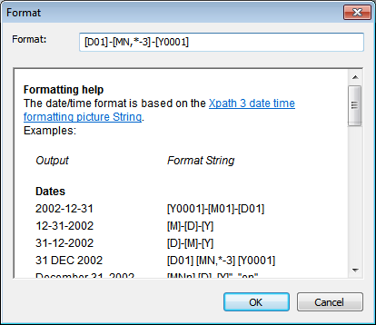 The formatting will be applied to the control's content if the content has the correct lexical form of xs:date (for the Date control), xs:time (for the Time control), or xs:dateTime (for the Date, Time, and DateTime controls). Basic examples are:
•xs:date: 2014-12-31 •xs:time: 23:59:59 •xs:dateTime: 2014-12-31T23:59:59
|
Select one of the supported languages from the dropdown list of the combo box (EN, DE, ES, FR, JA). The selected language will be used in the date/time formatting that is set in the Date/Time Format String property (see description above). If the names of months and weekdays are used in the format string, then these will be displayed in the language selected for this property. The default language is English.
|
Adds a predefined icon or a custom image to the button display. You can also optionally specify (in the Text property) an additional text string to accompany the button icon. If you use both icon and text, then the Button Image Position property specifies whether the icon is positioned to the left or the right of the text, and the Button Image/Text Distance property specifies the distance in pixels between the button and the text. Horizontal positioning of the icon-text pair within the button is specified with the Horizontal Alignment property.
Add a predefined icon by selecting one from the dropdown list of the property's combo box. Available icons include: +, –, >, Barcode, Biometric Authentication, Calendar, Cancel, Close, Closed Tree, Completed Task, Copy, Cut, Delete, Dragging, Dragging Popup, Edit, Email, Export, Fast Forward, Fast Rewind, Help, Import, Link, Microphone, Offline, OK, Open Task, Opened Tree, Paste, Pause, Photo, Photo Gallery, Play, Play Reverse, Print, Print PDF, Print Word, Redo, Refresh, Report, Resume, Save, Search, Select Multiple, Select Single, Settings, Share, Skip, Skip Back, Snooze, Stop, Stop Playing, Thumbs Up, Thumbs Down, Time, Undo, Unlink, View and Web.
Add a custom image by selecting Custom Image. On doing this, two related properties become available: Image Source and Image Source Type (see their descriptions below).
The value of this property can also be entered as an XPath expression. The expression must evaluate to a string that is any one of the values listed above. (For users of localized (non-English) MobileTogether Designer editions: Note that the expression must evaluate to the English-language value, not the localized value.)
The default value of the Button Image property is no value, which results in no icon being displayed.
When a predefined icon or Custom Image is selected, then the Button Image Color, Button Image Color (Disabled), Button Background, Button Image Position, and Button Image/Text Distance properties become available. These enable you to set, respectively, (i) a transparent or non-transparent background for the button, and (ii) the horizontal position of the icon relative to button text.
|
The Button Image Color property is enabled when the Button Image property has been set to a predefined image or custom image. It sets the color of the button image when the button is enabled. The default value is client-specific.
|
The Button Image Color (Disabled) property is enabled when the Button Image property has been set to a predefined button image or custom image. It sets the color of the button image when the button is disabled. The condition/s for enabling and disabling a button is set on the button's Enabled/Editable property. The property's default value is client-specific.
|
Selects whether the background of the button icon is transparent or non-transparent. The default is not transparent.
The value of this property can also be entered as an XPath expression. The expression must evaluate to a string that is either transparent or not transparent. Note that you cannot set padding on transparent buttons. (For users of localized (non-English) MobileTogether Designer editions: Note that the expression must evaluate to the English-language value, not the localized value.)
|
Specifies whether the button image (predefined icon or custom image) is located to the left or right of the button text (which is specified via the Text property). The default value is left of text.
The value of this property can also be entered as an XPath expression. The expression must evaluate to a string that is either left of text or right of text. (For users of localized (non-English) MobileTogether Designer editions: Note that the expression must evaluate to the English-language value, not the localized value.)
|
Sets the distance, in pixels, dp, or sp between the button image and button text. The default value is the default button padding (which is 0px).
The value of this property can also be entered as an XPath expression that is a string value. The allowed string values are those listed in the property's combo box.
For information about the relationships between pixels, dp (device-independent pixels), and sp (scale-independent pixels), see Sizes: Pixels, DPI, DP, SP.
|
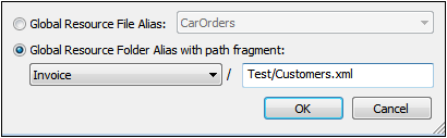
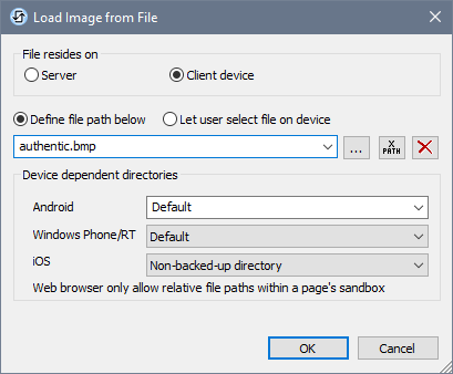
The value of the Image Source property references an image in one of the following ways:
•The URL of a binary image file (PNG, BMP, etc). The value of the property must be a URL. The URL is selected in the Specify File dialog (see description below). •An image file represented as a Base64-encoded string. The value of the property must be a Base64-encoded string. An XPath expression supplies the string, which could be entered directly or obtained form an XML node. •An SQL SELECT statement that queries a page source on the server. The query should return the Base64-encoded string that is to be used as the image. The SELECT statement is generated by an XPath expression.
The type of image source is provided by the property Image Source Type (see next property below). By default, Image Source Type is set to url. The Image Source property automatically opens the corresponding dialog: Specify File dialog for url (see below), and Edit XPath XQuery Expression dialog for base64 (see Base64-Encoded Images).
Note: If the image source is a URL and the URL is changed during simulation or while the solution runs, then the image must be explicitly reloaded with the Reload action. For example, if a combo box selection changes the selection of an image, a Reload action targeting the image must be defined on the combo box.
| |
Sets the type of the image source selected by the Image Source property above. Three type options are available:
•url: a binary image file, such as a PNG or BMP image file; this is the default image source type •base64: a Base64-encoded string to be used as the image •SQL: an SQL SELECT statement that queries the page source on the server and returns a Base64-encoded string to be used as the image
The value of this property can also be entered as an XPath expression. The expression must evaluate to a string that is a URL, a Base64 string, or an SQL SELECT statement.
|
Click the Additional Dialog button to display the control's Actions dialog. You can set actions to perform when a control event is triggered. The control's event/s are predefined and each is shown in its own tab in the right-hand pane of the Actions dialog. A library of actions is displayed in the left-hand pane. You can drag an action from the left-hand pane into an event's tab and then define the properties of the action. For each event, multiple actions can be set up. They will be executed in the order in which they occur, from top to bottom.
After defining a control's actions, you can access and edit them at any time by clicking the property's Additional Dialog button. Alternatively, you can access a control event by right-clicking the control and selecting the control's event in the context menu that appears.
|
An XPath expression that should evaluate to true() or false(). If the expression evaluates to false()—and only if it evaluates to false()—then the control is not visible. If the expression evaluates to true() or returns some other value, then the control is visible. The default is true(). Double-click inside the value field, or click the XPath button, to enter or edit an XPath expression. The Visible property can be used to render an object visible or not depending upon whether an XPath expression evaluates to true(). As a result, the display of an object can be made to be dynamically dependent on the content or structure of data.
Note: For information about the visibility of spanned columns/rows, see Table Properties.
Note: The $MTControlValue variable is not available for the evaluation of the Visible property. If it is used, then a validation error results.
|
The control is either enabled or disabled, according to whether the value of the property is true (enabled) or false (disabled). The value can be entered directly (by selecting it in the combo box or by double-clicking in the value field and entering the value you want). The value can also be an XPath expression that evaluates to boolean true or false. The default value is true. Typically the XPath expression of the Enabled/Editable property of a control would check the presence or value of a node. If the expression evaluates to true, the control will be enabled.
|
This property applies to buttons located in a row group of a top-level table. Set this property to true if you want to allow the row containing the button to be moved immediately the button is dragged. The row can be moved to a new location within the row group, effectively changing the position of the row within the row group. The property's default value is false. If this button property is set to false and the row group has been defined as being draggable, then the button must be long-tapped to activate Drag mode. If the property's value is set to true, then dragging starts immediately. Note that in this case the tap and long-tap are disabled and also the OnButtonClicked actions. See the topic Table Properties for more information.
The property's value can also be generated dynamically via an XPath expression.
|
Sets the color of the control's text when the control is enabled. You can do one of the following to select the color:
•Click the color palette to select a text color •Select a color from the dropdown list of the combo box •Double-click in the value field to enter a color code (for example, #FF0000), or click the XPath toolbar button and enter an XPath expression to generate the required text
Note: A control can be enabled/disabled according to context. For example, if in a form about personal details, the user enters an affirmative for the holding of life insurance, then the fields for details of the life insurance policy can be enabled; otherwise these fields can be disabled. To enable/disable a field, use the relevant control's Enabled/Editable property. To set a text color for when the control is disabled, use the Text Color (Disabled) property.
|
Sets the color of the control's text when the control is disabled. You can do one of the following to select the color:
•Click the color palette to select a text color •Select a color from the dropdown list of the combo box •Double-click in the value field to enter a color code (for example, #FF0000), or click the XPath toolbar button and enter an XPath expression to generate the required text
Note: A control can be enabled/disabled according to context. For example, if in a form about personal details, the user enters an affirmative for the holding of life insurance, then the fields for details of the life insurance policy can be enabled; otherwise these fields can be disabled. To enable/disable a field, use the relevant control's Enabled/Editable property. To set a text color for when the control is enabled, use the Text Color property.
|
Select a size from the dropdown list of the combo box. Allowed values are: smallest|small|medium|large|largest. Each platform/device has its own pixel-height for each size. So the default text size in pixels is the client-specific pixel-height that corresponds to the value medium.
You can generate other values by using the mt-font-height function. For example, to get a size that is 120% larger than the numeric size that corresponds to 'largest' on a device, use the following XPath expression for the TextSize value: mt-font-height('largest', 'px') * 1.2. The function generates the numeric (pixel) value that corresponds to the 'largest' size. This value is then multiplied by 1.2 to obtain the numeric value that is 120% of the value that corresponds to 'largest'.
For information about the relationships between pixels, dp (device-independent pixels), and sp (scale-independent pixels), see Sizes: Pixels, DPI, DP, SP.
|
Sets whether or not the text size should be automatically reduced to fit the width of the control. You can either select the value from the dropdown list or enter it as an XPath string expression. The property's values are:
•off (the text is not automatically resized; this is the default) •ellipsis (adds an ellipsis at the end of the visible text of the control when that text is too long to be displayed in its entirety) •individually (the text of this control only will be automatically resized) •group X (where X=1 to 9). You can set a control to belong to one of nine Auto-Fit groups (where each group is identified by a number from 1 to 9). The text size of all the controls in a group will be automatically resized to that of the control with the smallest of all the auto-fit sizes in that group. This ensures that a selected set of controls has a uniform and reasonable size, so saving you the trouble of finding, by trial and error, the optimum size for a group of controls. •template group X (where X=1 to 9). Like for a group (see previous list item), you can set a control in a control template to belong to one of nine Auto-Fit template groups (where each template group is identified by a number from 1 to 9). A template group is different from a group (previous list item) in that, if set on a control template, it is limited to the controls of a control template—as opposed to the controls of a page. However, you can also use a template group as a group if you set it on a page, and not on a control template.
In Design View, text size will be reduced to a minimum size that is 50% of the font size, even if the auto-fit size is smaller. At runtime, however, the actual auto-fit size will be displayed.
Note •If the Multiline property has been set to true, then: (i) if auto-fit is disabled, the text will wrap to multiple lines; (ii) if auto-fit is enabled, the text will auto-size and will not wrap; line break characters in the text would, however, create new lines.. •This property cannot be enabled if the Max Number of Lines label property has been set. You must choose either to set a maximum number of lines or to auto-fit the text. •In tables, this property can be used with the table's Wrap Content Auto-Fit Group property.
|
Select true or false from the dropdown list of the combo box to set the text in bold. You can also use an XPath expression. Default is false.
|
Select true or false from the dropdown list of the combo box to set the text in italics. The value can also be generated dynamically via an XPath expression. Default is false.
|
Select true or false from the dropdown list of the combo box to set underlining for the text. The value can also be generated dynamically via an XPath expression. Default is false.
|
Select true or false from the dropdown list of the combo box to determine whether a line is drawn through the text of the control. The value can also be generated dynamically via an XPath expression. The default is false.
|
Sets the background color of the object when the object is enabled. You can do one of the following to select the color:
•Click the color palette to select a background color. •Select a color from the dropdown list of the combo box. If the cell contains a control, you might want to select the option Control's background color. •Double-click in the value field to enter a color code (for example, #FF0000), or click the XPath toolbar button and enter an XPath expression to generate the color name/definition. To take up the background color of the control, enter the XPath expression: "control".
Note: You can set the background color of the cell to be the same as the background color of the control in the cell, by either: (i) selecting Control's background color in the property's combo box, or (ii) entering the XPath expression "control" in the property's value field.
Note: A control can be enabled/disabled according to context. For example, if in a form about personal details, the user enters an affirmative for the holding of life insurance, then the fields for details of the life insurance policy can be enabled; otherwise these fields can be disabled. To enable/disable a field, use the relevant control's Enabled/Editable property. To set a background color for when the object is disabled, use the Background Color (Disabled) property.
|
Sets the background color of the object when the object is disabled. You can do one of the following to select the color:
•Click the color palette to select a background color •Select a color from the dropdown list of the combo box •Double-click in the value field to enter a color code (for example, #FF0000), or click the XPath toolbar button and enter an XPath expression to generate the required text.
Note: A control can be enabled/disabled according to context. For example, if in a form about personal details, the user enters an affirmative for the holding of life insurance, then the fields for details of the life insurance policy can be enabled; otherwise these fields can be disabled. To enable/disable a field, use the relevant control's Enabled/Editable property. To set a background color for when the object is enabled, use the Background Color property.
|
Sets the text that appears as a tooltip when the end user hovers over the control with the mouse or long presses the control. A tooltip provides useful information to the end user about the control. Double-click inside the value field to edit. If an action has been set for a long press of the control, then no tooltip will be shown on a long press.
Note: Tooltips are not available on all controls, and for some controls they are not available on all platforms. On iOS, tooltips are not available for Edit Field or Signature controls.
|
This property applies in the case of some controls (such as images and vertical lines) to the control, in other cases (such as radio buttons and check boxes) to the text that accompanies the control. The property sets the horizontal alignment of the control or text to left, center, or right. Default is left for all controls except vertical lines, for which it is center. The property's value can also be specified via an XPath expression (which enables the value to be generated dynamically).
|
Sets the vertical alignment to top, middle, or bottom. Default is middle. The value can also be specified via an XPath expression (which enables the value to be generated dynamically). For Check Box controls, the property sets the vertical alignment of the check box relative to its text if the text is multiline (see the Multiline property)
|
Sets the width of the control. Select a value from the property's combo box. The following values are available:
•fill_parent: makes the control as wide as the parent, which could be, for example, a table cell or the page •wrap_content: makes the control only as wide as the control's content requires; when this value is selected, the property Max Control Width becomes available •wrap_content_longest_entry: is available for combo box controls and makes the combo box as wide as the longest content requires; when this property value is selected, the property Max Control Width becomes available •percent value: a percentage of the page width; select a value from the dropdown list, or enter a value directly •pixel, dp, or sp value: select a pixel, dp, or sp value from the dropdown list, or enter a value directly
In effect, fill_parent creates a maximum width, while wrap_content creates a minimum width. If the combo box is within a table cell, for example, fill_parent would let the combo box fill the cell whereas wrap_content might not fill the cell.
The default value is fill_parent for all controls except the following:
•Image and Chart: For these, the default is wrap_content. •Geolocation Map: The default is the smaller of the two values $MT_CanvasX and $MT_CanvasY. These two dynamic variables give, respectively, the width and height of the device's viewport. Since the default of both Control Height and Control Width are the same (in each case, the smaller of $MT_CanvasX and $MT_CanvasY), the default shape and size of the viewport in the control will always be a square with side equal to min($MT_CanvasX, $MT_CanvasY).
For information about the relationships between pixels, dp (device-independent pixels), and sp (scale-independent pixels), see Sizes: Pixels, DPI, DP, SP.
|
This property is available only when the control's Control Width property has been set to wrap_content. The Max Control Width property sets the maximum width of the control. Select a value from the property's combo box. The following values are available:
•percent value: a percentage of the page width; select a value from the dropdown list, or enter a value directly •pixel, dp, or sp value: select a pixel, dp, or sp value from the dropdown list, or enter a value directly
|
Sets the height of the control. Select a value from the property's combo box. The following values are available:
•fill_parent: makes the control as high as the parent, which could be, for example, a table cell or the page •wrap_content: makes the control only as high as the control's content requires.
In effect, fill_parent creates a maximum height, while wrap_content creates a minimum height.
Default values •For the the Geolocation Map control, the default is the smaller of the two values $MT_CanvasX and $MT_CanvasY. These two dynamic variables give, respectively, the width and height of the device's viewport. Since the default of both Control Height and Control Width are the same (in each case, the smaller of $MT_CanvasX and $MT_CanvasY), the default shape and size of the viewport in the control will always be a square with side equal to min($MT_CanvasX, $MT_CanvasY). •For all other controls, the default is wrap_content.
|
Sets the margin offsets of the control (or page) relative to the surrounding objects or to the borders of the containing object. Select a value in pixels, dp, or sp from the dropdown list of the combo box, or double-click in the value field to enter a length value. The specified offset will be created on all four sides of the control or page. If you wish to set a different margin for any of the four sides, expand the Margin property to display the individual margin properties (left, right, top and bottom), and set the different value. For example: If you set Margin to be 6px and Margin Bottom to be 12px, then the top, left and right margins will be 6px and the bottom margin will be 12px.
For information about the relationships between pixels, dp (device-independent pixels), and sp (scale-independent pixels), see Sizes: Pixels, DPI, DP, SP.
|
Sets the control's padding, which is the space between the control's border and the control's content. If the control is a table and the padding is set on a table row or column, then the padding is added to the margin of any control that is contained in the row or column; this increases the inset of the contained control and does not modify the size of table cells.
Select a value in pixels, dp, or sp from the dropdown list of the combo box, or double-click in the value field to enter a length value. The padding will be set on all four sides of the control. If you wish to set a different padding for any of the four sides, expand the Padding property to display the individual padding properties (left, right, top and bottom), and set the different value. For example: If you set Padding to be 6px and Padding Bottom to be 12px, then the top, left and right padding will be 6px and the bottom padding will be 12px.
For information about the relationships between pixels, dp (device-independent pixels), and sp (scale-independent pixels), see Sizes: Pixels, DPI, DP, SP.
|
The Tab Order property takes an integer as its value, or an XPath expression that evaluates to an integer. This integer number is the position of the control in the tab order sequence.
The tab order is the sequence in which controls receive the focus when the client-device user taps the Tab key. The entire tab order sequence can be set quickly and in the visual context of all controls of the page via the Page | Show/Define Tab Order menu command. The Tab Order property of individual controls sets the sequential position of that control only.
Note: The Tab Order feature is available on Web and Windows clients only.
|
Takes one of three values:
•OnEnter: Specifies that the actions of this control are executed when the Enter key is tapped. •OnEscape: Specifies that the actions of this control are executed when the Escape key is tapped. •None: No action when either Enter or Escape is pressed. This is the default value.
If XPath expressions are used to generate the values, the expressions must evaluate to "OnEnter" or "OnEscape". If more than one control on a page is given the same value (OnEnter or OnEscape), then the first visible and enabled control that has the value is selected when the key is tapped. (See the Visible and Enabled/Editable properties.)
This setting can also be made via the dialog to set the control's OnClicked actions (see the description of the control's events above).
Note: If you select the Page | Show/Define Tab Order menu command, then controls that have been assigned an Enter or Escape key-tap are marked with a symbol of the respective key.
Note: This feature is available on Web clients and Windows clients, and in simulations of all clients.
|
Opens the control's Local Variables dialog, where you can add, edit, and delete the variables of the control. A control variable has a name, which is a string, and a value, which is an XPath expression. The variables that are declared in the Local Variables dialog will be evaluated when the control is called and will be used with this value till the control is called again. Parameters can be used in the XPath expressions that calculate the variable's value.
Control variables are useful for providing values that can be used in control actions. For example, a control variable can select a domain name based on the control's context. So, if a the current node is, say, a Department node inside a Company node, then the current company could have a domain name of, say, altova.com or nanonull.com. With the domain name set as a control variable, the control variable can then be used in an action of the control. For example, email addresses of a department's Employee children can be built by using each employee's FirstName and LastName elements together with the control variable that contains the company's domain name.
Control variables can also be set via a control's context menu.
|
The Style Sheet property sets the style sheet to use for the control. The dropdown list of the Style Sheet property's combo box displays all the user-created style sheets that have been defined in the project. Select the style sheet you want to use for the control. Alternatively, you can use an XPath expression to select the style sheet you want; this has the advantage that you can make the selection of the style sheet conditional (see Applying User-Created Style Sheets). See the section Style Sheets for more information.
|
The name of one or more CSS classes that you want to associate with this control. Use a space to assign multiple classes: LabelClassOne LabelClassTwo. These classes can then be used in a CSS file (specified in the Browser Settings dialog) to assign properties specifically for this control. You can also use an XPath expression to generate or fetch the names of the class(es).
You can use the following predefined value to set specific behavior:
•mt-combo-open-on-focus opens the dropdown list of a combo box when the user tabs to it. You can use this value on (i) combo box controls and (ii) on table controls if the table contains combo box controls. Alternatively, if you want to open all combo boxes on a page individually, then you can set this value on the Browser CSS Class page property.
|