Creating a Control Template
Create a control template as follows:
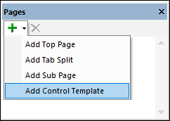
1.In the Pages Pane, click the Add Page icon and select Add Control Template (see screenshot below).
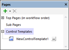
2.Double-click the new control template item that is added to the list (see screenshot below) and rename it suitably. The next step will be to declare parameters and define variables for the control template.
Create a control template from existing controls
You can also create a control template quickly if you already have one or more controls on the page that can be converted to a control template.
To create a control template in this way, select the controls you want to convert and right-click. If the controls can be converted, then the Create Template from Selection command will be enabled, and you can select it to create a new control template. The selected controls will be placed automatically in the new control template and a Placeholder Control that calls the newly created control template will replace the control/s at their original location. The new control template will be shown in the Pages Pane (see screenshot above).
Parameters and variables
Parameters enable you to use dynamic or static values within the scope of the control template when the template is instantiated. Both, parameters and variables, are declared in the control template. The main difference between the two is that while the values of variables are defined in the control template itself, the values of parameters are defined on the calling page and are passed to the control template's parameters when the control template is instantiated.
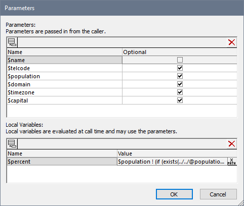
If you want to declare parameters and/or variables in a control template, in the Pages Pane (see screenshot above), click the template's Additional Options button (which is located to the right of the control template name). In the Parameters dialog that appears (screenshot below), add a parameter or variable (by clicking the Add Parameter or Add Variable toolbar icon in the top left of the respective pane) and name the parameter/variable suitably (by double-clicking and editing the name).
Parameters
Check a parameter's Optional box if you want to make the parameter non-mandatory. If a parameter is mandatory, it is an error if it does not receive a value at run time. If, in the calling placeholder control, the value of a parameter is defined by an XPath expression, then this expression is evaluated in the context of the placeholder control's context. The context node is not changed by the Control XPath Context property of the placeholder control that instantiates the control template.
Variables
To enter the value of a variable (dynamic or static), double-click in the variable's Value field and enter a suitable XPath expression.
Note the following points about how the XPath expressions of parameters and variables are evaluated:
•The context of XPath expressions will be the context node set in the Control XPath Context property of the calling placeholder control. If no value has been set for this property, then the context will be the context node of the calling placeholder control.
•This XPath expression to generate variable values can use the parameters of that control template as well as variables defined earlier in the list of variable definitions. For example: If a control template has parameters $a, $b, $c, and variables $x, $y, $z (in that order), then the variable $y can use this list of parameters and variables to generate its value: $a, $b, $c, $x, (but not $z).
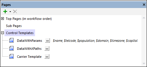
After you have finished declaring parameters and variables for the control template, click OK. The parameters you declared are displayed in the Pages Pane as shown for the DataWithParams template in the screenshot below. You can edit the parameter/variable list of a control template at any time by clicking the control template's Additional Options button to open the Parameters dialog.
Note: You can change the order of parameters and variables by dragging a parameter/variable and dropping it to a new location.
Note: If you change the order of parameters, you need to make sure that the parameter order is correct in the call to the control template (which is made via placeholder controls). Do this as follows: (i) Right-click the control template and select List Usages; (ii) For each usage (the list is shown in the Listings Pane), check whether the control template is selected via the dropdown list or via an XPath expression; (iii) If the control template is selected via an XPath expression and if its parameters are selected via an array expression (rather than a map expression), then make sure that the order of the parameters in the array is the same as that in the parameter definitions list of the Parameters dialog (see screenshot further above).
Content of the control template
To display the control template's design canvas, select the control template in the Pages Pane (see screenshot above). The design canvas will be displayed in Design View. Here, you can set up and design a set of controls as you do for a normal page. You can use controls, actions, page source nodes, and other components as usual.
Note the following points:
•Only the first visible control in sequential order will be displayed when the control template is instantiated. (A visible control is one that has its Visible property set to true.) This enables you to create multiple controls inside the template and to determine which of these is used by setting XPath conditional expressions on the Visible property of the respective controls. The first control with a Visible property that evaluates to true will be used.
•If you wish to display multiple controls when the control template is instantiated, add these controls inside the cells of a Table control with repeating rows or columns—since the table counts as a single control. See screenshot below, where a label has been added to each cell of a single row of the table, and the row itself can repeat. Tables with repeating columns and rows are also used in the example projects. Note, however, that you cannot add repeating tables (in which the entire table repeats).
•If you need to use a node from one of the design's page sources and the page source is not shown in the Page Sources Pane, then you can add the page source via the pane's Add Source icon.
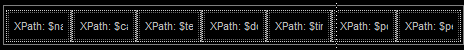
•In the control template's design, you can also use the parameters and variables that you declared for the control template. For example, in the DataWithParams control template shown in the screenshot below, a Table control has been created with a single row of seven cells, each of which has a label. Each label has a Text value that is generated by an XPath expression that selects a parameter or a variable. The parameter values will be supplied by the calling page and will become the texts of the labels. This control template can be used at different locations and can have different label texts according to the parameter values passed to the template from the calling page.
You can style the controls in a control template in the same way that these controls are usually styled (via their properties and via stylesheets).
After the control template has been created as described above, it can be used in top pages and sub pages, as well as in control templates themselves.
See Example Projects for examples of how to use control templates.
The context node of control templates
The context node of a control template will be the context node of the Placeholder Control that calls the control template. If you want to change the context node, you can specify a new context node via the Control XPath Context property of the calling placeholder control. You must be aware of what the context node is, since all XPath expressions in the control template must work correctly within this context. If you plan to reuse the control template at various design locations, make sure that the XPath expressions in the control template are correct in each of these different contexts.
Editing parameters and variables of control templates
You can edit the parameters and variables of a control template (add new, delete selected, or modify properties of) at any time. To do this, go to the control template's Parameters dialog by clicking the Additional Options button of the control template. This button is located to the right of the control template name in the Pages Pane (see screenshot below).