Check Box
Check boxes allow one of two possible values to be entered as the content of a node. In this way the user can be constrained to select one of two specific values. When you insert a check box control, you can specify whether the check box should be to the left or right of the check box text, or in the default system position. Two key properties of the check box control are:
•The text that accompanies the check box. This can be static text (entered as the value of the Text property; see below) or a dynamic value obtained via an XPath expression.
•The values that are to be respectively assigned the checked and unchecked states of the check box. These are assigned with the Checked Values property (see below). To specify which node will receive the value, make a page source link from the check box to a page source node (by dragging the node on to the check box).
Check boxes have the OnFinishEditing event, which is triggered when the end-user makes a check box selection. To define an action for this event, click the Additional Dialog button of the Control Action property. This displays the Control Actions dialog, in which you can specify the required action.

•When the control is associated with a data source node (page source link), placing the mouse over the control (in Page Design View) displays the associated node in a popup. •All page source links in the page source tree are displayed in a bold font. Tree nodes that are not page source links are displayed in normal font. •Placing the mouse over the page source link in the design tree displays information about the associated control. •To remove a data-source node association (and therefore the data in the control), right-click the control (in Page Design View) and click Unassign Page Source Link <NodeName>. •To reset a style or property (in the Styles & Properties Pane), select the property and click Reset in the pane's toolbar. •The values of several properties can be set by using XPath expressions. This allows values to be dynamic: that is, generated via calculations, or from data source nodes, at runtime. To set an XPath expression, click Edit XPath in the toolbar of the Styles & Properties Pane. •To edit the XPath expression of a style or property (in the Styles & Properties Pane), select the style or property, and click Edit XPath in the pane's toolbar. •To copy a control to another location in the design, press Ctrl and drag-and-drop the control to the desired copy location. •To assign specific properties for a control, define one or more classes for the control (via the Browser CSS Class property), and then assign rules for the class/es in an external CSS file (that you specify in the Browser Settings dialog). •A control's CSS properties can be defined in the Styles & Properties Pane and/or in an external CSS file. Those defined in the Styles & Properties Pane have priority. |
Check Box events
The OnFinishEditing event is available. For a description of the actions that can be defined for this event, see the Actions section.
Check box properties
The control's properties are available in the Styles & Properties Pane, and are listed below in the order in which they appear.

The name is used to reference the control from elsewhere in the page or project. Double-click inside the value field to edit.
|
The All Styles property becomes visible if the All Styles setting of the More Project Settings dialog has been set to true. (The default of this setting is false.)
The property enables you to set all the component's styles that you want to set via a single XPath map expression. See the two map expressions below for examples of how to do this. A map consists of a sequence of key–value pairs, where the key is one of the MobileTogether styles and the value is one that is valid for that property. What properties and values are allowed are shown in the Styles & Properties pane. For example, in the listing below, we see that the first style is Bold Text, which, according to the dropdown list of this property in the Styles & Properties pane, can take a value of either true or false. In the map expression, the value $XML1/R/@bold = "1" returns a Boolean value (true() or false()) depending on whether the attribute node R/@bold contains the string 1. In this way, we have set the Bold Text property dynamically: it will change according to the content of the R/@bold node. In a similar manner, the Background Color property is set dynamically.
map{ "Bold Text" : $XML1/R/@bold = "1", "Italic Text" : true(), "Text" : "hello", "Text Color" : "red", "Background Color" : $XML1/R/@background, "Text Size" : $XML1/R/@textsize }
map{ "Style Sheet" : "Sheet-1" }
Note the following points:
•When you enter a value for the All Styles property—even if it is not a map—all the styling properties of the current component in the Styles & Properties Pane will no longer be visible . •This is an advanced feature, so you must ensure that your XPath map expression is correct, both syntax and values. •You can enter the key–value pairs of the map in any order. •The key names are the names of style properties (or styles). In the first map above, for example, Bold Text and Text Size are style names. All styles and their available values are indicated under each component in the Styles & Properties Pane. •You can also specify a style sheet to use, as shown in the second map above.
|
The Text property takes as its value one of the following:
•A fixed value text string to be displayed in the control •An XPath expression that retrieves data from a node in a page source and displays this data in the control
Double-click inside the value field to edit, or click the XPath toolbar button and enter an XPath expression that generates the required text. Alternatively, right-click the property and select the entry method you want from the context menu (fixed-value or XPath).
Note: In the Rich Text control, you can enter an XPath expression that is an HTML-encoded string. If styles for HTML elements have been defined in the active Rich Text style sheet, then the text value of this property will be displayed with the appropriate formatting. See the Rich Text section for more information.
Note: The $MTControlValue variable is not available for the generation of the value of the Text property. If used, then a validation error results.
|
Sets multiline input/display on or off (true/false). The default is false. If the text of the control is longer than a single line, and the value is true, then the text will wrap to a new line; if the value is false, then the text will be truncated at the end of the first line.
Note •If this property is set to true, and if the Text Size Auto-Fit property is enabled, then the text will not wrap to multiple lines; line break characters in the text would, however, create new lines. •If this property is set to true on a label control, the Max Number of Lines property becomes available. •Check boxes with multilines can be vertically aligned via the Vertical Alignment property.
|
Provides an XML data value for the selected/unselected state of the control. The defaults are, respectively, 1 and 0. To change the XML values that will be entered in the associated page source node, click the property's Additional Dialog button. In the Edit Checked Values dialog that appears (screenshot below), enter a value for each the checked (selected) and unchecked (unselected) state. When the end user changes the control's state, the value corresponding to the new state (selected/unselected) will be entered in the page source node. 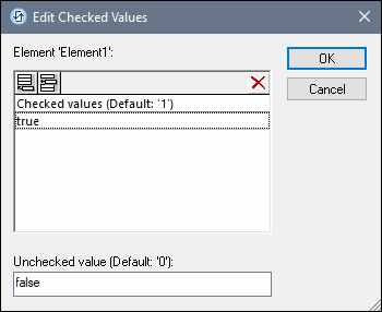 Note the following points:
•To specify which node will receive the value, make a page source link from the control to a page source node (by dragging the node on to the control). •If you enter more than one value for the Checked value, then the first value will be used; the others are ignored. •If you enter a Checked value but do not enter an Unchecked value, then the Unchecked value is no longer the default value but an empty string. •You can enter values for the Checked/Unchecked Values (true/false) property in a style sheet for: (i) all check boxes, and/or (ii) all switches, and/or (iii) all controls that use Checked/Unchecked Values (true/false) (which are check boxes and switches). •If values for Checked/Unchecked Values (true/false) are defined in a style sheet, and a control is, as a consequence, assigned values for this property in more than one place, then the most local definition wins. The most local definition is the style defined directly in the control's property. For priority involving a style sheet, see Priority within a Style Sheet and Priority across Style Sheets.
|
The value returned by the XPath expression is displayed in the control. This enables alternative ways to enter display values for certain controls. For example, a combo box could take its display value from either a page source node or the return value of the Get Value from XPath property.
Note: The $MTControlValue variable is not available for the generation of the value of the Get Value from XPath property. If used, then a validation error results.
|
The control has two states: checked and unchecked, each of which is associated with an XML value. These XML values are defined in the Checked Values property. The control is also associated with a page source node. If the value in the page source node is anything other than the XML value defined for the current status of the control (checked or unchecked), then auto-correction updates the value in the node to the value that has been defined for the current status.
The page source node might come to contain an invalid value if it were updated via some mechanism other than the control; for example, via an Update Node action. The Auto Correct Value property ensures that no undefined value is accepted. Auto-correction happens immediately the undefined value is detected, for example, when the solution is opened or when the incorrect value is entered.
For example, if the checked value is defined to be 1 and the unchecked value to be 0, and if the node's content is "somestring", then, (i) if the control is checked, the node's content will be corrected to 1, (ii) if the control is unchecked, the node's content will be corrected to 0. If there is more than one XML value assigned to the checked state, then the first XML value is used for the correction.
The Auto Correct Value property has two possible values: true or false. If the property is set to true, XML values are automatically corrected. The property's default value is false.
|
Sets the position of the check box relative to the control's text: either to the left or right of the text. The default is the operating system default.
|
Click the Additional Dialog button to display the control's Actions dialog. You can set actions to perform when a control event is triggered. The control's event/s are predefined and each is shown in its own tab in the right-hand pane of the Actions dialog. A library of actions is displayed in the left-hand pane. You can drag an action from the left-hand pane into an event's tab and then define the properties of the action. For each event, multiple actions can be set up. They will be executed in the order in which they occur, from top to bottom.
After defining a control's actions, you can access and edit them at any time by clicking the property's Additional Dialog button. Alternatively, you can access a control event by right-clicking the control and selecting the control's event in the context menu that appears.
|
An XPath expression that should evaluate to true() or false(). If the expression evaluates to false()—and only if it evaluates to false()—then the control is not visible. If the expression evaluates to true() or returns some other value, then the control is visible. The default is true(). Double-click inside the value field, or click the XPath button, to enter or edit an XPath expression. The Visible property can be used to render an object visible or not depending upon whether an XPath expression evaluates to true(). As a result, the display of an object can be made to be dynamically dependent on the content or structure of data.
Note: For information about the visibility of spanned columns/rows, see Table Properties.
Note: The $MTControlValue variable is not available for the evaluation of the Visible property. If it is used, then a validation error results.
|
The control is either enabled or disabled, according to whether the value of the property is true (enabled) or false (disabled). The value can be entered directly (by selecting it in the combo box or by double-clicking in the value field and entering the value you want). The value can also be an XPath expression that evaluates to boolean true or false. The default value is true. Typically the XPath expression of the Enabled/Editable property of a control would check the presence or value of a node. If the expression evaluates to true, the control will be enabled.
|
Sets the color of the control's text when the control is enabled. You can do one of the following to select the color:
•Click the color palette to select a text color •Select a color from the dropdown list of the combo box •Double-click in the value field to enter a color code (for example, #FF0000), or click the XPath toolbar button and enter an XPath expression to generate the required text
Note: A control can be enabled/disabled according to context. For example, if in a form about personal details, the user enters an affirmative for the holding of life insurance, then the fields for details of the life insurance policy can be enabled; otherwise these fields can be disabled. To enable/disable a field, use the relevant control's Enabled/Editable property. To set a text color for when the control is disabled, use the Text Color (Disabled) property.
|
Sets the color of the control's text when the control is disabled. You can do one of the following to select the color:
•Click the color palette to select a text color •Select a color from the dropdown list of the combo box •Double-click in the value field to enter a color code (for example, #FF0000), or click the XPath toolbar button and enter an XPath expression to generate the required text
Note: A control can be enabled/disabled according to context. For example, if in a form about personal details, the user enters an affirmative for the holding of life insurance, then the fields for details of the life insurance policy can be enabled; otherwise these fields can be disabled. To enable/disable a field, use the relevant control's Enabled/Editable property. To set a text color for when the control is enabled, use the Text Color property.
|
Select a size from the dropdown list of the combo box. Allowed values are: smallest|small|medium|large|largest. Each platform/device has its own pixel-height for each size. So the default text size in pixels is the client-specific pixel-height that corresponds to the value medium.
You can generate other values by using the mt-font-height function. For example, to get a size that is 120% larger than the numeric size that corresponds to 'largest' on a device, use the following XPath expression for the TextSize value: mt-font-height('largest', 'px') * 1.2. The function generates the numeric (pixel) value that corresponds to the 'largest' size. This value is then multiplied by 1.2 to obtain the numeric value that is 120% of the value that corresponds to 'largest'.
For information about the relationships between pixels, dp (device-independent pixels), and sp (scale-independent pixels), see Sizes: Pixels, DPI, DP, SP.
|
Sets whether or not the text size should be automatically reduced to fit the width of the control. You can either select the value from the dropdown list or enter it as an XPath string expression. The property's values are:
•off (the text is not automatically resized; this is the default) •ellipsis (adds an ellipsis at the end of the visible text of the control when that text is too long to be displayed in its entirety) •individually (the text of this control only will be automatically resized) •group X (where X=1 to 9). You can set a control to belong to one of nine Auto-Fit groups (where each group is identified by a number from 1 to 9). The text size of all the controls in a group will be automatically resized to that of the control with the smallest of all the auto-fit sizes in that group. This ensures that a selected set of controls has a uniform and reasonable size, so saving you the trouble of finding, by trial and error, the optimum size for a group of controls. •template group X (where X=1 to 9). Like for a group (see previous list item), you can set a control in a control template to belong to one of nine Auto-Fit template groups (where each template group is identified by a number from 1 to 9). A template group is different from a group (previous list item) in that, if set on a control template, it is limited to the controls of a control template—as opposed to the controls of a page. However, you can also use a template group as a group if you set it on a page, and not on a control template.
In Design View, text size will be reduced to a minimum size that is 50% of the font size, even if the auto-fit size is smaller. At runtime, however, the actual auto-fit size will be displayed.
Note •If the Multiline property has been set to true, then: (i) if auto-fit is disabled, the text will wrap to multiple lines; (ii) if auto-fit is enabled, the text will auto-size and will not wrap; line break characters in the text would, however, create new lines.. •This property cannot be enabled if the Max Number of Lines label property has been set. You must choose either to set a maximum number of lines or to auto-fit the text. •In tables, this property can be used with the table's Wrap Content Auto-Fit Group property.
|
Select true or false from the dropdown list of the combo box to set the text in bold. You can also use an XPath expression. Default is false.
|
Select true or false from the dropdown list of the combo box to set the text in italics. The value can also be generated dynamically via an XPath expression. Default is false.
|
Select true or false from the dropdown list of the combo box to set underlining for the text. The value can also be generated dynamically via an XPath expression. Default is false.
|
Select true or false from the dropdown list of the combo box to determine whether a line is drawn through the text of the control. The value can also be generated dynamically via an XPath expression. The default is false.
|
Sets the background color of the object when the object is enabled. You can do one of the following to select the color:
•Click the color palette to select a background color. •Select a color from the dropdown list of the combo box. If the cell contains a control, you might want to select the option Control's background color. •Double-click in the value field to enter a color code (for example, #FF0000), or click the XPath toolbar button and enter an XPath expression to generate the color name/definition. To take up the background color of the control, enter the XPath expression: "control".
Note: You can set the background color of the cell to be the same as the background color of the control in the cell, by either: (i) selecting Control's background color in the property's combo box, or (ii) entering the XPath expression "control" in the property's value field.
Note: A control can be enabled/disabled according to context. For example, if in a form about personal details, the user enters an affirmative for the holding of life insurance, then the fields for details of the life insurance policy can be enabled; otherwise these fields can be disabled. To enable/disable a field, use the relevant control's Enabled/Editable property. To set a background color for when the object is disabled, use the Background Color (Disabled) property.
|
Sets the background color of the object when the object is disabled. You can do one of the following to select the color:
•Click the color palette to select a background color •Select a color from the dropdown list of the combo box •Double-click in the value field to enter a color code (for example, #FF0000), or click the XPath toolbar button and enter an XPath expression to generate the required text.
Note: A control can be enabled/disabled according to context. For example, if in a form about personal details, the user enters an affirmative for the holding of life insurance, then the fields for details of the life insurance policy can be enabled; otherwise these fields can be disabled. To enable/disable a field, use the relevant control's Enabled/Editable property. To set a background color for when the object is enabled, use the Background Color property.
|
Sets the text that appears as a tooltip when the end user hovers over the control with the mouse or long presses the control. A tooltip provides useful information to the end user about the control. Double-click inside the value field to edit. If an action has been set for a long press of the control, then no tooltip will be shown on a long press.
Note: Tooltips are not available on all controls, and for some controls they are not available on all platforms. On iOS, tooltips are not available for Edit Field or Signature controls.
|
This property applies in the case of some controls (such as images and vertical lines) to the control, in other cases (such as radio buttons and check boxes) to the text that accompanies the control. The property sets the horizontal alignment of the control or text to left, center, or right. Default is left for all controls except vertical lines, for which it is center. The property's value can also be specified via an XPath expression (which enables the value to be generated dynamically).
|
Sets the vertical alignment to top, middle, or bottom. Default is middle. The value can also be specified via an XPath expression (which enables the value to be generated dynamically). For Check Box controls, the property sets the vertical alignment of the check box relative to its text if the text is multiline (see the Multiline property)
|
Sets the width of the control. Select a value from the property's combo box. The following values are available:
•fill_parent: makes the control as wide as the parent, which could be, for example, a table cell or the page •wrap_content: makes the control only as wide as the control's content requires; when this value is selected, the property Max Control Width becomes available •wrap_content_longest_entry: is available for combo box controls and makes the combo box as wide as the longest content requires; when this property value is selected, the property Max Control Width becomes available •percent value: a percentage of the page width; select a value from the dropdown list, or enter a value directly •pixel, dp, or sp value: select a pixel, dp, or sp value from the dropdown list, or enter a value directly
In effect, fill_parent creates a maximum width, while wrap_content creates a minimum width. If the combo box is within a table cell, for example, fill_parent would let the combo box fill the cell whereas wrap_content might not fill the cell.
The default value is fill_parent for all controls except the following:
•Image and Chart: For these, the default is wrap_content. •Geolocation Map: The default is the smaller of the two values $MT_CanvasX and $MT_CanvasY. These two dynamic variables give, respectively, the width and height of the device's viewport. Since the default of both Control Height and Control Width are the same (in each case, the smaller of $MT_CanvasX and $MT_CanvasY), the default shape and size of the viewport in the control will always be a square with side equal to min($MT_CanvasX, $MT_CanvasY).
For information about the relationships between pixels, dp (device-independent pixels), and sp (scale-independent pixels), see Sizes: Pixels, DPI, DP, SP.
|
This property is available only when the control's Control Width property has been set to wrap_content. The Max Control Width property sets the maximum width of the control. Select a value from the property's combo box. The following values are available:
•percent value: a percentage of the page width; select a value from the dropdown list, or enter a value directly •pixel, dp, or sp value: select a pixel, dp, or sp value from the dropdown list, or enter a value directly
|
Sets the margin offsets of the control (or page) relative to the surrounding objects or to the borders of the containing object. Select a value in pixels, dp, or sp from the dropdown list of the combo box, or double-click in the value field to enter a length value. The specified offset will be created on all four sides of the control or page. If you wish to set a different margin for any of the four sides, expand the Margin property to display the individual margin properties (left, right, top and bottom), and set the different value. For example: If you set Margin to be 6px and Margin Bottom to be 12px, then the top, left and right margins will be 6px and the bottom margin will be 12px.
For information about the relationships between pixels, dp (device-independent pixels), and sp (scale-independent pixels), see Sizes: Pixels, DPI, DP, SP.
|
Sets the control's padding, which is the space between the control's border and the control's content. If the control is a table and the padding is set on a table row or column, then the padding is added to the margin of any control that is contained in the row or column; this increases the inset of the contained control and does not modify the size of table cells.
Select a value in pixels, dp, or sp from the dropdown list of the combo box, or double-click in the value field to enter a length value. The padding will be set on all four sides of the control. If you wish to set a different padding for any of the four sides, expand the Padding property to display the individual padding properties (left, right, top and bottom), and set the different value. For example: If you set Padding to be 6px and Padding Bottom to be 12px, then the top, left and right padding will be 6px and the bottom padding will be 12px.
For information about the relationships between pixels, dp (device-independent pixels), and sp (scale-independent pixels), see Sizes: Pixels, DPI, DP, SP.
|
The Tab Order property takes an integer as its value, or an XPath expression that evaluates to an integer. This integer number is the position of the control in the tab order sequence.
The tab order is the sequence in which controls receive the focus when the client-device user taps the Tab key. The entire tab order sequence can be set quickly and in the visual context of all controls of the page via the Page | Show/Define Tab Order menu command. The Tab Order property of individual controls sets the sequential position of that control only.
Note: The Tab Order feature is available on Web and Windows clients only.
|
Opens the control's Local Variables dialog, where you can add, edit, and delete the variables of the control. A control variable has a name, which is a string, and a value, which is an XPath expression. The variables that are declared in the Local Variables dialog will be evaluated when the control is called and will be used with this value till the control is called again. Parameters can be used in the XPath expressions that calculate the variable's value.
Control variables are useful for providing values that can be used in control actions. For example, a control variable can select a domain name based on the control's context. So, if a the current node is, say, a Department node inside a Company node, then the current company could have a domain name of, say, altova.com or nanonull.com. With the domain name set as a control variable, the control variable can then be used in an action of the control. For example, email addresses of a department's Employee children can be built by using each employee's FirstName and LastName elements together with the control variable that contains the company's domain name.
Control variables can also be set via a control's context menu.
|
The Style Sheet property sets the style sheet to use for the control. The dropdown list of the Style Sheet property's combo box displays all the user-created style sheets that have been defined in the project. Select the style sheet you want to use for the control. Alternatively, you can use an XPath expression to select the style sheet you want; this has the advantage that you can make the selection of the style sheet conditional (see Applying User-Created Style Sheets). See the section Style Sheets for more information.
|
The name of one or more CSS classes that you want to associate with this control. Use a space to assign multiple classes: LabelClassOne LabelClassTwo. These classes can then be used in a CSS file (specified in the Browser Settings dialog) to assign properties specifically for this control. You can also use an XPath expression to generate or fetch the names of the class(es).
You can use the following predefined value to set specific behavior:
•mt-combo-open-on-focus opens the dropdown list of a combo box when the user tabs to it. You can use this value on (i) combo box controls and (ii) on table controls if the table contains combo box controls. Alternatively, if you want to open all combo boxes on a page individually, then you can set this value on the Browser CSS Class page property.
|