How to Set Styles
This topic describes where you can set styles for the different components of a page design and how settings at these various locations interact with each other. Broadly, stye properties can be defined for pages and for each control that has been placed on the page. The Table control is special because it can be used for laying out components neatly on a page and because it has a hierarchical structure, each level of which has its own style properties (table, row, column, cell). The individual style properties are described in detail in the topics about page properties and individual controls.
The Styles & Properties Pane
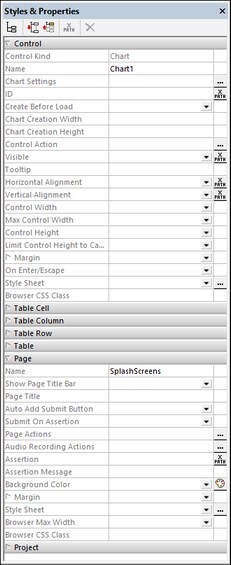
All styles can be set in the context-sensitive Styles & Properties Pane (screenshot below). When a control is selected in the design, the properties of that control are displayed at the top of the pane. In the example screenshot below, a Chart control was selected in the design. To set a value for any style property of the chart, select from the available values or enter the value you want, either directly or via an XPath expression. The style properties of ancestor components are displayed below the selected component—with higher-level ancestors being displayed progressively lower in the pane. For example, we can deduce from the screenshot below, that the chart control has been placed in a cell of a top-level table of the page. So, with the chart control selected, we can set the style properties not only of the chart, but also of the cell, column, row, and table that contain the chart. (To select another column or row of the table, you will need to select a component in the respective column or row.) With the chart selected, you can also set style properties of the page such as its margins and background color.
Note: When using tables, there can be some interaction between table components and what's in the table's cells. For example, a table column can be specified (with the wrap_content value of the column's Width property) to be only just as wide as the column's content (which could be an Image or a Label). For more information about using table layouts well, see the descriptions of the various table properties.
Style sheets and the cascading of styles
MobileTogether's Style Sheets feature enable you to use one or more style sheets to define style properties that can be used across all pages of the project. In the Project style sheet, you can define a style for each type of control (say, for all Buttons), for all tables, and for all pages of the project. This enables you to define default styles for the entire project and then override them in specific instances. This cascading of styles works as follows:
•There is always one default Project style sheet. Any style you define here will be automatically used across the project.
•You can create any number of custom named style sheets. A custom style sheet overrides the Project style sheet. So, if on a control, you want to override the styles of the Project style sheet with those of a custom style sheet, then you select, on the control's Style Sheet property, the custom style sheet that you want to use. You can override the Project styles of tables and pages in the same way—that is, by selecting a custom style sheet for the respective table or page.
•If you select a component and assign it a style value directly in the Styles & Properties Pane, then this value has a higher priority than that of any custom style sheet that might been assigned to the component.
For a detailed description of style sheets, go to the next section.
