Reusing a Template
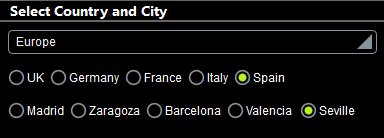
One of the main benefits of control templates is reuse. After you have created a control template, you can use it in different locations in your design. In our example Cities1-Reuse.mtd, the goal is to let users select their city by choosing continent, country, and city in that order as shown in the screenshot below. (All the geographic data is referenced from the XML page source CitiesWorldwide.xml.)
Since we are using two sets of horizontal radio buttons (one for countries and one for cities), we have created a single control template, named Dynamic Radio Buttons (Horizontal), and used it twice: once to generate radio buttons of the countries of the selected continent, and a second time to generate radio buttons of the cities of the selected country.
The project design
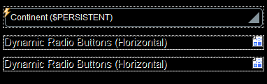
The project consists of the control template Dynamic Radio Buttons (Horizontal), which is used twice in the top page named Select Country and City. The design of the top page is shown in the screenshot below left. After the user selects a continent in the combo box, radio buttons of the countries in that continent are displayed. After a country is selected, radio buttons of the cities in that country are displayed.
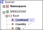
The continent, country, and city selected by the user are each stored in separate nodes of the $PERSISTENT page source (see screenshot above right). Dropping these three page source nodes (the @Continent, @Country, and @City attributes of the $PERSISTENT/Root element) on their respective design components performs certain important functions:
•@Continent on the combo box: updates @Continent, with the selection in the combo box and makes @Continent the context node of the combo box.
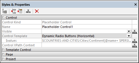
•@Country on placeholder-control-1 makes @Country the context node of the placeholder control (and of the control template that the placeholder control calls). The value in @Country is updated via the OnFinishEditing action of the radio button in the control template (see below).
•@City on placeholder-control-2 makes @City the context node of the placeholder control (and of the control template that the placeholder control calls). The value in @City is updated via the OnFinishEditing action of the radio button in the control template (see below).
The setting of a context node for the placeholder control is important because all XPath expressions in the control template called by the placeholder control will be evaluated relative to this context node.
The control template "Dynamic Radio Buttons (Horizontal)"
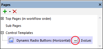
The control template has been declared to have one mandatory parameter named $values. You can see this declaration by clicking the Additional Components button in the Pages Pane (circled in red in the screenshot below).
The design of the control template is shown in the screenshot below. The control template consists of a table that expands horizontally, that is, a new column is created for each item of the sequence over which the table expands. This sequence (for the expansion of the table) is defined to be that held in the $values parameter (as shown in the screenshot below). Each column contains a radio button. So, if $values holds a sequence of country names, then a column containing a radio button will be created for each country name in the sequence. And if $values holds a sequence of city names, then a radio button will be created for each city name in the sequence. How the contents of $values is defined is explained below.
The radio button control has the following settings (defined in the Styles & Properties Pane):
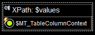
•A Text property that determines the text that accompanies each radio button. The text in our example is defined to be the contents of the $MT_TableColumnContext variable. This variable is a MobileTogether application variable that has been specially devised for use with tables that expand horizontally. It contains, for each column of such tables, the current context node. So, in our example, if a new column is created due to a country name in the $values sequence, then that country name is the context node for that column and that country name will be stored in $MT_TableColumnContext variable while that column is being generated. Since the Text property of the radio button has been set to $MT_TableColumnContext, each radio button will have the name of the sequence item that caused the generation of the current column.
•The Control Action property (for OnFinishEditing) updates the current node with the value of $MT_TableColumnContext. So: firstly, what is the current node? It is the context node of the calling placeholder control (see above). In our example, it is, respectively (for the first and second placeholder), the @Country and @City attributes of the $PERSISTENT/Root element. Secondly, which $MT_TableColumnContext value (that is, of which column) will be passed to the current node? Answer: The column containing the radio button that was clicked. Consequent to the above: The country/city name of the clicked radio button will be passed to the @Country or @City attribute, respectively.
•The Checked Value (or Get Value from XPath) property of the radio button defines whether the button has been selected (a value of 1) or not (a value of 0). The XPath expression that determines this value in the control template is: if ($MT_TableColumnContext = .) then 1 else 0. This expression sets the value of that radio button to 1 that has a $MT_TableColumnContext value that is equal to the value of the current node (which is the context node of the placeholder control and, in our example, either the @Country or @City attribute of the $PERSISTENT/Root element). Since the current node was updated with the value of $MT_TableColumnContext via the OnFinishEditing action, only the radio button that was clicked (and triggered the OnFinishEditing action) will have a value of 1.
All that is needed now is to specify the sequence that is passed to the control template's $values parameter. This definition is set on the placeholder control (see below).
Note: The Dynamic Radio Buttons (Horizontal) enables you to create horizontal radio buttons for any sequence of values that is supplied to the $values parameter.
The two Placeholder Controls that reuse the control template
A Placeholder Control is created for a control template by dropping the Placeholder Control in the design at the required location, and setting its Control Template property to select the control template you want. Alternatively, you can drop the wanted control template in the design at the required location; the Control Template property will be set automatically.
The key settings for the Placeholder Control in our example are explained below. The screenshot above shows the properties of the first Placeholder Control, which is used to select countries.
•Associated Page Source Node: This specifies the page source node that will be the context node of the Placeholder Control, and, by extension, the context node of the control template that is called. All XPath expressions in the control template (including for its parameters and variables) will be evaluated relative to this node. You can make this setting by dropping the page source node onto the Placeholder Control. In our project the associated page source nodes for the two Placeholder Controls are, respectively, the @Country and @City attributes of the $PERSISTENT/Root element.
•Control Template: Selects the control template that will be instantiated at the location of the Placeholder Control. You can select the control template in the property's combo box. (Alternatively, you can drag a control template into the design and this property will be set automatically to select that control template.)
•Parameters: Defines the values to be sent to the $values parameter of the control template. In the case of the Placeholder Control that instantiates radio buttons for the countries of the user-selected continent, the XPath expression is: $COUNTRIES-AND-CITIES/Cities/Continent[@name=$PERSISTENT/Root/@Continent]/Country/@name. The predicate filter in this expression (highlighted in yellow) selects the continent that the user has chosen (and which is now stored in the $PERSISTENT tree). The XPath expression of the second Placeholder Control, which generates radio buttons for cities of the selected country, is: $COUNTRIES-AND-CITIES/Cities/Continent[@name=$PERSISTENT/Root/@Continent]/Country[@name=$PERSISTENT/Root/@Country]/City/@name.
Notice that the two placeholders have different context nodes and send different sequences to the $values parameter. This enables the control template to generate the appropriate radio buttons in the two locations where it is instantiated by the respective Placeholder Controls.