Switching Templates
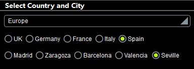
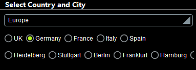
A second benefit of control templates is the ability to easily change templates in the Placeholder Control, for example, if you want to change the layout of a component. In the example Cities1-Reuse.mtd (described in the previous topic), we run into the following problem: While the list of cities in some cases is short enough to fit in the horizontal span of the display (such as for Spain), some lists are too long to fit (for example, Germany); see screenshots below.
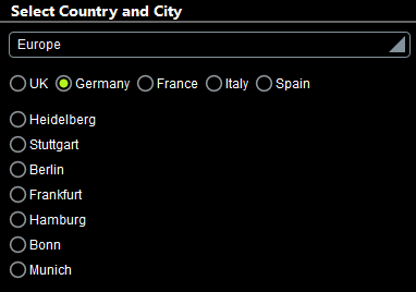
In order to fit all cities in the display, it would be more sensible to display cities in a vertical list. In the example Cities2-SwitchTemplates.mtd, we have added (to the previous design) a new control template that generates vertical radio buttons, and in the placeholder control that instantiates the radio buttons for cities, we have simply switched the control template to call the new control template. A simulation of the modified design is shown in the screenshot below.
The new control template: "Dynamic Radio Buttons (Vertical)"
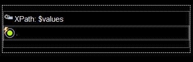
The control template has been declared to have one mandatory parameter named $values (just like the control template for horizontal radio buttons). Additionally, however, a variable named $source has been defined with a value that is the current node.
The design of the control template is shown in the screenshot below. The major difference from the template for horizontal radio buttons is that the table does not expand horizontally (creating a new column for each item in $values). Instead, a new row is generated for each item in $values. Since each row contains a radio button, the radio button list is vertical.
The radio button control has the following settings (defined in the Styles & Properties Pane):
•A Text property that selects the current node. Since the current node inside a table row will be the current $values item for which the row is being generated, the text of each radio button will be the current $values item.
•The Control Action property (for OnFinishEditing) updates the $source variable with the value of the current node (which is the current $values item). As a result, the $source variable will contain the text value of the clicked radio button.
•The Checked Value (or Get Value from XPath) property of the radio button defines whether the button has been selected (a value of 1) or not (a value of 0). The XPath expression that determines this property value is: if ($source = .) then 1 else 0. This expression sets the value of that radio button to 1 that has a current node value which is equal to the value of $source. This will be true only for the clicked radio button, since $source will be updated with the current node value only when the OnFinishEditing action is triggered (see previous point).
You now have a new control template that generates vertical radio buttons for the items in the template's $values parameter. Since this is the same parameter input that the Dynamic Radio Buttons (Horizontal) control template takes, you can now set a Placeholder Control to call either the template for horizontal radio buttons or that for vertical radio buttons.
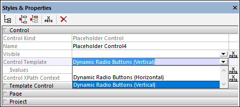
Switching between templates in the Placeholder Control
In the example file, we go to the top page and, in the design, select the placeholder that instantiates the radio buttons for cities. In the Styles & Properties Pane, we can now switch between Dynamic Radio Buttons (Vertical) for vertically listed radio buttons and Dynamic Radio Buttons (Horizontal) for horizontal radio buttons (see screenshot below). In our example, we have chosen to display cities in a vertical list.