Table Properties
Certain properties can be set for a table's cells, columns, and rows, as well as for the entire table. The screenshot below left shows the set of properties that are available for static tables and repeating tables. The screenshot below right shows the properties that are available for dynamic tables. Note that dynamic tables have an additional set of Table Row Group properties. This is because a dynamic table typically defines a group of rows (row group), where each row corresponds to a single instance of the same element. For example, if each Person child element of an Office element corresponds to a row of the table, then all the Person elements together constitute the row group.
Table properties are discussed in detail in the description of the Table control. In this section, we discuss those table properties that are unique to MobileTogether or are handled uniquely.


Property: Repeating
The Repeating property is available for repeating tables (the entire table repeats) and static tables. It takes a Boolean value (true or false) and determines whether the table is repeating or static. The property it is not available for dynamic tables.
The value of this property is automatically assigned at the time a repeating or static table is created. A repeating table has a Repeating property of true, while a static table has a Repeating property of false. After a table has been created as a particular type (repeating or static), its type can be changed by changing the value of the table's Repeating property.
Property: Create for each item in
The Create for each item in property is available for tables of all types and table row groups (in dynamic tables). It specifies the number of times the repeating table or repeating table row group is re-created. This number is equal to the number of items in the sequence returned by the property's XPath expression. The expression can return two types of sequence:
•Nodes from a page source tree. This is an alternative to associating a repeating table (or table row group) with a page source node—an association made by dragging and dropping the node onto the table. An XPath expression of this kind also allows more flexibility in the node selection. For example, the XPath expression $XML1/Offices/Office[@location='US'] returns a sequence of Office nodes that have an attribute of @location='US'. The US filter cannot be applied by using the alternative method of dropping the Office node onto the table. However, this filter can be achieved with the Create for each item in property.
•Items unrelated to the page source tree. For example, in the month October 2014, the expression 1 to subsequence(age-details(xs:date("2014-01-01")), 2, 1) returns a nine-item sequence, namely, the integers from 1 to 9, which is the number of months that have elapsed between 01 January 2014 and a day in October 2014. This is because the basic XPath expression is 1 to X. And X (according to the subsequence function) is the second item of the three-item sequence returned by the age-details function. This latter function returns the "age" of the current day (in our month of October 2014) relative to the input date (01 January 2014) in terms of the three-item sequence years, months, days (which in this case will be 0 years, 9 months and XX days). The second item of the three-item sequence is the number of months in the age, which is 9. Since the returned sequence contains nine items (the range from 1 to 9), the table will be created nine times.
Note: If you wish to preview the results of XPath expressions, run MobileTogether Designer's built-in simulator (Run | Simulate Workflow), and, in the Simulator dialog that appears,click Evaluate XPath and then Evaluator.
Enabling row dragging in tables with dynamic rows
A table with repeating rows consists of multiple rows, each of which corresponds to one instance of the repeating data element and which we call a data row. For example, a Person row group would typically contain multiple Person data rows that occur in some specific order. The end user might want to reorder the Person data rows and would typically do this by dragging a data row to its new position. In the design, you can enable row dragging and define the actions to perform when the dragged row has been dropped at its new position. You can enable row dragging by using the following properties:
•Table Row Group properties: Draggable property. If the property is set to false, then row dragging is disabled. If the property is set to true, then the end user can drag any data row to a new location by first long-tapping or long-clicking anywhere in the data row till Drag mode is activated and then dragging the row to its new location in the table. You can avoid the long-clicking by setting the Instant Row Dragging property of any button in the row group to true. In this case, the end user can drag immediately. If you set the value of the Draggable property to true, then a popup appears asking whether you want to automatically let MobileTogether define the reordering actions. Unless you wish to assign other actions instead of reordering actions, select Yes.
•Table Row Group properties: Gestures property. This property enables you to set actions to perform when the data row is dropped in its new location or swiped. For example, when a row is dropped at a new location, the reordering is shown in the interface but the underlying data is not automatically reordered. If you want this to happen, actions must be explicitly defined to do this. So, for example, if the end user moves a Person row from position 1 to position 5 in the display and you therefore want to move the corresponding Person element in the underlying data to the new position, then actions to do this must be specified. You can let MobileTogether define the reordering actions for you automatically (see previous bullet point) or you can define the actions yourself. Alternatively, you can let MobileTogether define the reordering actions and then modify or augment these actions.
Note that this feature applies only to the row groups of top-level dynamic tables.
The Draggable and Gestures properties are described in the Table control topic. The Instant Row Dragging property is a property of the Button control and is described with the other Button properties.
Swipe actions for dynamic rows
You can set actions to be performed when the end user left-swipes or right-swipes a data row of a row group. You can set swiping actions by using the Swipe to Left and Swipe to Right properties of the Table Row Group (see screenshot below).
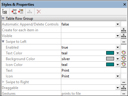
Setting up the actions of a Swipe event consists of the following:
•Set the Enabled property to true.
•On swiping, a text string and an icon can be displayed in the swiped row. Define the corresponding properties according to what you want to display (see screenshot above). The icon is selected from a set of available icons.
•Set one or more actions to be carried out on swiping. The Actions dialog for swiping is accessed via the Gestures property or the Additional Dialog button of the Swipe to Left/Right property. In the screenshot above, you can see that a Print to File action has been set for the Swipe to Left property.
Note that this feature applies only to the row groups of top-level dynamic tables.
These properties are described in the Table control topic.
Row/Column joining and spanning
To join multiple rows or multiple columns, select, respectively, the row or column in the design that you want to span, and use the appropriate Join command from the context menu, the Table menu, or the application toolbar. The selected row/column will be joined with the adjacent row/column you selected. If the joined rows or columns are, respectively, within a row group or column group (which are created for dynamic rows or columns), then the join occurs within each instance of the group, and the joined row/column is displayed in each group.
In the case of dynamic columns, an additional type of column merging, called spanning, is available: The columns of all column groups are spanned to a single column, whether the column group in the design consists of one or more columns. To do this, set the Spans Column Groups property (available in the Styles & Properties Pane) to true. This property is available only in the first column of a column group. It takes a value of true or false. Default is false. If the property is set to true, then, in the output, all the columns of the column group are spanned, resulting in one column.
The table below shows a design consisting of a column group comprising two columns, which are not spanned. The column group is associated with the element Node.
Column Group in design, corresponds to the repeating element Node. Not spanned
|
In the output, the column group is repeated for each instance of Node. As a result, two columns are created for each Node element, as shown in the table below.
Node[1] | Node[1] | Node[2] | Node[2] | ... | Node[n] | Node[n] |
If the dynamic column group were spanned, by setting the Spans Column Groups property to true, then the effect in the design is as if both columns were joined (see table below). The properties and content of the resulting column will be that of the first column.
Column Group in design corresponding to repeating element Node: spanned
|
In the output, the column group is spanned across all instances of Node. As a result, there will be only one column for all the instances of Node, as shown in the table below. If the content of the column is dynamically selected via an XPath expression that locates Node elements, then an error will be returned.
Node[1 to n] |
When dynamic columns are spanned, you can think of the transformation process as occurring in two steps: (i) In the design, all columns (of any type, including static) in the column group are joined together into one column, as if the Join command were used on them; (ii) in the output, all the instances of the repeating element are created as a single column. Any XPath expression that: (i) is located within a spanned dynamic column in the design, and (ii) tries to locate individual element instances corresponding to output columns will return an error.
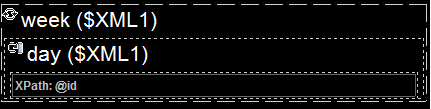
The screenshot below shows a simple example of a dynamic column created in a column group. The column group in the design contains a single column group that is associated with the day element, and this column group is within a (repeating) table associated with the week element (which, in the page source, is the parent of the day element). Since the week element repeats, a new table will be created for each week element. If, in the page source, there are multiple day child elements of the week element, and if, in the design, the dynamic columns of the column group are not spanned, then the table (for each week) generated from this design will have as many columns as there are day child elements. If, however, you set the Spans Column Groups property to true, then the columns in the generated table will be spanned, and the table will have only one column.
For more information about column groups, see Dynamic Columns.
Column/Row visibility
The visibility of a column or row is set by selecting the column or row, and setting its Visible property to true or false. The default value is true.
If columns or rows are spanned, the visibility of the spanned columns/rows can be specified individually if the visibility of the first column/row in the spanned set has been given a value of true. If the visibility of the first column/row in the spanned set of columns/rows has been given a value of false, then all the columns/rows in the spanned set are given a value of false.
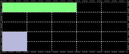
Screenshot above: Spanned columns in the first row (colored green):
•The three spanned columns in Row-1 (green) are considered to be Column-1. The next column in Row-1 is Column-4. In Row-1, there is no Column-2 or Column-3.
•If you select any of the first three columns individually in Rows 2 to 5 and set the visibility to true/false, then the visibility of none of the other columns will be affected.
•If you select (the spanned) Column-1 in Row-1 and set the visibility to true/false, then the visibility of only Column-1 will be modified. Column-2 and Column-3 (in Rows 2 to 5) will not be affected.
Screenshot above: Spanned rows in the first column (colored blue):
•The spanned rows in Column-1 (blue) are considered to be Row 4. In Column-1, there is no Row-5.
•If you select either of the two rows (Row-4 or Row-5) individually in Columns 2 to 5 and set the visibility to true/false, then the other row will not be affected.
•If you select (the spanned) Row-4 in Column-1 and set the visibility to true/false, then the visibility of only Row-4 will be modified. Row-5 (in Columns 2 to 5) will not be affected
Scrollable tables
If a table is very long and/or very wide, you can set it to be vertically and/or horizontally scrollable. In this event, only a certain portion of the table will be displayed; the rest can be scrolled in and out of view. You can set multiple tables on a page to be scrollable.
Vertical scrolling
The Max Table Height property specifies the table's height, in pixels or relative to the device's screen height. Select one of the values from the property's combo box. For example, if you select 50%, then the table will have a height of half of the device's screen height (see screen at first left in image below). If the table has a vertical extent that does not fit in the allotted screen space (in this example, 50% of the screen height), then the table will have a scroll bar and the end user can scroll the rest of the table in and out of the allotted screen space. If design components occur above the table, then all these components are displayed above the table; the table itself will have the absolute or relative height specified via this property.
Note: The table and the page have separate scroll bars (see screens in the image below). In the MobileTogether Designer Simulator, use the scroll wheel to scroll vertically, and click-and-drag to scroll horizontally.
Note: On Android 4.x devices, if there are two or more (scrollable or non-scrollable) tables on a page, then, if any of these tables is scrollable, it cannot be scrolled vertically.
Note: See the Scrollable Tables tutorial for an example.

The Max Table Height property can take two other values (besides a pixel or percentage value):
•Rest of screen height (max): The table height is minimized as much as possible so that as much of the rest of the page can be displayed. In the image above, the screen at extreme right shows a table that has been given this property value: The table height has been reduced so that all the five components of the page are displayed. Notice, in this case, that the scroll bar of the page has been reduced to zero since the entire page is in view.
•Rest of screen height (always): This option enables you to use the entire screen height to display the page. If a table does not have enough vertical extent to fill the page, then additional empty space is added below the table so that the last component of the page fits just above the bottom of the screen. This setting allows you to ensure that end-of-page content is located at the bottom of the screen.
The Scroll Vertically property becomes available after a value has been set for the Max Table Height property and no Max Table Width value is set. The Scroll Vertically property can take one of two values:
•Whole table: The whole table scrolls in and out of the table height that is allotted to the table via the Max Table Height property. Whole table is the default value.
•Rows except header and footer: The table's header and footer stay fixed in the view. The table's body rows scroll within the remaining table height.
The Row Group Chunk Size property becomes available only if there is a repeating row-group in the table and after a value has been set for the Max Table Height property of scrollable tables. It enables you to specify the number of row groups that are loaded at a time. When the user scrolls down and the last row group of the last-loaded chunk is reached, then the next chunk is loaded. There is no default value for this property.
Horizontal scrolling
The Max Table Width property specifies the table's width: (i) in pixels, (ii) relative to the device's screen width, or (iii) optimized for columns (wrap_content). The default is wrap_content. Select the value you want from the dropdown list of the property's combo box. If the table width is larger than the screen width, then the table will be displayed with a horizontal scroll bar. Users can swipe left or right to scroll the table.
Table borders
The Table menu offers a number of commands to edit table structure. Several table properties are set in the Styles & Properties Pane. Additionally, table borders can be conveniently set in the Border Settings dialog (Table | Border Settings).