Overlay Charts
Overlay charts (screenshot below) enable you to combine multiple charts of different types. The overlay chart in the screenshot below is explained in the text of the screenshot. The following types of chart can be combined:
•2D bar charts and stacked bar charts
•Line charts
•Area charts and stacked area charts
•Candlestick charts

Creating the overlay chart
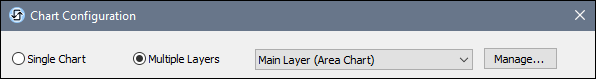
An overlay chart is created by selecting the Multiple Layers radio button in the Chart Configuration dialog (see screenshot below). A main layer is automatically created. You can select the type of chart for the main layer and then make the chart settings and data selection in the usual way.
Managing the layers of the overlay chart
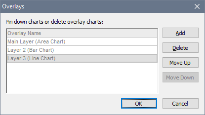
You can add new layers to an overlay chart and delete layers. To do this, click the Manage button in the Chart Configuration dialog (see screenshot above). This displays the Overlays dialog (screenshot below). Click Add to add a new layer. To delete a layer, select a layer and click Delete.
You should note that when a layer is placed over another, it will obscure the layers beneath it. Since only area charts can be made transparent, some layer arrangements might not be optimal. For example a bar chart that is layered over a line chart would obscure parts of the lines. You should keep this in mind when planning the layering order.
Data selection for the various charts
The data selection for each chart depends on the chart type and is done in the usual ways for each chart type. See the sections, Chart Data Selection: Simple and Chart Data Selection: Flexible for an overview of chart data selection.
The following general points relating to overlay charts are important and should be noted:
•The X-Axis for all chart layers is common and is the X-Axis specified in the main layer. If this X-Axis definition cannot be evaluated for another chart, then that chart will not be drawn. X-Axes specified in chart definitions of other layers are ignored.
•The Y-Axes series for each chart are selected separately. The Y-Axes of each layer is drawn parallel to each other, starting from the left for the bottom-most layer (the main layer) and proceeding to right with each layer. Note that a label can be specified for each Y-Axis, in its chart settings.
Important chart settings
The following chart settings are relevant:
•The title of the chart is specified in the Chart Title setting of the main layer.
•X-Axis settings are specified in the settings for the main layer.
•Y-Axis labels can be set for each chart separately.
•Y-Axis start points (minimum) and end points (maximum), as well as the tick intervals, can be specified for each chart separately. This enables axes to be calibrated relative to each other.
•The colors of series in each chart can be selected separately.