Editing Rich Text Content
Text content in a Rich Text control is displayed on all client devices. The styles are defined in the style sheet that is assigned to the control. On Web clients and Windows clients, the end user can additionally edit the text content. This section describes how to edit rich text on a Web or Windows client.
The Rich Text control
When a Rich Text control is rendered on a Web or Windows client (screenshot below), it will consist of two parts:
•A toolbar for editing, which is fixed at the top of the control.
•A content part, in which text can be edited (modified, added, or deleted). If the content requires more space than is available for the control on the device, then the content part of the control will have a scroll bar. The height of the control can be set with the control's Rich Text Height property.

The control's toolbar
The toolbar of the Rich Text control (screenshot below) is displayed on Web and Windows clients only.
It consists of the following icons (from left):
•An Undo (Ctrl+Z) icon and a Redo (Ctrl+Y) icon.
•Text-alignment icons: respectively, to align text left, center, and right, and to justify text. These icons will become enabled when the cursor is placed inside a block element for which a style attribute has been defined.
•Icons to apply bold (Ctrl+B), italic (Ctrl+I), underline (Ctrl+U), and strike-through formatting to the selected text. At the markup level, the respective styles are applied by enclosing the selected text with the element that is assigned to that icon. (Either the element or a designated attribute will specify the respective style, see Toolbar Assignments.)
•You can cut (Ctrl+X), copy (Ctrl+C), and paste (Ctrl+V) content. If content was copied from a Rich Text control, a pop-up will appear when pasting, asking whether you want to paste the content as XML or as text. The copied XML tree will be pasted as XML if the XML structure at that point allows the copied elements to be inserted; otherwise only the text content is pasted.
•An icon with a dropdown menu of markup tag sizes. You can select sizes from between a maximum, which shows the entire node name, to a minimum, which shows empty small start and end tags. The screenshot below shows markup tags at maximum size.

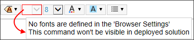
•Four combo boxes in which to select, respectively, the font family, font size, font color, and font background. The set of available fonts can be customized in the Browser Settings dialog. If no font is specified in the Browser Settings dialog, then the font selection combo box will be disabled in the deployed solution. A warning to this effect is displayed in simulations when the cursor is placed over the font selection combo box (see screenshot below).
•A combo box in which to select the list-item marker of (i) the entire list (in the case of Container lists), or (ii) the selected list-item (in the case of Item-sequence lists).
Note: When the cursor is placed at a location where a toolbar-based style cannot be applied, then that toolbar item is disabled.
Note: When a deployed solution is opened on a client for editing, toolbar items that have not been mapped to an element are not displayed. In the designer (during simulations), however, these toolbar items are displayed, but they are disabled and shown with a red border; if you place the cursor over one of these toolbar items, a tool tip informs you that a mapping for that toolbar item has not been defined. In this way, you can distinguish between toolbar items that are disabled because of the cursor location (see previous note) and toolbar items that are disabled because they have not been mapped.
Inserting and removing elements
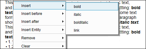
To insert an element in the text content, it is best to define child elements of editable elements in the style sheet. If this has been done, then the end user can right-click a text selection inside an element and, from the context menu that appears, select the element to insert (see screenshot below).
The elements that are shown in the context menu depend on the element in which the cursor is placed:
•Insert: Inserts a child element at the cursor selection point or around a text selection. The context menu lists the child elements that have been defined.
•Insert before/after: Inserts a sibling element before or after the element in which the cursor is placed. The context menu shows the sibling elements based on the structure of the page source selected in the style sheet.
•Insert Entity: Inserts XML special characters (ampersand, apostrophe, less-than character, greater-than character, quote) as character entities at the cursor selection point or as a replacement of the text selection.
•Remove: Removes the element in which the cursor is placed or an ancestor element. The context menu shows the current element and all ancestors based on the structure of the page source selected in the style sheet.
•Clear: Clears markup that has been added to enclose a text selection. For example, if a text selection has been made bold, then the markup that created the bold styling is cleared.
Editing a list
The following screenshot shows two lists. The first list is a Container list while the second list is an Item-sequence list.
Note the following list-specific editing functionality:
•Change the list-item marker via the List Marker combo box in the toolbar. If an item in a Container list is selected, then the markers of all items in the list are changed. If an item in an Item-sequence list is selected, then the marker of only that list item is changed.
•To insert a list item, place the cursor at the end of the list item immediately below which you want to insert the new list item, and press Enter.
•To remove a list item, toggle on the markup tags and select the list item you want to remove; then select Remove in the context menu.