Profiler Results: Exports and Charts
After running the XSLT/XQuery Profiler, the results can be exported to an XML file and to a chart that can be saved as an image file.
Export
On clicking the Export button, you will be prompted to select a location and filename for the XML file to which profiler results can be saved. To get a clearer view of the structure, it is best to view the XML file in Grid View. For example, when viewing an XSLT Profiler result in Grid View, you will see the structure of the XML document as consisting of three hierarchical levels, each identified by a node element. The first node element represents the document root, the second node element the xsl:stylesheet element, and the third node element the global elements (such as xsl:output and xsl:template). The profiling data is stored in attributes of each of the node elements.
Chart
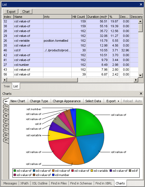
After running the XSLT/XQuery Profiler, a chart of the results or a subset of the results can be generated. In the Profiler window (see screenshot below), click the Chart button to generate the chart in the Charts output window (see screenshot below).
Note the following points:
•In the Profiler window (Tree View or List View), a subset of the results can be selected by marking them. Click with the Ctrl and/or Shift keys to mark multiple items. In List View the results can be sorted on the basis of a column's values by clicking on that column's header. This can be useful, for example, for ordering result items according to the most time-intensive items and then selecting a subset that takes up most of the transformation time. By selecting subsets unwanted result items can be filtered out. In the screenshot above, the highlighted result items have been selected.
•After a chart has been created its type (pie chart, bar chart, line chart, etc) can be changed by clicking the Change Type button of the Charts output window. The various types of charts are described in detail in the Charts section of the documentation.
•Clicking the Select Data button of the Charts output window pops up the Select Data dialog (screenshot below). In this dialog, you can select data for the X-Axis and Y-Axis from the data table that is produced by the Select Columns process. To select data for the X-Axis click in the Axis Values text box and then either enter the range of table values (for example, A1:A7) or drag the cursor from the start of the range to the end of the range. Do the same for the Y-Axis.
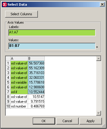
Clicking the Select Columns button enables you to change the data selection for the data table. See the Source XPath, X-Axis Selection, and Y-Axis Selection for information about how column selection works.
For more detailed information about charts see the Charts section of the documentation.