Content Model Objects
In Content Model View, the objects shown in the diagram are best organized in three broad groups:
•Compositors: (i) sequence, (ii) choice, (iii) all
•Components: (i) element, (ii) complex type, (iii) model group, (iv) wildcard
•Miscellaneous: (i) attribute, (ii) attribute group, (iii) assertion, (iv) constraint, (v) open content
The graphical representations of these objects are described individually below.
Compositors
A compositor defines the order in which child elements occur. There are three compositors: sequence, choice, and all.
To insert a compositor:
1.Right-click the element to which you wish to add child elements
2.Select Add Child | Sequence (or Choice or All).
The compositor is added, and will look as below:
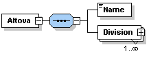
•Sequence
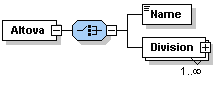
•Choice
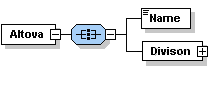
•All
To change the compositor, right-click the compositor and select Change Model | Sequence (or Choice or All). After you have added the compositor, you will need to add child element/s or a model group.
Components
Given below is a list of components that are used in content models. The graphical representation of each provides detailed information about the component's type and structural properties.
•Mandatory single element
Details: The rectangle indicates an element and the solid border indicates that the element is required. The absence of a number range indicates a single element (i.e. minOcc=1 and maxOcc=1). The name of the element is Country. The blue color indicates that the element is currently selected; (a component is selected by clicking it). When a component is not selected, it is white.
•Single optional element
Details: The rectangle indicates an element and the dashed border means the element is optional. The absence of a number range indicates a single element (i.e. minOcc=0 and maxOcc=1). Element name is Location.
Note: The context menu option Optional converts a mandatory element into an optional one.
•Mandatory multiple element
Details: The rectangle indicates an element and the solid border indicates that the element is required. The number range 1..5 means that minOcc=1 and maxOcc=5. Element name is Alias.
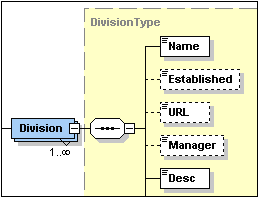
•Mandatory multiple element containing child elements
Details: The rectangle indicates an element and the solid border indicates that the element is required. The number range 1..infinity means that minOcc=1 and maxOcc=unbounded. The plus sign means complex content (i.e. at least one element or attribute child). Element name is Division.
Note: The context menu option Unbounded changes maxOcc to unbounded.
Clicking on the + sign of the element expands the tree view and shows the child elements.
•Element referencing global element
Details: The arrow in the bottom-left means the element references a global element. The rectangle indicates an element and the solid border indicates that the element is required. The number range 1..infinity means that minOcc=1 and maxOcc=unbounded. The plus sign indicates complex content (i.e. at least one element or attribute child). Element name is xs:field.
Note: A global element can be referenced from within simple and complex type definitions, thus enabling you to re-use a global declaration at multiple locations in your schema. You can create a reference to a global element in two ways: (i) by entering a name for the local element that is the same as that of the global element; and (ii) by right-clicking the local element and selecting the option Reference from the context menu. You can view the definition of a global element by holding down Ctrl and double-clicking the element. Alternatively, right-click, and select Go to Definition. If you create a reference to an element that does not exist, the element name appears in red as a warning that there is no definition to refer to.
•Complex type
Details: The irregular hexagon with a plus sign indicates a complex type. The complex type shown here has the name keybase. This symbol (the irregular hexagon with a plus sign) indicates a global complex type. A global complex type is declared in the Schema Overview, and its content model is typically defined in Content Model View. A global complex type can be used either as (i) the data type of an element, or (ii) the base type of another complex type by assigning it to the element or complex type, respectively, in the Details entry helper (in either Content Model View or in Schema Overview).
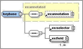
The keybase complex type shown above was declared in Schema Overview with a base type of xs:annotated. The base type is displayed as a rectangle with a dashed gray border and a yellow background color. Then, in Content Model View, the child elements xs:selector and xs:field were created. (Note the tiny arrows in the bottom left corner of the xs:selector and xs:field rectangles. These indicate that both elements reference global elements of those names.)
A local complex type is defined directly in Content Model View by creating a child element or attribute for an element. There is no separate symbol for local complex types.
Note: The base type of a content model is displayed as a rectangle with a dashed gray border and a yellow background color. You can go to the content model of the base type by double-clicking its name.
•Model group
Details: The irregular octagon with a plus sign indicates a model group. A model group allows you to define and reuse element declarations.
Note: When the model group is declared (in Schema Overview) it is given a name. You subsequently define its content model (in Content Model View) by assigning it a child compositor that contains the element declarations. When the model group is used, it is inserted as a child, or inserted or appended within the content model of some other component (in Content Model View).
•Wildcards
Details: The irregular octagon with any at left indicates a wildcard.
Note: Wildcards are used as placeholders to allow elements not specified in the schema or from other namespaces. ##other = elements can belong to any namespace other than the target namespace defined in the schema; ##any = elements can belong to any namespace; ##targetNamespace = elements must belong to the target namespace defined in the schema; ##local = elements cannot belong to any namespace; anyURI = elements belong to the namespace you specify.
Miscellaneous objects
Miscellaneous objects are attributes, attribute groups, assertions, identity constraints, and open content.
•Attributes, Attribute Groups

Details: Indicated with the word 'attributes' in italics in a rectangle that can be expanded. Each attribute is shown in a rectangle with a (i) dashed border if the attribute is optional, or (ii) a solid border if the attribute is required (mandatory). Attribute groups and attribute wildcards are also included in the 'attributes' rectangle.
Note: Attributes can be edited in the diagram and in the Details Entry Helper. Attributes can be displayed in the Content Model View diagram or in the AAIDC pane below the Content Model View. You can toggle between these two views by clicking the Display Attributes  icon. To change the order of attributes of an element, drag the attribute and drop when the arrow appears at the required location.
•Assertions
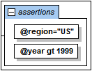
Details: Indicated with the word 'assertions' in italics in a rectangle that can be expanded. Each assertion is shown in a rectangle within the Assertions box.
Note: Assertions can be edited in the diagram and in the Details Entry Helper. They can be displayed in the Content Model View diagram or in the AAIDC pane below the Content Model View. You can toggle between these two views by clicking the Display Assertions  icon. To change the order of assertions on an element, drag the assertion and drop when the arrow appears at the required location.
•Identity constraints
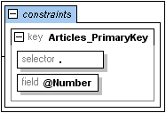
Details: Indicated with the word 'constraints' in italics in a rectangle that can be expanded.
Note: The identity constraints listed in the content model of a component show constraints as defined with the key and keyref elements, and with the unique element. Identity constraints defined using the ID datatype are not shown in the content model diagram, but in the Details Entry Helper. Identity constraints can be displayed and edited in the Content Model View or in the Identity Constraints tab of Schema Overview. In Content Model View, you can toggle the Constraints box on and off with the Display Constraints  icon.
icon.
•Conditional Type Assignment
Details: The alternative element is a rectangle containing the XPath expression that will be tested (see screenshot above). The type of the alternative element is specified in the Details entry helper. If the type is a complex type, it is shown in the alternative element's expanded rectangle and can be further edited there (see screenshot below). Simple types are not shown in the diagram, but can be defined in the Simple Type tab of the Details entry helper.
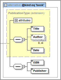
Note: The alternative element is new in XSD 1.1. If the XPath expression evaluates to true, the type specified by the alternative element will be the selected type. The first alternative element from among the alternative siblings to evaluate to true is selected. So the order of alternative elements is important. The order can be changed by dragging the alternative element boxes into the desired order. See the section Conditional Type Assignment for a detailed description.
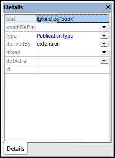
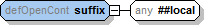
•Default Open Content, Open Content
Details: The defaultOpenContent and openContent elements are indicated in Content Model View with the labels openContent and defOpenContent. Wildcard element content is indicated with an any box (see screenshot above).
Note: The defaultOpenContent and openContent elements are new in XSD 1.1. Default Open Content is a global component and is created in Schema Overview. In the Content Model View of a particular component's content model, you can replace the Default Open Content with Open Content specific to that component that overrides the schema's Default Open Content. Simply add Open Content as a child of the component. The Default Open Content box will be replaced by an Open Content box. In Content Model View, you can edit the mode attribute of the Open Content and the namespace of its wildcard element, both in the diagram and in the Details entry helper. You can also modify the Default Open Content (for the whole schema) from within its representation in the Content Model View of any complex type.
Note:
•Predefined details you have specified in the Schema Display Configuration dialog can be turned on and off by clicking the Add Predefined Details  toolbar icon.
•You can toggle Attributes, Assertions, and Identity Constraints to appear either in the diagram of the content model itself or in the AAIDC pane (below Content Model View) by clicking the Display in Diagram icons for attributes, assertions, and identity constraints, respectively.
•In Content Model View, you can jump to the content model view of any global component within the current content model by holding down the Ctrl key and double-clicking the required component.
•The context menu of components contain commands to (i) go to the definition of a component, and (ii) go to the type definition of a component, if these exist.