Grid View
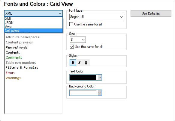
The Grid View section (screenshot below) allows you to customize the appearance of text in the XML Grid View, JSON Grid View and the Avro Grid View. The Cell Colors option (see screenshot) enables you to set the colors of cells when grid components are displayed as tables. In the combo box, select the document display for which you want to configure Grid View. Then select the text item type you want to format and assign to it the desired formatting properties (listed below).
Note: Formatting will be set for the currently active theme. To set the formatting of another theme, make the other theme the active theme.
XML Grid, JSON Grid, Avro Grid
You can set the following properties for the selected text item type:
•Font face and size: The selected font will also be used in printouts of Grid View. If you want to use the same font face or size for all text item types, check the respective Use the same for all check box.
•Text style, text color, text background: Sets the style, color, and background of individual text item types. The current settings are immediately reflected in the list in the left-hand pane, so you can preview how the text item will look.
Cell Colors (of Table Displays in all Grids)
Table displays in all grids (XML, JSON, Avro) can be configured not only on the basis of their language-related semantics (for example, an XML element can be formatted differently than an XML comment). You can also format Grid View on the basis of cell function: for example, to differentiate between the selected/unselected state of different table components. Such differentiation is best achieved by assigning different background colors to each item (see screenshot below), but you can also use other/additional formatting properties for different types of cell.

Settings for the following components are available:
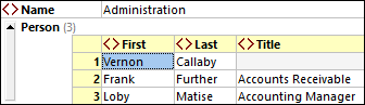
•Table Header (unselected) and Table Header Selection: These refer to column and row headers. The screenshot below shows headers unselected; its background color is as set in the dialog above. The Header Selected color is activated when all headers are selected—not when an individual header is selected. All headers can be selected by clicking the cell that intersects the column and row headers, or by selecting the element created as the table—or any of its ancestors.
•Missing Table Entry: Refers to non-existent elements or attributes in the document (see screenshot below).
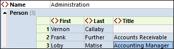
•Selection and Focus: Refers to the cells that are selected and the cells that have the focus. For example, in the screenshot below, the entire Person table is selected, and the cell at bottom right has the focus.
•Inactive Selection, Inactive Focus: If a block of cells has been selected and one or more cells in that block has been made the focus, then both the selection and focus are active as long as Grid View is active. If, however, some other dialog or window is made active without having removed the selection or focus in Grid View, then the selection and focus in Grid View are inactive. If Grid View is made active again, then the selection and focus become active again.
Note: In addition to the colors you define here, XMLSpy uses the regular selection and menu color preferences set in the Display Settings in the Control Panel of your Windows installation.
Set Defaults
The Set Defaults button resets fonts to the original installation settings.
Save and exit
After making the settings, click OK to finish.