Type-Related Features
For each of the chart types, and even for the various sub-types, the Change Appearance dialog box provides a section where you can define the type-related features of the chart.
Pie chart
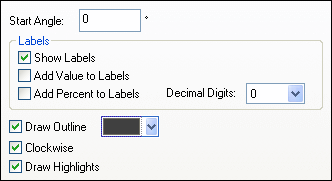
Most settings are the same for the 2d and 3d versions. In 2d pie charts, you can additionally draw highlights.
In 3d pie charts, you can display drop shadows, add transparency and define the 3d tilt.
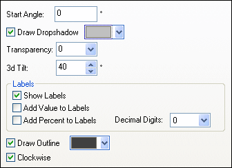
The Start Angle value defines where the first row of the selected column will be displayed in the chart. An angle of 0 degrees corresponds to 12 o'clock on a watch.
You can show labels in addition to, or instead of, the legend, add values and/or percentage to the labels, and define for the percentage values the number of decimal digits to be displayed.
The color that you can select next to the Draw Outline check box is used for the optional border drawn around the chart and the individual pie segments. The Clockwise check box allows you to specify whether the rows should be listed clockwise or counter-clockwise.
In 3d pie charts, you can draw a drop shadow and define its color, add transparency to the chart, and define the 3d tilt. In 2d charts, the Draw Highlights option adds additional structure to the chart.
Bar chart
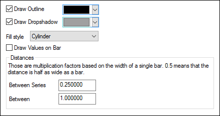
For bar charts, you can make the following setting:
•Add an outline to the bars and define its color.
•In 2d bar charts, you can also draw a drop shadow and define its color (this option is not available for 3d bar charts).
•By default, the shape of the bars resembles a cylinder, however you can also choose "Vertical Gradient" or "Solid" from the Fill style drop-down list (this option is available for 2d bar charts only).
•The values of a bar (corresponding to the height of the bar on the Y-axis) can be drawn on the bar. The font of the values can be specified in the Fonts settings (this option is available only for 2d bar charts, not stacked).
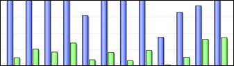
•The distance between the series of a bar-group and between bar-groups can be specified as a decimal fraction of the width of a single bar. For example, in the screenshot below, which shows bar-groups that each consist of a blue series and a green series, the distance between the series has been set to a 25% (=0.25) of the width of a bar; the distance between bar-groups has been set to 100% (=1.0) of the width of a bar. This option is available only for 2d bar charts.
Line chart
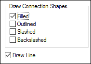
To draw connection shapes that mark the values in line charts, you need to activate at least one check box in the Draw Connection Shapes group box. You can use five different shapes to mark a series: square, rhomb, triangle, inverted triangle, and circle. If there are more than five series in your chart you can combine the connection shapes by selecting more than one option in the Draw Connection Shapes group box. In the screenshot below, both Filled and Slashed have been selected and the Slashed type is used for the sixth series and beyond.
The Draw Line option enables the graph to be drawn with (i) only connection shapes, or (ii) with connection shapes joined by a line.
Connection shapes are available for both line charts and value line charts.
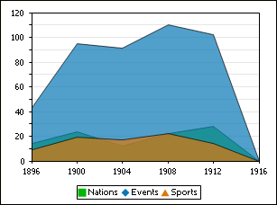
Area chart
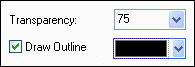
Among the properties that you can change for area charts is transparency; this way you can prevent that one series is hidden by another series in the chart. In addition, you can add an outline to the individual data areas and define its color (see screenshot below).
Candlestick chart
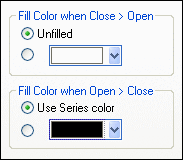
If both opening and closing value are defined as series, you can choose the colors and whether or not the candle should be filled if the closing value is greater than the opening value.
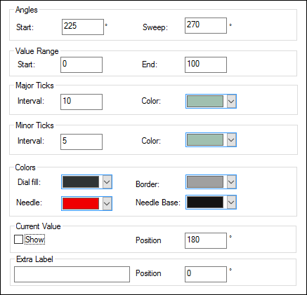
Gauge chart
The Start value in the Angles group box defines the position of the 0 mark and the Sweep value is the angle that is used for display. In the Value Range group box you can define the minimum and maximum values to be displayed. Tick marks are displayed with (major ticks) or without (minor ticks) the corresponding value; you can define separate colors for them. In the Colors group box you can define colors for the dial fill, needle, needle base (hides the first part of the needle in the center of the chart), and the border that surrounds the chart. The current value and an extra label can be shown at any angle you like.