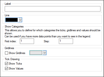
X-Axis
In the X-axis section of the Change Appearance dialog box, you can enter a label for the axis, and define colors for the axis and the grid lines (if displayed). You can also define whether or not you want to display tick marks and axis values. This section is the same for all bar, line, area, and candlestick charts. The Show Categories options enables you to specify that only a subset of all categories (X-Axis values) are displayed, that is, only the ticks, grid lines, and values of the selected categories will be displayed. Create the subset of displayed categories by entering (i) the index of the first value to display, and (ii) the number of indices to step. For example, if there are 101 categories, from 1900, 1901, 1902 ... 1999, 2000, then you can show every tenth year from 1900 to 2000 by setting First index to 1 and Step to 10.
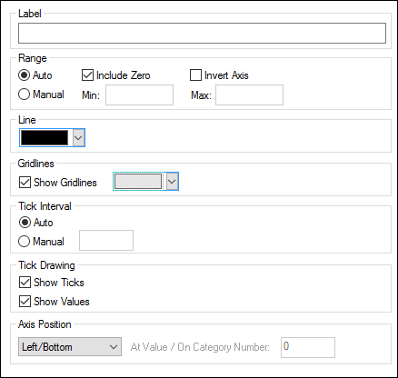
In Value Line Charts however, you can also define the value range, and define at what interval tick marks should be displayed.
Label
The text entered into the Label field will be printed below the axis as a description of the X-axis.
Range
By default, the Auto radio button is selected in the Range group box. If you want to display a fragment of the chart in greater detail, activate the Manual radio button and enter minimum and maximum values into the respective fields. If the column that is used for the X-axis does not include zero, you can deactivate the Include Zero check box and the X-axis will start with the minimum value that is available in the series. The Invert Axis option enables you to invert the values of the X-Axis. For example, if the values run from the 0 to 360, selecting this option will generate the X-Axis so that 360 is at the origin and the values progress down to 0 as the X-Axis goes upwards.
Line
The axis is displayed in the color that you choose from the Line drop-down-list. You can use one of the preselected colors, or click the Other color... button to choose a standard color or define a custom color. Click the Select... button on the Custom tab and use the pipette to pick a color that is displayed somewhere on your screen.
Grid lines
If the Show Grid lines check box is activated, you can choose a color from the corresponding drop-down list box.
Tick Interval
If you are not satisfied with the default tick marks, you can activate the Manual radio button in the Tick Interval group box and enter the difference between the individual tick marks into the corresponding field.
Tick Drawing
You can switch the display of tick marks on the axis and/or axis values on or off.
Axis Position
From the drop-down list, you can choose the position where the axis is to be displayed. When selecting "At Value / On Category Number", you can also position the axis anywhere within the plot.