Local Styles
When styles are defined locally, the style rules are defined directly on the component. These local rules have precedence over both global style rules and style rules in external CSS stylesheets that select that component. Locally defined styles are CSS styles and are defined either via the Format toolbar or in the Styles sidebar. (This is as opposed to global styles, which are defined in the Style Repository sidebar.)
Local styles via the Format toolbar
You can select content in the design and apply local styles via the Format toolbar (screenshot below).

You can apply predefined HTML formatting (such as div, h1, pre, etc), text styling, background color, text alignment, lists, and hyperlinks. See the section, Format toolbar, for details.
Local styles via the Styles sidebar
Defining a style locally via the Styles sidebar consists of three parts:
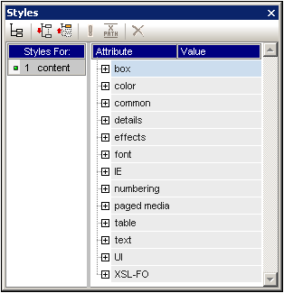
1.The component to be styled is selected in Design View. Any component in the design except node tags can be styled. The component selected in Design View then appears in the Styles-For column of the Styles sidebar (see screenshot below). In the screenshot below, a content component was selected in Design View and consequently appears in the Styles-For column.
Very often, the component selected in Design View might contain other components. In this case all the components in the selection are displayed, organized by component-type, in the Styles-For column of the Styles sidebar. The screenshot below shows the different component-types contained in the Design View selection. To the left of each component-type is the number of instances of that component-type in the selection. For example, in the screenshot below, there are 16 text components and two Auto-Calculation components (among others) in the Design View selection. You can also select a range of components by keeping the Shift key pressed while selecting the second, end-of-range component.
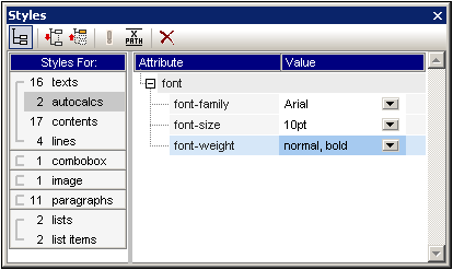
| 2. | After making the selection in Design View, you select, in the Styles-For column, the component-type you wish to style. If there is more than one instance of the component-type you select, then the styles you define will be applied to all these instances. So, for example, if you select the 16-texts item of the screenshot above, then the styles you define (see Step 3 below) will be applied to all 16 text components. If you wish to style, say, four of these text components differently, then you must select and style each of the four components separately. If two components of the same component-type have been styled differently and both are selected in Design View, then the styles of both instances are displayed in the Style Definitions pane. In the screenshot above, for example, while one Auto-Calculation has a normal font-weight, the other has a bold font-weight. When the 2-Autocalcs item is selected in the Styles-For pane, both font-weights are displayed. |
| 3. | After selecting, in the Styles-For column, the component-type to style, styles are defined in the Style Definitions pane. How to do this is described in the section Setting Style Values. |