Check Boxes
You can create a check box as a data-entry device. This enables you to constrain user input to one of two choices. In the Edit Check Box dialog (shown below), you specify the XML values to map to the checked and unchecked events.
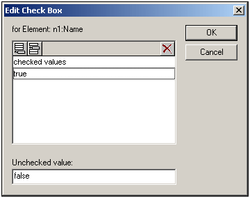
In the above screenshot, an element called Name has been created as a check box. If the Authentic View user checks the check box, a value of true will be entered as the value of the element Name. If the value is unchecked, then the value false is entered as the XML value of Name (as defined in the dialog).
Note: When a new Name (or check box) element is created in Authentic View, its XML value is empty (it is not the Unchecked Value). The Unchecked Value is entered only after the check box has first been checked, and then unchecked. To have a default value in a node, create a Template XML file that contains the default value.
Note: Check boxes in Text output are displayed as square brackets: [] for unselected check boxes; [x] for selected check boxes.
Accessing the Edit Check Box dialog
If you are creating a new check box, when you create the node as a check box, the Edit Check Box dialog pops up. To access the Edit Check Box dialog afterwards, do the following:
1.Select the check box in the design.
2.In the Properties sidebar, select the checkbox item and then the checkbox group of properties (see screenshot below).
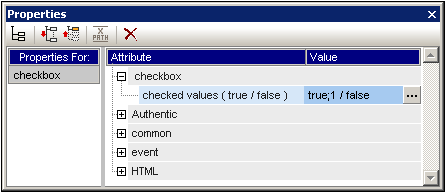
| 3. | Click the Edit button  of the check values property. This pops up the Edit Check Box dialog. of the check values property. This pops up the Edit Check Box dialog. |
Note: You can modify the HTML properties of a check box by selecting it and then modifying its HTML properties in the Properties sidebar.