Chart Data Selection: Flexible
In the Chart Data Selector pane (screenshot below) of the Chart Configuration dialog, the Flexible option enables the Series Axis (Z-Axis), X-Axis, and Y-Axis data to be selected freely using XPath expressions. The XPath expression for an axis returns the sequence of items that are to be plotted on that axis. These sequences (of items) for the axes are then collated to generate the chart.
Note the following points:
•A series refers to a series of values plotted for a set of X-Axis (Category Axis) ticks. A second series would plot a second set of values on the same X-Axis ticks. For example, if the X-Axis represented the years 2008, 2009, and 2010, and the Y-Axis represented sales turnover, then Series 1 could represent America (sales in America for those three years) while Series 2 could represent Europe (sales in Europe for those three years). If this data were selected for a bar chart, then for each year (2008, 2009, 2010) on the X-Axis, there would be two bars (America and Europe), one for each series. In the case of pie charts and single-bar charts, only one series is possible. See the chart type table for more information about each chart type.
•Each row in the Chart Data Selector pane represents a series.
•The XPath expression in the For-Each column provides the context for the evaluation of each of the other three XPath expressions. The For-Each XPath expression is itself evaluated in the context of the node in the design within which it was inserted.
The following example illustrates important points to consider when selecting data for the axes. We will use the XML document below.

<?xml version="1.0" encoding="UTF-8"?> <Data xmlns:xsi="http://www.w3.org/2001/XMLSchema-instance" xsi:noNamespaceSchemaLocation="YearlySales.xsd"> <ChartType>Pie Chart 2D</ChartType> <Region id="Americas"> <Year id="2005">30000</Year> <Year id="2006">90000</Year> <Year id="2007">120000</Year> <Year id="2008">180000</Year> <Year id="2009">140000</Year> <Year id="2010">100000</Year> </Region> <Region id="Europe"> <Year id="2005">50000</Year> <Year id="2006">60000</Year> <Year id="2007">80000</Year> <Year id="2008">100000</Year> <Year id="2009">95000</Year> <Year id="2010">80000</Year> </Region> <Region id="Asia"> <Year id="2005">10000</Year> <Year id="2006">25000</Year> <Year id="2007">70000</Year> <Year id="2008">110000</Year> <Year id="2009">125000</Year> <Year id="2010">150000</Year> </Region> </Data> |
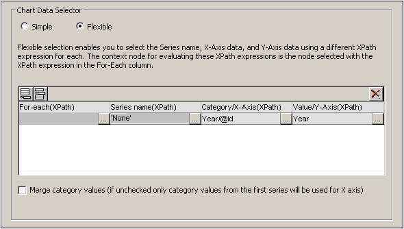
One row, one series
Say we wish to generate a 2D bar chart for each Region element (there are three such elements: for the Americas, Europe, and Asia). Let us create the chart in the design within the Region element node. The context node for the For-Each XPath expressions in the Chart Data Selector will therefore be the Region element.
In the chart data selection shown in the screenshot above, the For-Each expression returns the current node (which is the Region element), so the Region element will be the context node for all the other three XPath expressions (series, X-Axis, and Y-Axis). Since there is only one series in this chart, we do not need a series name and so we leave this column blank. The X-Axis selection returns six values. Six will therefore be the number of ticks on the X-Axis and the six items of the sequence will be the respective labels of the X-Axis ticks. The Y-Axis selection also returns six items, each of which is plotted on the Y-Axis for its corresponding X-Axis tick. Since the chart was created within the Region element, the XSLT engine will iterate over the three Region elements to produce three charts, one for each Region element. For each chart, that particular Region element's descendant nodes will be used.
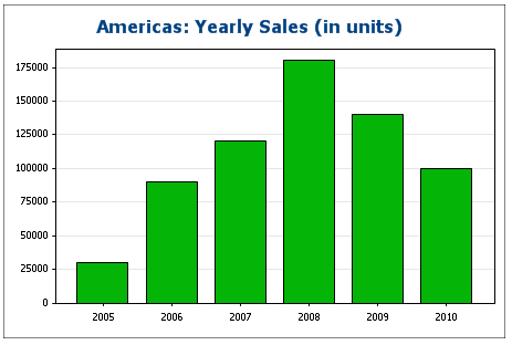
The chart for the Americas region would look something like this in the output:
Three rows, three series, category values not merged
To create multiple series, additional rows can be added to the chart data selection, as shown in the screenshot below.
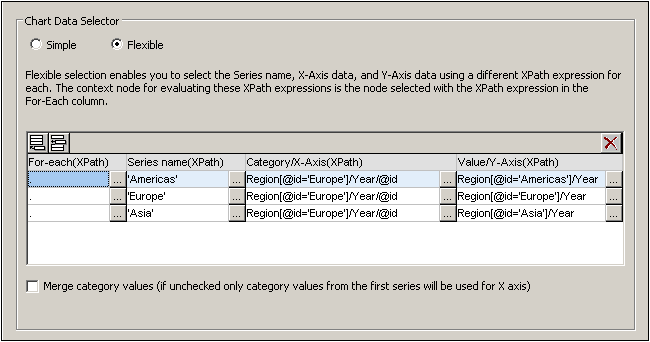
The important points to note about the data selection above are:
•Each row defines a series and all rows have the Data element as its context node (since the chart is created inside a Data node).
•The first row is set to define the Americas series and is given a string expression as its series name. The X-Axis values are selected using the Year/@id values of the Europe region (it doesn't matter which region is selected since all have the same Year/@id values). The Y-Axis values of the first (Americas) series are selected for the Americas region using a predicate filter.
•The second and third series follow the same pattern as the first series. Note, however, that the X-Axis selection for each series is identical. But since the Merge Category Values check box is not checked, the second and third expressions are ignored. (Even if the values were merged, it would not make a difference because the values of each series are identical; only new distinct values would be added to the category values.)
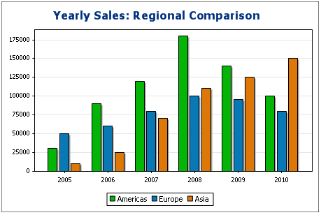
The chart generated with the data selection above would look something like this:
Three rows, three series, category values merged
The data selection in this example (see screenshot below) is different from the previous example in three respects: (i) the X-Axis selection for the third series has an extra item (2011) added to the series, and (ii) the Merge Category Values check box has been checked, and (iii) the Y-Axis tick interval has been manually set to 20000.
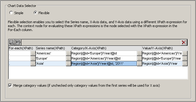
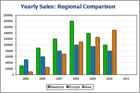
The effect of this change is to add one new item (2011) to the X-Axis result sequence. The chart would look something like this:
One row, three series
The chart in this example is created within the Data node (see XML document above). Only one row is used for data selection, but it generates three series. This is because the XPath expression in the For-Each column returns a sequence of three items, thus implicitly creating three series.
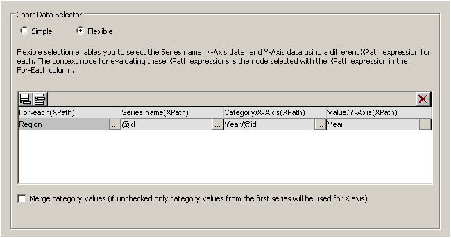
For each series, the series name, X-Axis, and Y-Axis selections will be correspond to the different regions because each series has a different Region element as its context node. The chart for this data selection will look something like this:
Rules for chart data selection
The following points should be noted when using the Chart Data Selector to select data for the various chart axes:
1.The number of bars (or pie chart slices, etc) is equal to the number of items in the larger of the X-Axis or Y-Axis sequences of a single data row selection. So if the X-Axis (which gives labels) has five items and the Y-Axis (which gives values) has six items, then six bars will be plotted with the last one being unlabelled. If the X-Axis has six items and the Y-Axis five items, then six bars will be plotted with the last one being labeled but having a value of zero.
2.The number of series is equal to the cumulative number of items in all the sequences returned by expressions in the For-Each column.
3.The name of a series is selected with the XPath expression of the Z-Axis (or Series Name Axis). If, in a data selection row, this XPath expression is left empty, then a no-name series is created. Also if the XPath expression returns a sequence with a lesser number of items than the number of series, then some series will have no name.
For more examples of how data is selected with the Flexible option, see the examples in the following sections. These examples include:
•The use of editable Authentic variables for data selection, also in Gauges
•XPath expressions for complex data selection
•Using the Series Axis to generate grouped bars
•Using the Series Axis to generate line graphs
•Using literal sequences from an XPath expression as values
•Using Java and .NET functions