Report Charts
You can generate charts in reports to graphically present data held in the records. The Y-Axis of the chart must be a number. This will be the case if, for the Y-Axis, either of the following is available and chosen: (i) a field having a number value, or (ii) a summary value of a grouping value (for example, the count of individual years in the data set: say, 3 instances of the year 2020).
| Note: | Charts can be created only on the basis of fields that have been included in the report form (that is, on the basis of the columns of the table). |
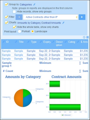
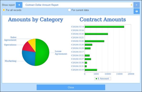
The screenshots below show, at left, a report form in which two charts have been defined, and, at right, the actual report with the charts.
| Note: | After a chart has been created, you will have the option to hide the table and show only the charts. Select the corresponding option to do so (see screenshot above left). (You should not delete the table because its columns provide the dataset from which the charts will be created.) |
Creating charts
To create a chart, do the following:
1.In the report form, select the Charts option.
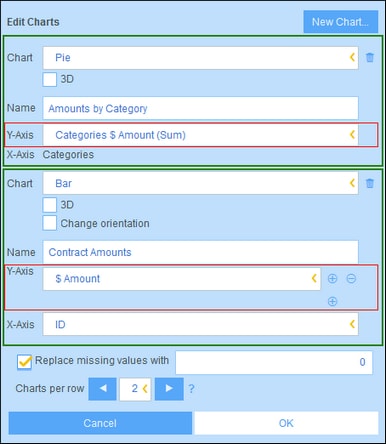
2.In the Edit Charts form that appears (screenshot below), select the chart type you want (bar chart, line chart, area chart, or pie chart) and give the chart a name. Select the Y-Axis field/s and X-Axis field. For all chart types, except pie charts, you can select multiple fields for the Y-Axis (the Y-Axes combo boxes are outlined in red below). For pie charts you can select only one field for the Y-Axis. Notice, in the screenshot below, that you are not allowed to add new fields for the Y-Axis of the pie chart. The fields that are available for Y-Axis selection are number fields and summary values of grouping criteria. For both X and Y axes, the fields available for selection are determined automatically on the basis of the datatypes of fields and grouping criteria, if any.
3.If you want to present more than one chart, add new charts by clicking New Chart and defining each chart as described in Step 2 above.
4.If you want, you can replace any missing value in the datasets with a value of your choice.
5.Specify how many charts should be displayed in a single row of the report. For example, in the report shown in the screenshots above, we have specified that two charts are to be shown per row.
6.After you have finished defining your chart, click OK and then Save Form.


