Text State Icons
A Text State Icon is an Authentic View toolbar button that is associated with an element name. In Authentic View, when a Text State Icon is clicked, the selected text fragment is enclosed by the element associated with the Text State Icon. The text formatting defined for this element (in the element's global template) will therefore be applied to the selected text fragment. In this way, the Authentic View user can apply text styles using Text State Icons.
As the SPS designer, you will create the Text State Icons and define the styles of the elements associated with the Text State Icons.
Creating a Text State Icon
To create a Text State Icon for the Authentic toolbar, first select the command Authentic | Custom Toolbar Buttons, then click the Add button at the top right of the Authentic Custom Buttons dialog (see screenshot below) and select Add Text State Icon.
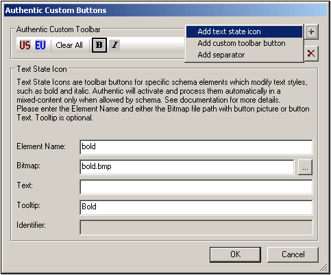
Text State Icons take the following parameters:
•Element Name: This is the element that will enclose the selected text fragment when the Text State Icon is clicked in Authentic View.
•Bitmap: The location of an image for the Text State Icon. The file path is relative to the SPS.
•Text: If no bitmap is available, the text entered in this field will be used as the button text of the Text State Icon.
•Tooltip: This is an optional guide for the Authentic View user on mouseover.
In the example above, we have used familiar bitmaps as the Text State Icons to mark up text with the bold and italic elements. If you wish, you could use any bitmap or button text that you think might be easier for the Authentic View user to relate to. For example, important text fragments could be associated with the bold element, while comments could be associated with the italic element. The Text State Icons could then be created as shown in the screenshot below.
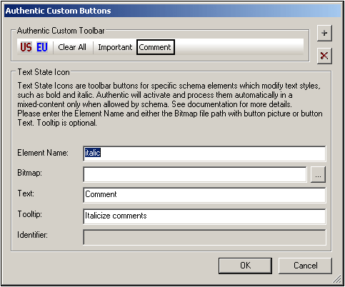
In the above screenshot, note that the Comment Text State Icon is associated with the italic element. So, when text is selected in Authentic View and then the Comment Text State Icon is clicked, that text fragment will be enclosed by the italic element and will be processed in the way defined for the italic element (described in the next section).
Defining a style rule for the element associated with a Text State Icon
The style properties of an element associated with a Text State Icon can be defined in a global template (see screenshot below).
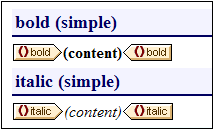
This screenshot shows the global templates of two elements (bold and italic), each of which has been associated with a Text State Icon. The styling has been done by selecting the (contents) component and defining the desired font style in the Styles sidebar.
Consequently, whenever the Authentic View user creates these elements around text fragments, the respective global template (with its text styles) is applied to that text fragment.