Composite Styles
The Composite Styles feature gives Authentic View users the ability to style the entire output of the following design components:
•Paragraph (block) design elements
The mechanism for doing this is explained below.
| Note: | For a further more general description of Composite Styles, see the section Composite Styles. The description in this section describes how Composite Styles can be set up so that the Authentic View user can edit them. |
Entering the Composite Style in the XML attribute
A default Composite Style (composed of multiple styling properties) is entered as the attribute-value of an element in the source XML document. For example, the desc-style attribute in the XML source document listing below contains a default Composite Style:
<Desc desc-style="font-family:Verdana; font-size:12pt; color:blue">
You, the SPS designer, can now allow the Authentic View user to edit these styling properties. This gives the Authentic View user control over the styling of the design component's text output. You enable user-editing of a Composite Style by setting the Composite Style of the design component to be the attribute containing the default Composite Style (see below).
| Note: | The attributes that will be used to access the Composite Styles must be defined in the source schema in order for the XML document to be valid. |
Supported CSS text-styling properties
The following CSS styles can be used in Composite Styles:
font-family | font-size | font-weight | font-style |
color | background-color | text-align | text-decoration |
Setting the attribute as the Composite Style of a design component
If you set the Composite Style of a design component to be an attribute, then the Authentic View user can edit this Composite Style. The Authentic View user can place the cursor anywhere within the text output of the design component and use the RichEdit toolbar of Authentic View to edit the Composite Style of that design component.
To set an attribute as the Composite Style of a design component, do the following:
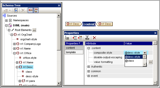
1.In Design View, select the design component to which you wish to assign an attribute as Composite Style. In the screenshot below, the (contents) placeholder of the Desc element has been selected.

2.In the combo box of the Composite Style property of the Content component (see Properties sidebar at bottom right of screenshot above), the attributes of the context element are displayed. Select the attribute you wish to set as the Composite Style of the design component. (Note that there is also an empty entry in the combo box should you wish to apply no Composite Style. In this case, the RichEdit feature of Authentic View will not be enabled in the output of this design component.)
In Authentic View the user can now use the RichEdit toolbar to modify the Composite Style of this design component.