Create Mobile Apps that Automatically Support Dark Theme
Android and Apple mobile devices support a display option called Dark Theme, which you can think of as almost a negative image of the normal screen display. In Dark Theme white is black, black is white, and color intensity in general is adjusted. Dark Theme reduces power requirements, which can extend runtime for a battery charge, and can be easier to view in low light.
Altova MobileTogether includes features to let developers create mobile apps that automatically support Dark Theme by detecting the user setting when the app is launched.
Let’s look at an example:
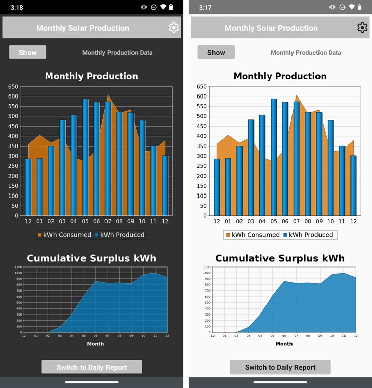
Shown below are two views of a mobile app running on the same mobile device in Light Theme and Dark Theme.
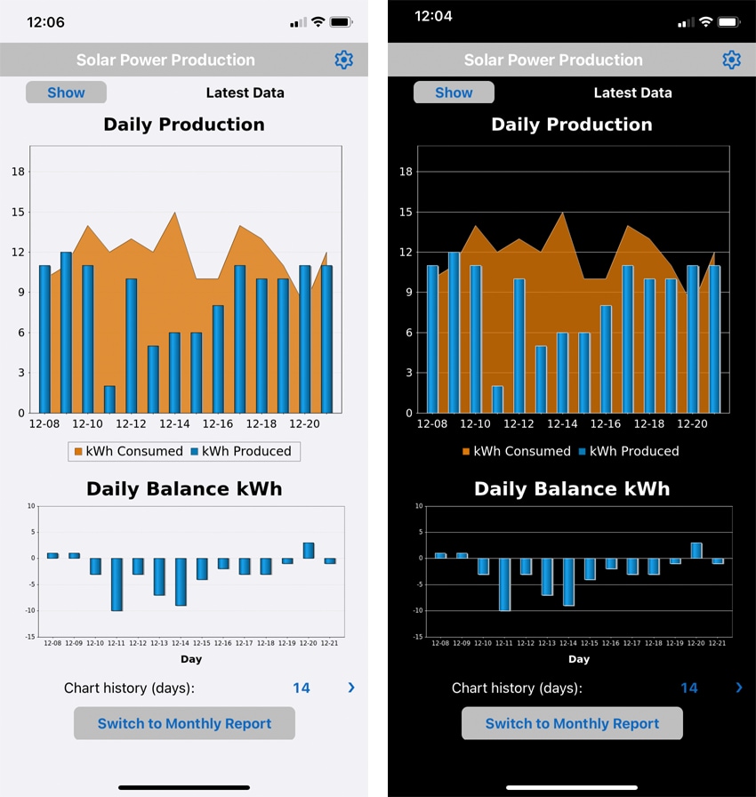
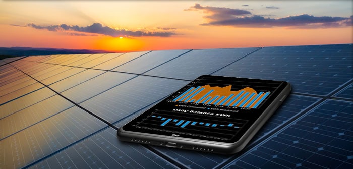
This app lets users record solar panel production and electricity consumption from meter readings and produces charts to illustrate the data and track the surplus over time.
Many residential solar generation systems connect to the utility power grid with net-zero billing. Solar panels installed on the roof provide power to the home only while the sun is shining. Electricity comes from the grid at night or whenever demand exceeds production. When the system produces more electricity than the home consumes, the excess is fed back to the grid and supplements utility generation capacity.
Altova MobileTogether makes it easy for mobile developers to create cross-platform mobile apps in the MobileTogether Designer, which combines drag-and-drop UI design tools, the powerful Action Tree visual programming language for event handling, and standardized functional programming for data selection and processing.
Every component of the app is highly customizable, but by default elements like colors for text, buttons, rules, borders, and even window backgrounds are all implemented in system defaults for each device. The MobileTogether Designer includes a Styles helper window where developers can specify overall project settings, including a setting for Light or Dark Theme.
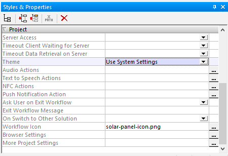
The options for the theme setting are Use System Settings, Enforce Light Theme, or Enforce Dark Theme. The default is Use System Settings, so developers can automatically support Dark Theme without doing anything special.
Automatically Support Dark Theme in Charts with Custom Colors
Some elements may need custom color settings, and developers can specify alternates for Light Theme and Dark Theme. The first step is to detect which user setting is in effect.
MobileTogether includes global variables that let developers detect user device settings at runtime and program appropriate actions based on device functionality. The MobileTogether Designer Global Variables dialog lists all the global variables and their values for the selected simulation device.
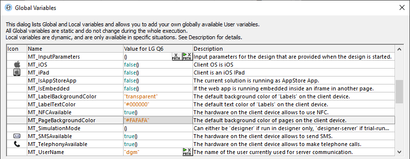
The default page background color for a particular Android phone is highlighted above. This value changes if the device is in Dark Theme. A lower hex value indicates a darker shade and a higher value is lighter.
The hex value #808080 is the shade 50% gray. We can create an XPath expression to test the value at runtime and assume any default background color darker than 50% gray indicates the device is in Dark Theme. The XPath Evaluator in the Designer Simulation window is a good scratchpad to work out the exact syntax of the expression:
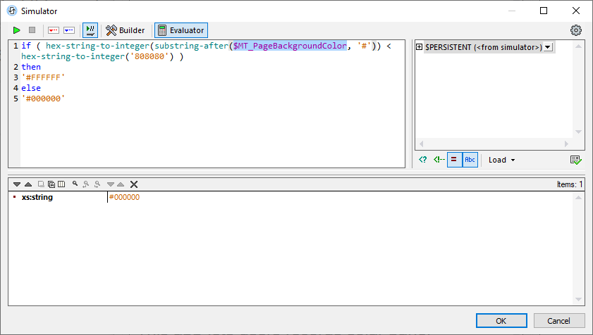
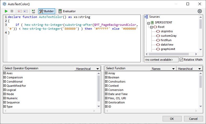
This expression converts the hex string to an integer, compares it to the value for 50% gray, and selects the string value for black or white based on the result. This is a good expression to automatically select a text color for Light Theme or Dark Theme, so let’s apply it in a user function:
MobileTogether includes features to easily build rich charts and graphs that have the same appearance on all platforms. The example Solar Tool app shown at the top uses a bar chart to illustrate daily solar power generation overlayed on an area chart that shows electricity consumption. Developers choose settings for these charts from a series of Chart Creation dialogs, like the Change Appearance dialog shown here:
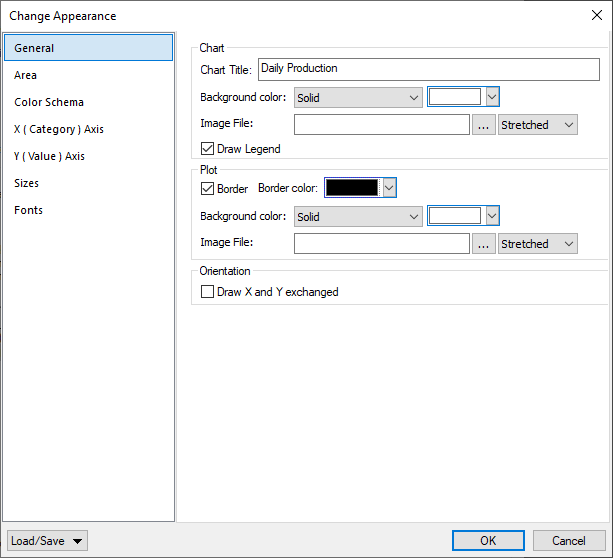
Many of these dialogs set colors, like the Background color and Border color in this example. However, we have complete control to override these defaults based on Dynamic XPath Settings, which are evaluated on the client device at runtime.
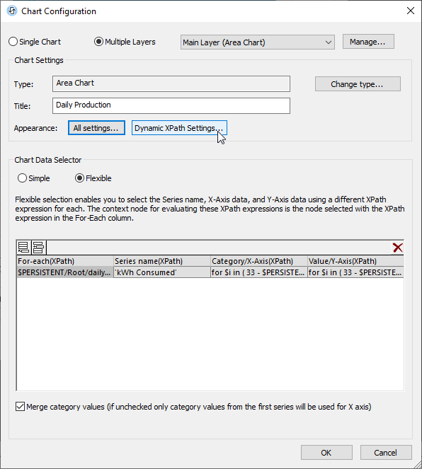
Clicking this button opens a dialog with options to set an XPath value or expression for each chart feature. In the image below, we set the values for all elements that are specified as either black or white in the Chart Settings dialogs. We set the original white elements to be the default background color and we set black elements like text and borders to use our AutoTextColor() function.
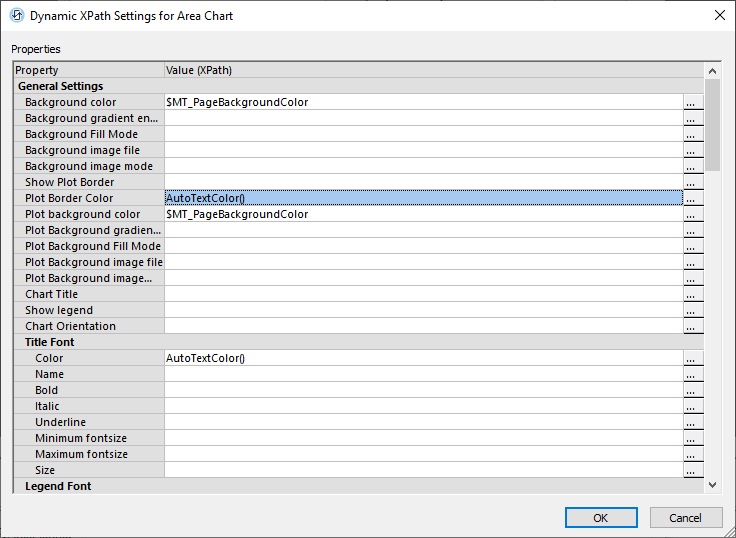
We set other elements like grid lines for each axis in the Creation Settings dialogs to be a light gray shade that works for either theme. There’s a separate Dynamic XPath Settings dialog for each layer of each chart, but once they are all edited, that’s it. The charts will automatically be created correctly for Light Theme and Dark Theme.
Here is an Android phone displaying the charts for cumulative surplus in Dark Theme and Light Theme:
If you’re ready to create user-friendly mobile applications that automatically support Dark Theme based on user settings, just download the free to use MobileTogether Designer. And be sure to check out the MobileTogether Demos page with links to videos, tutorials, and more demo apps.