Check Boxes and Radio Buttons
While input fields enable users to enter data without restriction, check boxes and radio buttons enable the entry of data that is restricted to specific values.
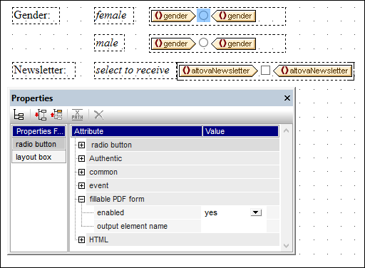
•Check box: A checked value and an unchecked value can be defined. If the user checks the box in the PDF form, then the checked value is entered for that data field; otherwise the unchecked value is entered. In the screenshot below, the altovaNewsletter element has been set to take the value of a check box. If the user checks the box in the PDF form, then a value of yes will be entered in the altovaNewsletter element.
•Radio buttons: Multiple radio buttons, each representing a different value, are mapped to a single data field. The value of the radio button that the user selects in the PDF form is entered as the value of that data field. For example, in the screenshot below, a radio button with a value of female and a radio button with a value of male are both mapped to the element gender. Because both radio buttons are mapped to a single element, they automatically become mutually exclusive. This means that only one of them can be selected at a time; the other will be deselected automatically if selected previously. The value of the button that the user selects in the PDF form will be entered in the gender element (that is, either female or male).
Note the following points:
•Default values of data fields are taken from the corresponding nodes in the Working XML File. If no Working XML File has been assigned, then there are no default values.
•Radio buttons are displayed as check boxes in the PDF form.
Inserting check boxes and radio buttons
Insert a check box or radio buttons as follows:
1.Select the Insert Check Box or Insert Radio Button toolbar icon. Alternatively, select the menu command Insert Form Controls | Insert Check Box or Insert Form Controls | Insert Radio Button.
2.In the form's layout container, click the location where you wish to insert the control.
3.You will be prompted to select the schema node with which the control is to be associated. This is the node in which user-entered data will be stored. Select the node and click OK. The node and control will be created inside a layout box. In the screenshot above, a check box has been created for the altovaNewsletter element, and radio buttons have been created for the gender element.
4.Select the control in the design, and then set the enabled property of its Fillable PDF Form group of properties to yes (see screenshot above). Alternatively, you can set the property value to an XPath expression that evaluates to the string yes. This is useful, for example, if you wish to specify via a global user-declared parameter that a control is fillable. In this case, first define a global user-declared parameter with a value of yes, then set the enabled property to an XPath expression that calls the parameter, for example: $MyFillablePDFParam. Since the parameter's value is yes, the control's fillable property will then be enabled.
5.The values of the output element and id properties provide the name of the data field when the form data is saved or extracted. If you do not set at least one of these properties, then data field names are generated automatically, and cannot be known beforehand. If you wish to process field data, it is easier to use the data field name that you set here than a generated name. See the section Form Data, especially Extracting as FDF/XML, for more information.