Example: Gauge Charts
In this section, we discuss the gauge charts contained in the SPS file YearlySales.sps. The SPS design is based on the XML Schema YearlySales.xsd and it uses YearlySales.xml as its Working XML File. All three files are located in the (My) Documents folder, C:\Documents and Settings\<username>\My Documents\Altova\StyleVision2026\StyleVisionExamples/Tutorial/Charts.
After opening the SPS file in StyleVision, switch to Authentic Preview, and, in the Chart Type combo box (screenshot below), select Gauge to see the gauge charts.

On the gauge charts (screenshot below), selecting options in the Select Region and Select Year combo boxes causes the needle in each of the two gauges (round and bar) to point to the correct value on the gauge scale. The screenshot below shows sales in Asia in 2009, as an absolute value (125000) and as a percentage of total sales in that year (34.7%).

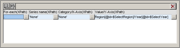
The settings for both charts are similar. Here we consider the first gauge chart: the round gauge chart. To generate a gauge chart a single value is needed, and this is provided by the Y-Axis entry. In the round gauge chart this value is the yearly sales of a user-selected region in a user-selected year. The Y-Axis must accordingly select this data. The X-Axis and Series Name Axis entries are ignored. The XPath expression to select the required data is created as follows:
1.The user-selected region is stored in an editable variable for Authentic ($SelectRegion), and the user-selected year is stored in an editable variable for Authentic ($SelectYear).
2.These two editable variables are used in predicates to filter which Region element and then which of its Year child elements is selected as the data for the Y-Axis (see the XPath expression in the screenshot below).
3.The following gauge settings (accessed by right-clicking the chart in the design, then selecting Edit Chart Settings | All Settings | Gauge) were modified. The scale was changed to a maximum of 200000, and the major and minor ticks, were set, respectively to 20000 and 10000. Major and minor ticks are the major and minor divisions on the scale (see screenshot above).
Note: The scale must be set to the correct range and ticks must be suitably adjusted in order for gauge charts to display correctly.
For more information about data selection for the various axes, see the section Rules for Chart Data Selection.
