Example: Pie Charts
In this section, we discuss the 2D and 3D pie charts contained in the SPS file YearlySales.sps. The SPS design is based on the XML Schema YearlySales.xsd and it uses YearlySales.xml (screenshot below) as its Working XML File. All three files are located in the (My) Documents folder, C:\Documents and Settings\<username>\My Documents\Altova\StyleVision2026\StyleVisionExamples/Tutorial/Charts.

<?xml version="1.0" encoding="UTF-8"?> <Data xmlns:xsi="http://www.w3.org/2001/XMLSchema-instance" xsi:noNamespaceSchemaLocation="YearlySales.xsd"> <ChartType>Pie Chart 2D</ChartType> <Region id="Americas"> <Year id="2005">30000</Year> <Year id="2006">90000</Year> <Year id="2007">120000</Year> <Year id="2008">180000</Year> <Year id="2009">140000</Year> <Year id="2010">100000</Year> </Region> <Region id="Europe"> <Year id="2005">50000</Year> <Year id="2006">60000</Year> <Year id="2007">80000</Year> <Year id="2008">100000</Year> <Year id="2009">95000</Year> <Year id="2010">80000</Year> </Region> <Region id="Asia"> <Year id="2005">10000</Year> <Year id="2006">25000</Year> <Year id="2007">70000</Year> <Year id="2008">110000</Year> <Year id="2009">125000</Year> <Year id="2010">150000</Year> </Region> </Data> |
After opening the SPS file in StyleVision, switch to Authentic Preview, and, in the Chart Type combo box (screenshot below), select Pie Chart 2D and Pie Chart 3D to see the two kinds of chart.

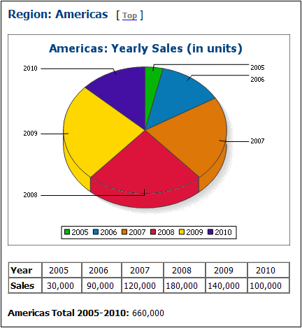
For each chart type (2D pie charts and 3D pie charts), there are four charts. The first three charts of each chart type show the yearly sales of the three sales regions. Each of these pie charts (see screenshot of a 3D pie chart below) represents a single region, and the slices of the pie chart represent the region's sales per year for the six years from 2005 to 2010.
To view the chart settings of these charts, switch to Design View, select the appropriate branch (Pie Chart 2D or Pie Chart 3D) in the first condition of the design, right-click the chart, and select Edit Chart Settings. This pops up the Chart Configuration dialog.
Note the following points about the Regional Yearly Sales charts:
1.The charts have been inserted within the Region element, so the context node is the Region element. A chart is therefore created for each iteration of the XSLT Engine over the Region element.
2.The title of each chart contains the value of the Region/@id attribute. Click the Dynamic XPath Settings button to see how this is done.
3.Since no more than one series is required, we can leave the Z-Axis or Series Name Axis empty. This results in a default no-name series being created.
4.The X-Axis selects the labels to be used for the slices of the pie chart, in this case the years 2005 to 2010, which are obtained with the XPath expression Year/@id (see screenshot below).
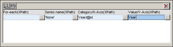
5.The Y-Axis selects the values that appear for each of the slices of the pie chart. In our example, these are the contents of the Year element children of the Region element.
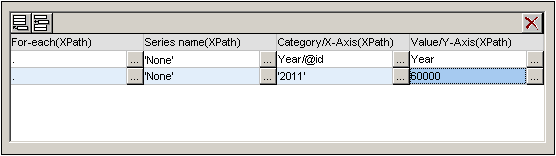
6.The number of slices in the pie chart is determined according to the Chart Data Selector Rules. So, if the selection were made as in the screenshot below, then another slice for the year 2011 would be added with a value of 60000.
7.The items of the sequence selected for the X-Axis will be assigned, in corresponding order, as the label for each slice of the pie chart. Each X-Axis item also generates a legend item.
8.The number of X-Axis and Y-Axis items in each series should be the same (see screenshot above), though it is not an error if they are not the same. If there are fewer X-Axis items than Y-Axis items, then the latter slices of the pie chart (which do not have a corresponding X-Axis item) will be unlabelled. If there are more X-Axis items than Y-Axis items, then the extra X-Axis items will be ignored for label-generation, but they will be generated as legend items.
Using variables in XPath expressions that select axes data
The 2D Pie Chart example has a fourth pie chart at the bottom of the page: the Yearly Market Share pie chart (screenshot below).
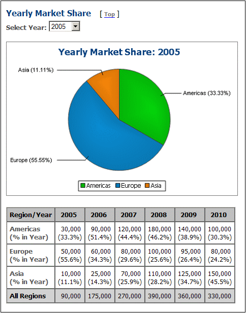
In Authentic Preview, when the year selection is changed in the Select Year combo box, the pie chart changes to show the correct values for the selected year. This is achieved by (i) storing the user selection in an editable variable for Authentic ($SelectYear), and (ii) using this editable variable in an XPath predicate to determine which years are selected for the Y-Axis: for $i in //Year[@id=$SelectYear] return $i. In Design View, open the Chart Configuration dialog to see the data selection settings. Also, the labels of the X-Axis contain the percentage share of the pie of that X.Axis tick; the percentage can be toggled on and off in the Pie settings of the advanced settings of the chart. In these settings you can also specify whether the Y-Axis value should be shown in the labels or not.
Using XPath capabilities for complex data selection
The important thing to bear in mind is that the data selection for each axis (X and Y) must return the sequence of required atomic items. The last 3D pie chart shows the yearly worldwide sales. The XPath expressions for the data selection are as follows:
X-Axis: for $i in distinct-values(//Year/@id) return $i
The selection could as easily have been: 2005, 2006, 2007, 2008, 2009, 2010
Y-Axis: for $i in distinct-values(//Year/@id) return sum(//Year[@id=$i])
The selection returns, for each year, the sum of worldwide sales for that year, that is, for a given year, the sum of sales in all three regions.