Example: Area Charts
In this section, we discuss the area charts contained in the SPS file YearlySales.sps. The SPS design is based on the XML Schema YearlySales.xsd and it uses YearlySales.xml (screenshot below) as its Working XML File. All three files are located in the (My) Documents folder, C:\Documents and Settings\<username>\My Documents\Altova\StyleVision2026\StyleVisionExamples/Tutorial/Charts.

<?xml version="1.0" encoding="UTF-8"?> <Data xmlns:xsi="http://www.w3.org/2001/XMLSchema-instance" xsi:noNamespaceSchemaLocation="YearlySales.xsd"> <ChartType>Pie Chart 2D</ChartType> <Region id="Americas"> <Year id="2005">30000</Year> <Year id="2006">90000</Year> <Year id="2007">120000</Year> <Year id="2008">180000</Year> <Year id="2009">140000</Year> <Year id="2010">100000</Year> </Region> <Region id="Europe"> <Year id="2005">50000</Year> <Year id="2006">60000</Year> <Year id="2007">80000</Year> <Year id="2008">100000</Year> <Year id="2009">95000</Year> <Year id="2010">80000</Year> </Region> <Region id="Asia"> <Year id="2005">10000</Year> <Year id="2006">25000</Year> <Year id="2007">70000</Year> <Year id="2008">110000</Year> <Year id="2009">125000</Year> <Year id="2010">150000</Year> </Region> </Data> |
After opening the SPS file in StyleVision, switch to Authentic Preview, and, in the Chart Type combo box (screenshot below), select Area Charts to see the two kinds of area chart: (i) standard overlay, and (ii) stacked.

Selecting data for area charts
If we have the years on the X-Axis and the unit sales on the Y-Axis, then the yearly sales of each region can be plotted as an area, with each subsequent area overlaying the previous areas (screenshot below). Area charts are selected via the Change Type dialog. For area charts in which some areas overlay parts of other areas, it is advisable to set transparency for the areas—an option available for area charts via their Chart Settings.
The data selection for area charts is done as follows: For the Series Name Axis, we select the names of the three regions. To do this, we create the chart, not within a Region element, but one level higher (within the Data element; refer to XML document above), so that we can target all three Region elements easily. Our XPath expressions for the three axes would be as in the screenshot below.
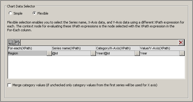
Note the following points about this data selection:
•The context node of the chart is one level higher than the Region element: It is the Data element.
•The for-each iteration is created on the Region element.
•The Z-Axis (Series Name Axis) selects the name of the region (Region/@id).
•As with the bar charts showing regional yearly sales, the X-Axis selects the names of the years (Region/Year/@id) and the Y-Axis selects the sales for each year (content of the Region/Year element).
What the data selection above does is this: For each Region element, it selects a series name (the value of the Region element's id attribute), then generates the X-Axis for the Region (using the sequence obtained with the values of the Year/@id attributes). It then generates the Y-Axis values (using the sequence obtained with the content of the Year elements). This is done for all three Region elements, in sequence, generating the chart shown above.
For more information about data selection for the various axes, see the section Rules for Chart Data Selection.
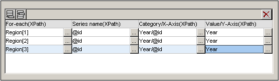
The same effect is obtained with the data selection shown in the screenshot below. In this data selection, each region and its axes are selected individually, with one region following on another. Note that, since the X-Axis items of the second and third series will be ignored, it is safe to leave these fields in the dialog box empty.
Yet another way to select the same data would be with the XPath expressions in the screenshot below.
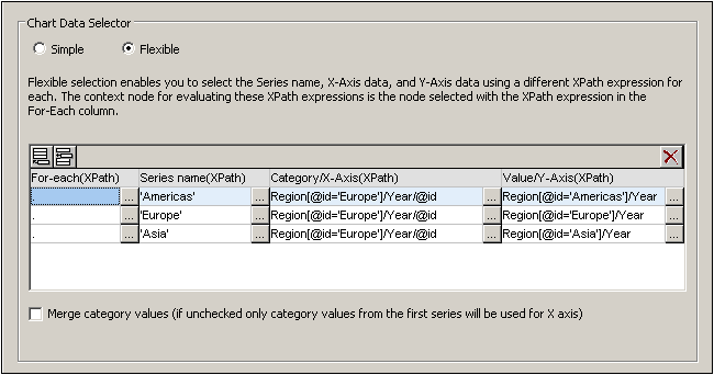
Notice that the X-Axis expression in all three data selection rows is identical. What is required is that the XPath data selection returns the correct sequence of items. The sequence can also be entered directly in the XPath expression. For example: "2005, 2006, 2007, 2008, 2009, 2010". Something similar has actually been done for the Series Axis.
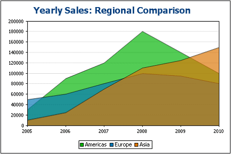
Stacked area charts
Stacked area charts (screenshot below) use the same data selection principles as for the standard overlay area charts. All three axes are selected exactly as described above. However, instead of areas being superimposed on the same coordinate grid, the areas are stacked along the Y-Axis so that Y-Axis values are cumulative (screenshot below).
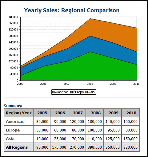
Stacked area charts enable multiple areas to be compared. For example, in the screenshot above, the sales of the three regions (Americas, Europe, and Asia) can be can be visually compared by observing the sizes of their areas over a particular period. In the chart, notice that the plotted Y-Axis value of a series in a given year is the sum of that series' original Y-Axis value plus the Y-Axis values of all the series plotted below it. So Europe in 2005 is plotted at 80,000 (50,000 + 30,000 (of Americas)) while Asia is plotted at 90,000 (10,000 + 50,000 (Europe) + 30,000 (Americas)).