Formatting the Content
StyleVision offers a powerful and flexible styling mechanism, based on CSS, for formatting components in the design. The following are the key aspects of StyleVision's styling mechanism:
•CSS style rules can be defined for both block components and inline components.
•Predefined formats are block components that have inherent styles and can be used as wrappers for a group of components that need to be treated as a block. The inherent styles of these predefined formats can be overridden by styles you specify locally on each component. This is in keeping with the cascading principle of CSS.
•Class attributes can be declared on components in the design, and the class can be used as a selector of external or global style rules.
•You can specify styles at three levels. These are, in increasing order of priority: (i) style rules in external stylesheets, (ii) global style rules, and (iii) local style rules.
In this section, you will learn how to:
•Assign a component a class attribute
•Define styles in an external CSS stylesheet and add this stylesheet to the style repository of the SPS
•Define local styles for a selection of multiple design components
•Define local styles for a single component
Assigning predefined formats
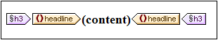
One reason to assign a predefined format is to give a component the inherent styling of that predefined format. In the design, select the headline element and then select Enclose with | Special Paragraph | Heading 3 (h3) (alternatively use the Predefined Formats combo box in the toolbar). The predefined format tags are created around the headline element (screenshot below).
Notice that the font properties of the contents change and that vertical spacing is added above and below the predefined format. These property values are inherent in the h3 predefined format.
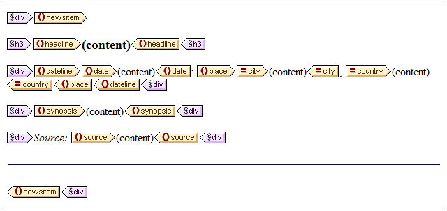
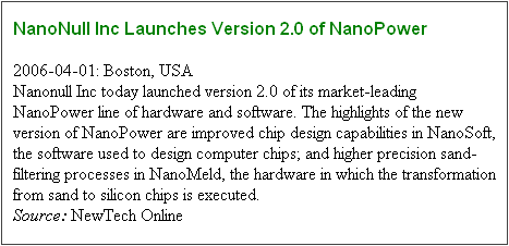
Another use of predefined formats is to group design components in a block so that they can be formatted as a block or assigned inline properties as a group. The most convenient predefined property for this purpose is the div predefined format, which creates a block without spacing above or below. In your design, assign the newsitem, dateline, synopsis, and source nodes separate div components. Your design should look something like the screenshot below. Note that the static text "Source: " is also included in the div component that contains the source element, and that the entire newsitem element is inside a div component.
You have now grouped components together in different div blocks. Later in this section, you will learn how to assign styles to such blocks of grouped components.
Assigning components to class attributes
A style rule can be defined for a class of components. For example, all headers can be defined to have a set of common properties (for example, a particular font-family, font-weight, and color). To do this you must do two things: (i) assign the components that are to have the common properties to a single class; (ii) define the styling properties for that class.
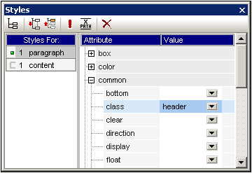
In your design, select the h3 tag, and, in the Styles sidebar, select 1 paragraph (to select the predefined format), and the common group of properties. Expand the common group of properties, then double-click in the Value field of the class property and enter header.
This particular instance of the h3 format is now assigned to a class named header. When you define styling properties for the header class (styles from an external stylesheet or global SPS styles), these properties will be applied to all components in the SPS that have the header class.
Adding an external CSS stylesheet to the style repository
Style rules in an external CSS stylesheet can be applied to components in the SPS design. External stylesheets must, however, first be added to the style repository in order for rules in them to be applied to components. In the Style Repository sidebar (in Design View), do the following:
1.Select the External item.
2.Click the Add button in the toolbar of the Style Repository sidebar. This pops up the Open dialog.
3.Browse for the file C:\Documents and Settings\<username>\My Documents\Altova\StyleVision2026\StyleVisionExamples\Tutorial\QuickStart\QuickStart.css, which is in the (My) Documents folder, and click Open.
The stylesheet is added to the style repository. It contains the following rules that are relevant at this stage:
.header {
font-family: "Arial", sans-serif;
font-weight: bold;
color: red;
}
h3 {
font-size: 12pt;
}
The style rules for the header class and h3 element are combined and produce the following HTML output for the headline element.
Defining global style rules
Global style rules can be defined for the entire SPS using CSS selectors. The rules are defined directly in the Style Repository sidebar. Create a global style rule for the header class as follows:
1.With Design View active, in the Style Repository sidebar, select the Global item.
2.Click the Add button in the toolbar. This creates an empty rule for the wildcard selector (*), which is highlighted.
3.Type in .header to replace the wildcard as the selector.
4.Expand the color group of properties, and select green from the dropdown list of the color property values (screenshot below).
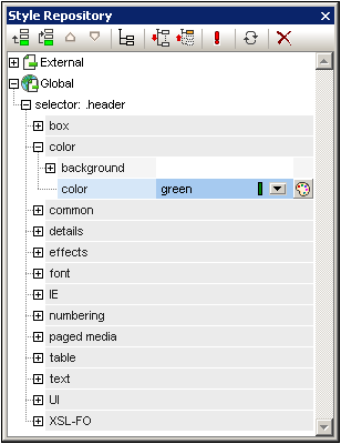
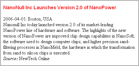
Where the global style rule defines a property that is also defined in the external stylesheet (the color property), the property value in the global rule takes precedence. In the HTML preview, the contents of the headline will therefore be green. Other property definitions from the external stylesheet (not over-ridden by a property in a global style rule) are retained (in this case, font-family and font-weight).
Defining local styles for multiple components at once
Local styles can be defined for multiple components at once. In your design, to specify that the entire text contents of a news item should have Arial as its font, click the div component surrounding the newsitem element and, in the Styles sidebar, in the Styles For column, select 1 paragraph. Then, in the font group of properties, assign Arial as the font-family. This property setting will be inherited by all five descendant predefined formats.
Now, in the design, select the three div components surrounding the dateline, synopsis, and source nodes (by keeping the Shift key pressed as you click each div component). In the Styles sidebar, select 3 paragraphs, then the font group of properties, and set a font-size of 10pt. (The h3 component was not selected because it already has the required font-size of 12pt.)
Finally, in the design, select the div component surrounding the dateline element. In the Styles For column of the Styles sidebar, select 1 paragraph. In the font group of properties, set font-weight to bold and font-style to italic. In the color group of properties, set color to gray. The output of the dateline will look like this
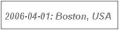
Notice that the styling defined for the div component has been applied to the static text within the div component as well (that is, to the colon and the comma).
Defining local styles for a single component
A local style defined on a single component overrides all other styles defined at higher levels of the SPS for that component. In the design, select the headline element and assign it a color of navy (color property in the color group of style properties). The locally defined property (color:navy) overrides the global style for the .header class (color:green).
Select the div component surrounding the source element. In the Styles sidebar, with the 1 paragraph item in the Styles For column selected, set the color property (in the color group of style properties) to gray. In the font group of style properties, set font-weight to bold. These values are applied to the static text. Remember that in the last section the static text "Source: " was assigned a font-style value of italic. The new properties (font-weight:bold and color:gray) are additional to the font-style:italic property.
Now, in Design View, select the (content) placeholder of the source element. In the Styles For column, with 1 content selected, set the color property (in the color group of style properties) to black. In the font group of properties, set font-weight to normal. The new properties are set on the contents placeholder node of the source element and override the properties defined on the div component (see screenshot below).
Completing the formatting
To complete the formatting in this section, select the div component on the synopsis element and, in the Predefined Formats combo box in the toolbar, select p. This gives the block the inherent styles of HTML's p element. The HTML preview should now look something like this:

After you are done, save the file.