Insert Design Elements
The Insert Design Elements toolbar contains icons for commands to insert design elements in the SPS design, and for related commands. The various design elements that can be inserted via these toolbar icons are shown in the screenshot below. There are three types of items in the toolbar:
1.Design elements, which are context-node-sensitive (the majority of elements in the toolbar),
2.Layout elements, which are independent of node context, and
3.Grid-related toggles to aid design.
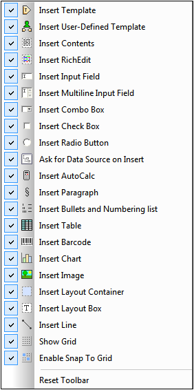
Design elements
The design elements are the context-node-sensitive elements that are available in the Insert menu. To insert a design element using its toolbar icon, do the following:
1.Select the toolbar icon for the element you wish to insert.
2.Click the location in the design where the element is to be inserted. A Insert Design Element for the selected design element pops up. This displays the schema tree with the context node highlighted. The context node is the node within which the cursor has been placed for the insertion of the design element.
3.If you wish to insert the design element within the currently selected context node, click OK. If you wish to select another context node, do so in the schema tree and then click OK.
4.In the case of some design elements, such as Auto-Calculations, a further step is required, such as the definition of an Auto-Calculation. In other cases, such as the insertion of a user-defined template, the Insert Design Element dialog is skipped. In such cases, another dialog, such as the Edit XPath Expression dialog will pop up. Carry out the required step and press the dialog's OK button.
The design element will be inserted at the end of Step 3 or Step 4, depending on the kind of design element being inserted.
Layout elements
There are three layout element commands in the Insert Design Elements toolbar: to insert (i) a layout container; (ii) a layout box; and (iii) a line. Note that layout boxes and lines can only be inserted within a layout container.
To insert a layout container, select the Insert Layout Container icon and then click at the location in the design where you wish to insert the layout container. You will be prompted about the size of the layout container, on selecting which the layout container will be inserted. To insert a layout box, click the Insert Layout Box icon, then move the cursor to the location within the layout container at which you wish to insert the layout box and click. The layout box is inserted. Click inside the layout box to start typing. To insert a line, click the Insert Line icon, then move the cursor to the location within the layout container at which you wish to start drawing the line. Click to define the start point of the line and then drag the cursor to the desired endpoint. Release the cursor at the end point. The line is inserted and extends from the indicated start point to the indicated end point.
To re-size layout containers and layout boxes, place the cursor over the right or bottom border of the layout container or layout box and drag the border so as to obtain the desired size. To move a layout box, place the cursor over the top or left border of the layout box and, when the cursor turns to a cross, drag the layout box to the new location.
Grid-related toggles
The Show Grid command toggles the display of the drawing grid on and off. When the Snap to Grid command is toggled on, elements created within the layout container, such as layout boxes and lines, snap to grid lines and grid line intersections. The properties of the grid can be set in the Design tab of the Options dialog (Tools | Options).