Check Boxes
You can create a check box as a data-entry device. In Basic edition, you can leave the settings in the Edit Check Box dialog at their default settings (since Basic edition does not support Authentic View, as a result of which no value can be entered in the XML file.)
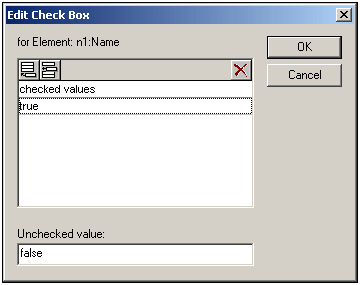
In the above screenshot, an element called Name has been created as a check box. If the Authentic View user checks the check box, a value of true will be entered as the value of the element Name. If the value is unchecked, then the value false is entered as the XML value of Name (as defined in the dialog).
Note: Check boxes in Text output are displayed as square brackets: [] for unselected check boxes; [x] for selected check boxes.
Accessing the Edit Check Box dialog
If you are creating a new check box, when you create the node as a check box, the Edit Check Box dialog pops up. To access the Edit Check Box dialog afterwards, do the following:
1.Select the check box in the design.
2.In the Properties sidebar, select the checkbox item and then the checkbox group of properties (see screenshot below).
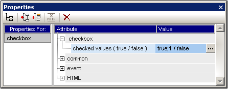
| 3. | Click the Edit button  of the check values property. This pops up the Edit Check Box dialog. of the check values property. This pops up the Edit Check Box dialog. |
Note: You can modify the HTML properties of a check box by selecting it and then modifying its HTML properties in the Properties sidebar.