A page design (screenshot below) consists of page controls—such as combo boxes, tables, and images—that are laid out and formatted exactly as the end user will see the page. Controls are dragged into the design from the Controls Pane. After a control has been placed in the design, you can do the following:
•Controls can be linked to page source nodes (available in the Page Sources Pane) so that data from these nodes can be displayed in the design and processed. Typically, an association between a control and a page source node is defined by dragging a node from its source tree (in the Page Sources Pane) onto the control. A node association of this type is called the page source link of the control.
•Set control actions: Control actions determine the functionality to be executed when a control-related event is triggered (for example, when a button is clicked). You define control actions by right-clicking a control, and selecting Control Actions. Control actions are described in the section Actions.
•Set control properties: The properties of a control define the control's appearance (including position). Consequently, a control's properties also define the appearance of the page. To set a control's properties, select the control and set its properties in the Styles & Properties Pane. Each control's properties are described in the sub-section of this section.
•When the control is associated with a data source node (page source link), placing the mouse over the control (in Page Design View) displays the associated node in a popup. •All page source links in the page source tree are displayed in a bold font. Tree nodes that are not page source links are displayed in normal font. •Placing the mouse over the page source link in the design tree displays information about the associated control. •To remove a data-source node association (and therefore the data in the control), right-click the control (in Page Design View) and click Unassign Page Source Link <NodeName>. •To reset a style or property (in the Styles & Properties Pane), select the property and click Reset in the pane's toolbar. •The values of several properties can be set by using XPath expressions. This allows values to be dynamic: that is, generated via calculations, or from data source nodes, at runtime. To set an XPath expression, click Edit XPath in the toolbar of the Styles & Properties Pane. •To edit the XPath expression of a style or property (in the Styles & Properties Pane), select the style or property, and click Edit XPath in the pane's toolbar. •To copy a control to another location in the design, press Ctrl and drag-and-drop the control to the desired copy location. •To assign specific properties for a control, define one or more classes for the control (via the Browser CSS Class property), and then assign rules for the class/es in an external CSS file (that you specify in the Browser Settings dialog). •A control's CSS properties can be defined in the Styles & Properties Pane and/or in an external CSS file. Those defined in the Styles & Properties Pane have priority. |
List of controls
Given below is a list of available controls, arranged alphabetically, together with a screenshot showing different controls..
Context menu
Each control in the page design has a context menu. The following control-related commands are common to most context menus.
This command is enabled for those controls that can be associated with a page source node and for which an association exists. Unassign Page Source <Name> deletes the association between control and page source. Note that there is no other way to delete the control's association with a node. |
|
Displays the Control Actions dialog, in which you can set actions for various control events. For a description of available actions for control events and how to set control actions, go to the section, Page Design | Actions. |
|
Opens the control's Local Variables dialog, where you can add, edit, and delete the variables of the control. A control variable has a name, which is a string, and a value, which is an XPath expression. The variables that are declared in the Local Variables dialog will be evaluated when the control is called and will be used with the corresponding values till the control is called again. Parameters can be used in the XPath expression that calculates a variable's value. Control variables are useful for providing values that can be used in control actions. Consider, for example, a Department node inside a Company node where the domain name of each Company node (for example, altova.com or nanonull.com) is provided in a child node of the Company node. If you now set a control variable to select the domain-name node, then the control variable can be used in an action of the control to dynamically select each company's domain name when that company is being processed. For example, the email addresses of a department's Employee children can be built by using each employee's FirstName and LastName elements together with the control variable that contains the company's domain name. Control variables can also be set via a control's Control Variables property (available in the Styles & Properties pane when the control is selected). The currently defined control variables are listed as sub-items of the Control Variables property; each control variable can be edited by double-clicking it. |
|
Enabled for controls in which text can be entered. Rolls out a sub-menu with the following options: •Directly: To enter static text directly as the text of the control •XPath: Displays the Edit XPath/XQuery Expression dialog, in which you can enter the XPath expression that selects the text of the control •XML Node: Refers to the option of displaying the content of an XML node as the control's text. Clicking the option displays a hint that a page source node can be dragged from the Page Sources Pane onto the control. The dragged-and-dropped node will be associated with the control, and the node's content will be entered as the text of the control |
|
Displays the Localization dialog, in which you can define the localization (translation) of strings that appear in various controls of the project. This command has the same effect as the Project | Localization command. For a description of localization, go to the description of the Project | Localization command. |
|
If a control has a file that can be deployed or if an Image control has a file that can be embedded, then the respective sub-commands of the Deploy/Embed File command are enabled. •For the option to deploy a file, you can choose the sub-command for where you want to deploy the file. On deployment, the file is added to the Deployable Files list of the Files Pane. •When you embed an image file, the binary data of the image file (PNG, BMP, etc) is converted into text-based Base64-encoding, and this text is embedded in the design file. On embedding, the Image control's Embed Image property is set to true. See the description of the property for more information. |
|
If a control template can be created from the selected design component/s, then the Create Template from Selection command is enabled. Selecting the command does the following: (i) adds to the project a new control template that contains the selected design component/s (see the Pages Pane); (ii) replaces the selected design component/s with a Placeholder Control. To return to the previous state, use the context menu command Replace Placeholder with Template Content (see description immediately below). |
|
This command is enabled when for Placeholder Controls, which are controls that instantiate a control template of the project. The command replaces the Placeholder Control with the content of the control template for which it is a placeholder. Note that neither the control template nor its content is deleted. The reverse command is Create Template from Selection (see description immediately above). |
|
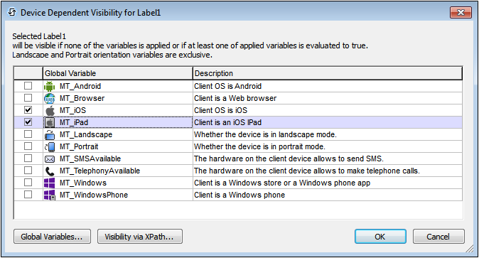
Displays the Device Dependent Visibility dialog (screenshot below). The dialog contains a list of client-device types. Select the client-device type for which you want the control to be visible, and click OK. If the client-device type has an icon, this icon appears in the design, to the left of the control to which it applies (see screenshot below). |
|
Displays the Page Actions dialog, in which you can set actions for various page events. This command has the same effect as the Page | Page Actions command. For a description of available actions for page events and how to set page actions, go to the description of the Page | Page Actions command. |
|