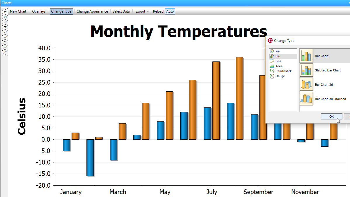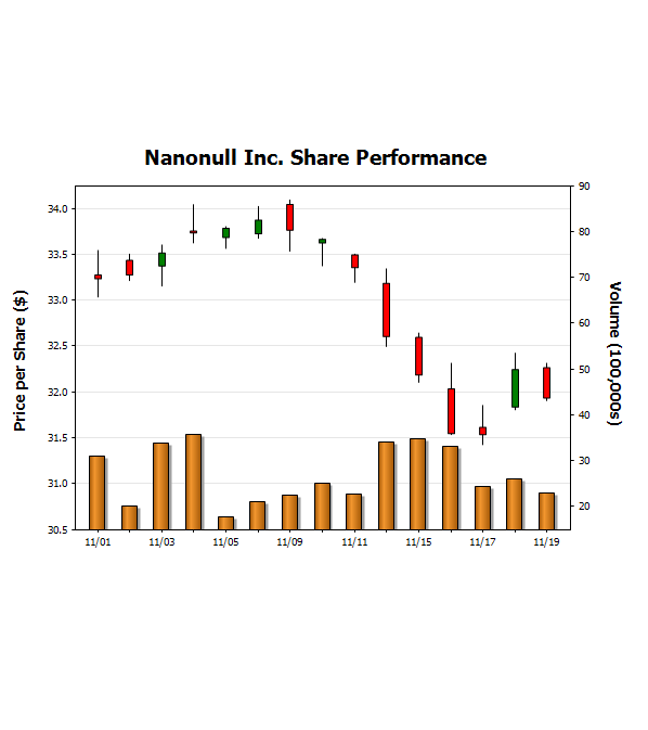
XMLSpy makes it easy to create eye-catching, impactful charts for displaying XML data. You can visualize, analyze, and report numerical XML and XBRL data directly inside XMLSpy with just a few clicks.
Chart creation in XMLSpy brings a whole new dimension to working with, communicating, and reporting XML data. It's no longer necessary to export XML in a different format, or to another application, in order to create an attractive, dynamic chart to immediately communicate data results and relationships. Once you've specified the data and appearance of your graph, XMLSpy offers various one-click options for sharing it: printing, copying to the clipboard, saving as an image file, or even exporting it as XSLT or XQuery code for easy re-use. The XSLT/XQuery code can be executed in XMLSpy and via RaptorXML, Altova's high-performance XML and XBRL server.
To build a chart or graph, you simply highlight a range of data in XML Text View or XML Grid View, right click, and select New Chart. The Select Columns dialog opens, allowing you to specify the data for the X axis and Y axis. The Source XPath is automatically entered based on your cursor position or highlighted data range. Alternatively, you can enter the XPath manually to specify the data you want to graph. Once your data is selected, the Select Data dialog lets you further configure your chart series, axis values, and so on.
You can also create charts directly in XML Grid using a special chart function.
The Chart Appearance dialog allows granular customization of the chart's appearance, including chart title and legend, color scheme, axis labels, background image, and more.
The chart display is dynamic based on the underlying XML data, so if you update your XML file, the chart is updated as well.


