Document Display
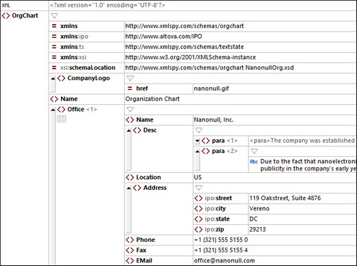
In Grid View an XML document is displayed hierarchically within a grid (see screenshot below).
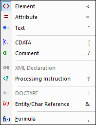
Each grid line displays one XML structural item (known as a node), such as element, attribute, comment, or text. The different node types that are available in XML documents are shown in the screenshot below together with their icons. In Grid View, the type of a node is indicated by the icon at left in a grid cell. Note that nodes of type Element, Attribute, and Processing Instruction have a key and a value, whereas nodes of type Text, CDATA, and Comment have only a value. For example, an element node will have a name (its key) and content (its value), whereas a text node will have only a value.

Features of the Grid View display
Note the following features:
•You can zoom the grid in and out via Ctrl + Mouse Wheel, or Ctrl+[Plus] and Ctrl+[Minus].
•Sibling elements that have the same name are numbered, starting from 1. In the screenshot above, for example, the Office element that is numbered one is the first of a sequence of Office elements. The other elements in the screenshot are not numbered—because they do not have sibling elements of the same name.
•Nodes can be expanded or collapsed by clicking the arrowhead icon at the left of the node's symbol (see screenshot above). When a node is collapsed, any content it has is displayed as text in a single line.
•If you select multiple components at the same level, you can expand/collapse all of them by pressing Shift and clicking any one of the selected components' arrowheads.
•If word-wrap is switched on via the Grid View toolbar, then all cells containing text that is longer than the width of the cell will wrap. You can toggle off word-wrap by clicking its icon in the Grid View toolbar.
•Formulas are specific to XMLSpy.
Toolbar/in-cell command buttons
In XML Grid View, buttons in grid cells or in the Grid View toolbar provide functionality that is available in the context of the current selection (cell or column). Using these commands is a faster and easier way to carry out commonly used operations. The available commands are listed in the table below. Display-related commands are shown with a blue background. Commands for editing the document (structure and content) are shown with a beige background. For additional commands in a particular cell's context, use the cell's context menu. Note: The name of a command is displayed as a tool tip when you hover over the cell button or toolbar icon.
| Optimizes widths of grid columns according to cell content. |
 / /  | When colored, Table Display is on, otherwise off. Click to switch the display |
 / /  | A toggle command in top left cell of table. Switches rows to columns and vice versa |
 / /  | When colored, a filter for the table, object, or array is active, otherwise the filter s deactivated. Click to deactivate/activate. To edit the expression, double-click it |
| Toggle command to word-wrap cells. When selected, word-wrap is on. By default. only the contents of items are wrapped. If you want to additionally wrap the names of items, choose this option from the icon's dropdown list. |
| Zoom level of Grid View |
 | Enabled when a column header in Table View is selected. The buttons sort the rows of the table, respectively, in descending or ascending order of column content |
| Note: | For a description of other toolbar commands, see the section Context Menu in Grid View. |
Display as table
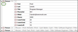
Repeating elements are shown in standard Grid View, one after the other, progressing vertically downward in document order (screenshot below left). However, displaying repeating elements as the rows of a table provides additional editing features. In the screenshots below, the Person element is the repeating element. The screenshot at left shows standard Grid View; the first Person element is shown expanded, while subsequent instances are shown collapsed. The screenshot at right shows the repeating Person elements as the rows of a table.
To switch to Table View, click the Table Mode icon (circled in green in the screenshot below left). When switched to table display, the icon is displayed in color (see screenshot below right).
Table View offers unique editing benefits in that whole rows and columns can be manipulated relative to other columns and rows in the table. This enables such operations as sorting table rows on the values of one column. For example, in the screenshot above right, the six Person elements can be sorted on the basis of their Last child elements via a single command in the Grid View toolbar. This is simpler than running an XSLT transformation, which would be the usual way to sort an XML nodeset.
For more information, see the topic Table Display.


