Layout Containers
A Layout Container has the following properties:
•It can be inserted within the flow of a document, that is, within a template. Or it can be inserted as the container within which the document design is created.
•It can have the same dimensions as the page dimensions defined for that section (the Auto-Fit to Page property of Layout Containers). Or it can have any other dimensions you specify. See the Layout Container size section below for details.
•A layout grid and a zoom feature make the positioning of objects in the Layout Container easier.
•It can have style properties, such as borders, background colors, font-properties for the whole container, etc.
•It can contain Layout Boxes and Lines, but no other design element. (All design elements must be placed within Layout Boxes.)
•It can contain a blueprint, which is an image placed on the artboard to serve as a reference template for the designer. The design can then be built to match the blueprint exactly.
| Note: | Layout Containers are supported in Authentic View only in the Enterprise Editions of Altova products. |
Inserting a Layout Container
To insert a Layout Container, click the Insert Layout Container icon in the Insert Design Elements toolbar and click the location in the design where the Layout Container is to be inserted. A dialog appears asking whether you wish to auto-fit the Layout Container to the page. If you click Yes, the Layout Container will have the same size as the page dimensions defined in the page layout properties of that particular document section. If you click No, then a Layout Container with a default size of 3.5in x 5.0in is created.
Note that a Layout Container can also be created at the time you create an SPS.
Layout Container size
There are two sets of properties that affect the size of the Layout Container:
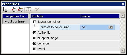
•The Auto-Fit Page Size property (Properties sidebar, screenshot below) can be set to yes to create a Layout Container having the same dimensions as those specified for pages in that document section. A value of no for this property creates a Layout Container with a customizable size.
•The height and width properties of the Details group of Layout Container styles (in the Styles sidebar) specify the dimensions of the Layout Container. The dimensions can also be modified directly in the design by dragging the right and bottom margins of the Layout Container. Note that the height and width properties will take effect only when the Auto-Fit Page Size property has a value of no.
Layout Container Grid
The Layout Container has a grid to aid in spacing items in the layout. The following settings control usage of the grid:
•Show/Hide Grid: A toggle command in the Insert Design Elements toolbar switches the display of the grid on and off.
•Grid Size: In the Design tab of the Options dialog (Tools | Options) units for horizontal and vertical lengths can be specified. Note that if very large length units are selected, the grid might not be clearly visible.
•Snap to Grid: A toggle command in the Insert Design Elements toolbar enables or disables the Snap to Grid function. When the Snap to Grid feature is enabled, the top and left edges of Layout Boxes and the endpoints of Layout Lines align with grid lines and points, respectively.
Zooming
To help position objects more accurately, you can magnify the view. Do this by changing the Zoom factor in the Zoom combo box (in the Standard toolbar), or by pressing the Ctrl key and scrolling with the mouse.
Layout Container style properties
There are two types of style properties that can be applied to Layout Containers:
•Those applied to the Layout Container alone and which are not inheritable, such as the border and background-color properties.
•Those that are inheritable by the Layout Boxes in the Layout Container, such as font properties.
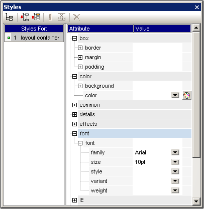
The style properties of a Layout Container are set in the Layout Container styles in the Styles sidebar (screenshot above).
Layout Container contents
The only design items that can be contained in a Layout Container are Layout Boxes and Lines. Additionally, a blueprint (which is not a design element) can be placed in the Layout Container as a design aid. All design elements must be placed in a Layout Box.
Blueprints
One blueprint can be placed in a Layout Container at a time to aid the designer in creating the SPS. The blueprint is an image file that can be placed to exactly fit the size of the Layout Container. Alternatively, if the blueprint image is smaller than the Layout Container, it can be offset to the desired location in the design (see Blueprint image properties screenshot below). The designer can use the blueprint by reproducing the SPS design over the blueprint design. In this way the designer will be able to place design elements in the layout exactly as in the blueprint. The blueprint will appear only in Design View, but not in any output view: this is because its purpose is only to aid in the design of the SPS.
The blueprint's properties can be controlled via the Blueprint image group of properties of the Layout Container properties (in the Properties sidebar, screenshot below).
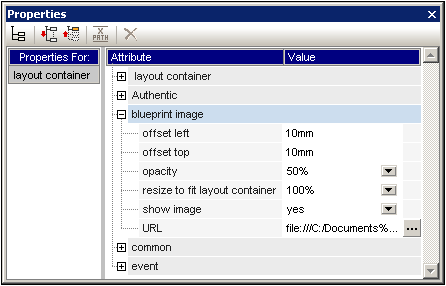
The opacity of the blueprint in the Layout Container can be specified so that the blueprint does not interfere with the viewing of the design. The display of the blueprint image can also be switched off with the Show Image property if required.