
We are excited to have launched the MOST WANTED edition of the Altova MissionKit today! The MissionKit 2010 represents the most wanted functionality as reported by you! We’ve wrangled over 70 new features into this version of Altova’s XML, database, and UML product line to deliver on your list of demands. Check out the highlights for each product included in the MissionKit 2010 tool suite below; subsequent posts will cover the new features in each product in greater detail.
WSDL 2.0
One of the features most often asked for is support for the latest version of WSDL: WSDL 2.0. In addition to existing WSDL 1.1 editing and validation capabilities, XMLSpy now supports WSDL 2.0 in the graphical WSDL editor. It also allows one-click conversion between WSDL 1.1 and 2.0 files. 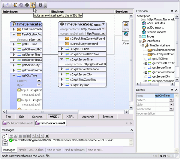
WSDL 2.0 support has also been added to version 2010 of the MapForce data mapping tool, allowing you to connect to WSDL 2.0 (or 1.1) Web services and integrate their functionality into mappings of XML, databases, flat file, EDI, Excel 2007, and XBRL data. You can also use MapForce to build new Web services based on WSDL 2.0 definitions. MapForce 2010 delivers a number of other enhancements for data mapping, conversion, and integration.
XBRL Enhancements
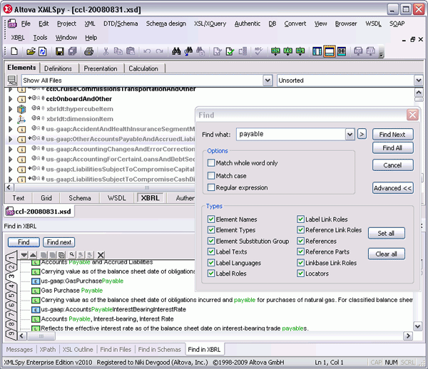
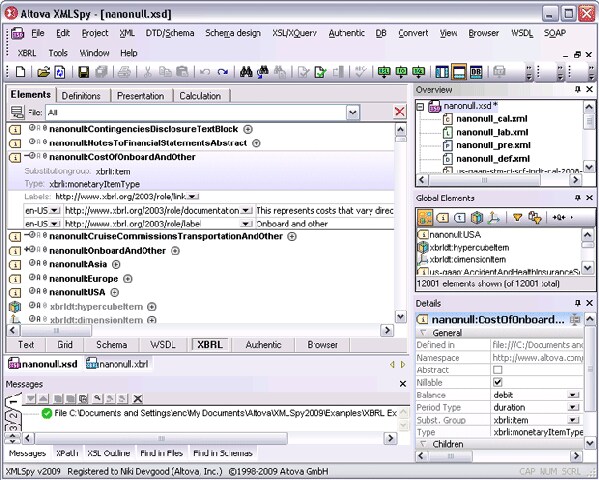
Several new features for working with XBRL have been added in version 2010. XMLSpy includes a new XBRL Taxonomy Wizard for getting a head start creating taxonomies in the graphical XBRL Taxonomy Editor. You can also now generate comprehensive documentation for your XBRL taxonomies, or simply print the graphical XBRL representation. Find and sort capabilities let you work more easily with large, complex taxonomies.
If you’re not familiar with the extensive support for working with XBRL in the Altova MissionKit, check out the XBRL Solutions Center page.
JSON Support
With more and more developers working with JSON in the XML, AJAX, and Web services apps they’ve created in XMLSpy, we’ve received a lot of inquires about JSON support. Now you can edit your JSON files directly in XMLSpy, using Text View or the graphical Grid / Tree View with intelligent JSON entry helpers. XMLSpy even supports one-click JSON <=> XML conversion. Check out the rest of the features most desired by XMLSpy users.
New Design Paradigm in StyleVision
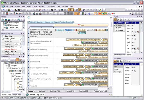
The StyleVision graphical stylesheet design / single source publishing tool now gives you a new, flexible option for designing stylesheets and electronic forms. The new design paradigm lets you create templates within layout containers, and even optionally upload a blueprint image on which to base your design. This way, you can specify your design first and add XML and/or database content after.
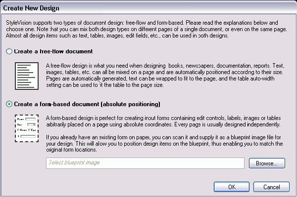
This new form-based design option is made possible by new support for absolute positioning in design layouts. Instead of having content and layout elements flow on the page automatically, like a typical web page layout, you can now specify exact X and Y coordinates for each element to absolutely position it on a page. This feature gives you more control over form design in the manner of desktop publishing applications, but also adds the powerful single source publishing capabilities for XML, XBRL, and database data that have always been present in StyleVision. Read about the numerous other enhancements in StyleVision 2010. Authentic 2010 users will directly benefit from many of the new StyleVision features for true electronic forms design described above. The sophisticated e-Forms created in StyleVision 2010 are presented in Authentic’s WYSIWYG-interface for XML and database content editing by non-technical business users. In addition, with the release of Version 2010, Authentic is now offered in Enterprise and Community Editions, both of which are available as either as a desktop application or browser plug-in. The new Authentic 2010 Enterprise Edition requires a paid license and provides advanced features for WYSIWYG XML and database content editing. Authentic 2010 Browser Plug-in Enterprise Edition is offered on a 12 month license term basis. Authentic 2010 Community Edition is available under a free license and is also offered in desktop and browser plug-in versions.
SysML Support
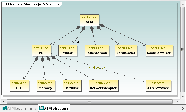
Altova’s affordable UML modeling tool has become even more robust with support for SysML, which is related to UML but optimized for designing software to operate and control embedded systems and other complex devices. UModel 2010 supports all SysML v1.1 diagram types and elements with all the same productivity-enhancing features available for UML and BPNM modeling, including code generation in Java, C#, and Visual Basic.
Read about all the new features in UModel 2010.
New Diff/Merge Capabilities
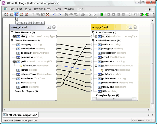
Both DatabaseSpy and DiffDog have received some exciting and oft-requested new diff/merge features in version 2010. DatabaseSpy, the highly-affordable, multi-database query, design, and comparison tool now allows you to compare and merge database schemas between databases of the same type or across different database types (all major relational databases are supported). DatabaseSpy displays differences between database schemas in a graphical manner, and you can generate a change script to merge changes in either direction.
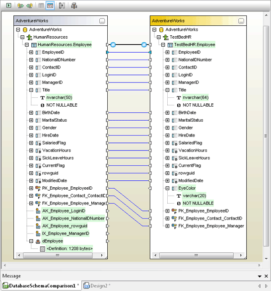
DatabaseSpy 2010 also adds the ability to convert database structures between different database types, for example, to migrate from MySQL® to Oracle® or SQL Server®. Version 2010 of the DiffDog diff/merge tool for files, directories, and databases includes functionality similar to DatabaseSpy for comparing and merging database schemas, and it also provides the most wanted XML Schema diff feature. Since XML Schemas are ever-evolving as requirements change, existing XML files often also need to be updated to remain valid. You can now compare two XML Schemas graphically in DiffDog 2010, and then DiffDog will generate an XSLT file to transform any related instance documents according to the new schema. Alternatively, you can choose to generate an Altova MapForce mapping file based on the DiffDog comparison to further refine the transformation
between schemas.

Collect your Handsome Reward
If you’re an Altova customer with active Support and Maintenance Package, simply download and install version 2010, and your existing key code will activate the new version. New customers can download a free, fully-functional 30-day trial to start working with all these new features today.
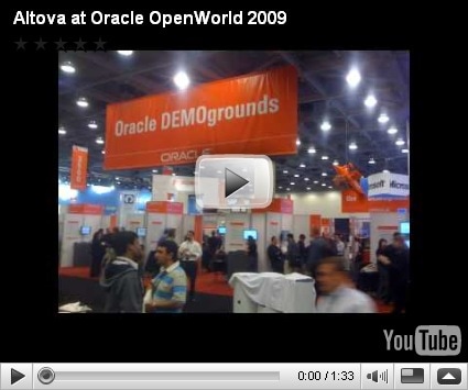
 The Altova team is on its way to an exciting event next week in San Francisco, Oracle OpenWorld! If you will be there, stop by booth #220 in Moscone South near the database demo grounds from September 29th – October 1st for a demo of Altova’s tools for Oracle users and to see our new cross-platform mobile development solution MobileTogether.


 MACPA invested in the


 Fortunately, the best attractions were all indoors. Oracle OpenWorld is one of the largest events held each year at the Moscone Convention Center. The keynote speeches, conference seminars, and partner exhibitions fill all three buildings. Even Howard Street between the North and South halls is closed for an entire block to create room for the lunch pavilion. Oracle OpenWorld is the best place to come for face-to-face education and interaction on all subjects related to every facet of the Oracle ecosystem. Altova is an Oracle Partner and this is an event we look forward to every year. The


")


 Of course, if you have an active


 MapForce 2009 –

 and a small snippet of the same piece translated to MusicXML:
  The MusicXML-based Dolet 4 plugins for Finale and Sibelius provide a more accurate and usable representation of sheet music than Standard MIDI translation. For example, the images below show the same piece of music. On the left is a Finale 2009 rendering of a MIDI file exported from Sibelius, and on the right is the same application’s interpretation of a MusicXML 2.0 file exported from the same version of Sibelius.
 In the MIDI rendition, vital information like chord symbols, lyrics, slurs, articulations, and even title and composer are omitted from the translation. In addition to providing native support for MusicXML, the recently released Dolet 4 for Finale and Dolet 4 for Sibelius plugins enhance the capabilities of these programs by adding advanced features like:
 Recordare has used Altova’s XMLSpy