Mobile App Development: Follow Up on a User Story
My friend Casey used the Solar Tool mobile app created with Altova MobileTogether to track rooftop solar production for a full year now and reports some surprising results. We first wrote about Casey’s user story in the spring, when she anticipated higher solar power production as hours of sunlight increased. Casey expected the billing cycle that included June 21, the summer solstice, to be her best generation month. Her actual results were very different and worth investigating.
As summer approached, Casey requested a small enhancement to the Solar Tool mobile app. The original Monthly Production chart we designed together reported 12 full months generation and use, based on bills from the power company, plus the interim period since the last bill. Casey asked me to enhance the chart to show 13 months instead of 12, for easy comparison with the same month last year.
Here is Casey’s Monthly Production chart for 13 months:
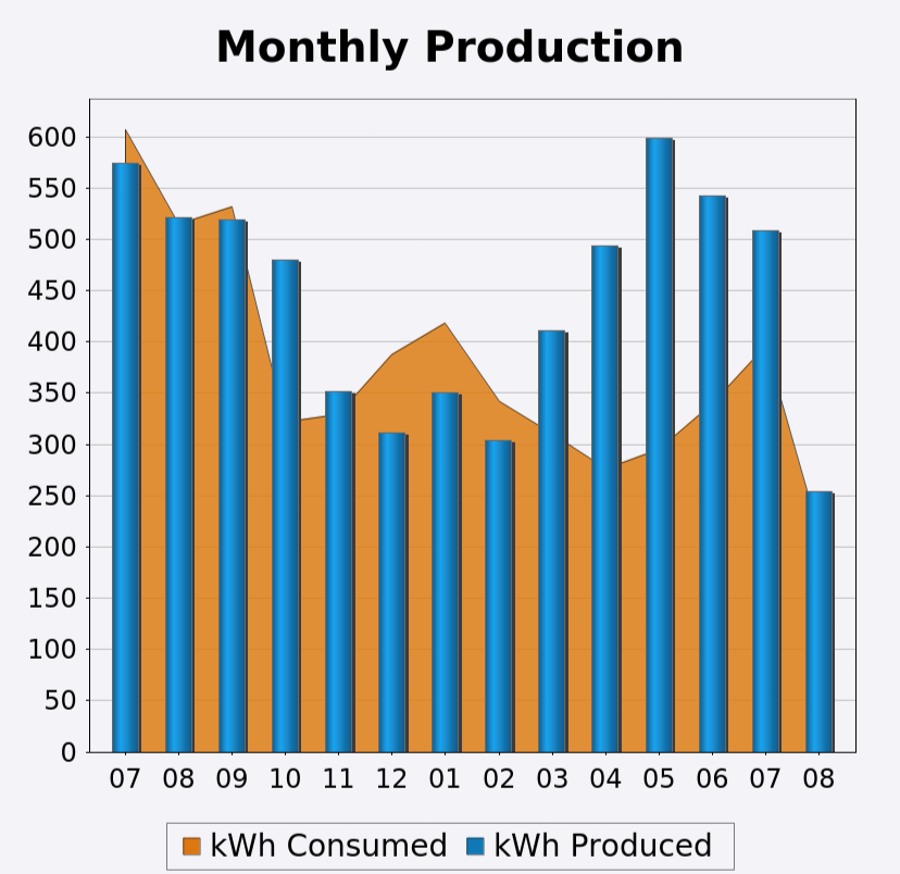
Remember, Casey’s house has two electric meters. The monthly production chart is built in two layers. The orange area in the background layer represents electricity consumed each month, based on power company readings of the usage meter reported on each month’s bill. The blue bars in the top layer are electricity produced by the solar panels, also shown on the bill from readings of the generation meter.
Numbers along the x-axis are months of the year, where 07 at the left is the July bill for June 15-July 16 from one year ago, and 08 on the right is the partial month before the next bill due in August.
Surprisingly, May was Casey’s best month of production, not the billing cycle from June to July when the hours of daylight were longest.
The weather pattern at Casey’s house was very different from last year. Summer days were clear and hot last year. This year, mornings started with clear skies, but clouds typically built up later in the day. Some afternoons it even rained. With less direct sunlight, the solar panels generated less power. Casey’s house didn’t get as warm in the afternoons either, so the air conditioning ran fewer hours, consuming less electricity.
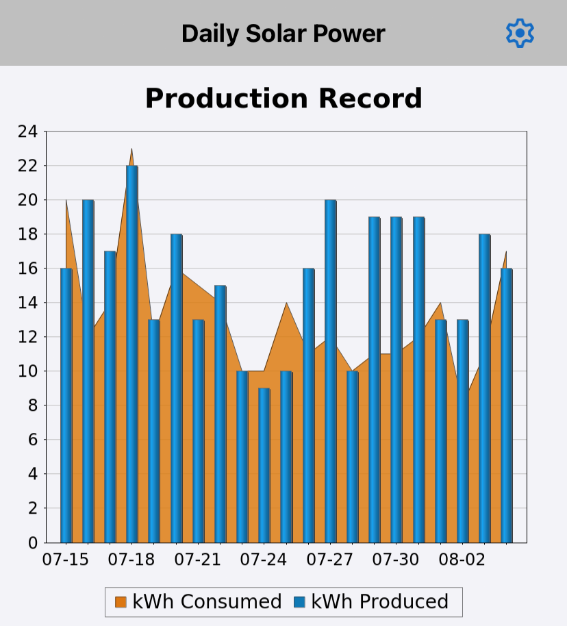
The Daily Production graph in the Solar Tool app shows how inconsistent results have been from day to day. Production and consumption both varied widely.
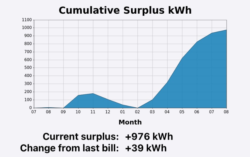
Despite Casey’s unexpected result, the Cumulative Surplus graph validates the net-zero billing concept for rooftop solar generation. Casey is entering the seasons of less daylight and more electricity consumption with a bank of produced kilowatt hours to draw down.
MobileTogether uses a combination of drag-and-drop UI design, the powerful Action Tree visual programming language for event handling, and standardized functional programming for data selection and processing, making it easy for any programmer or web developer to build highly sophisticated, data-driven mobile apps for all platforms.
Check out our MobileTogether video demos, more sample apps, or even the online manual for all the info. When you’re ready to start your own cross-platform mobile app development project, download the MobileTogether Designer to get started.
If you want to examine the Solar Tool app we built based on Casey’s user story, it is available on GitHub.