Processing the Groupon API – Epilogue


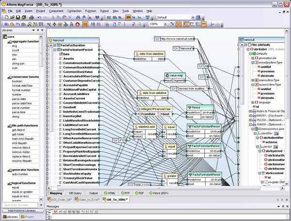
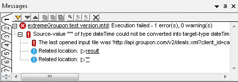
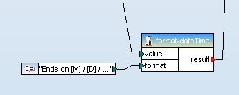
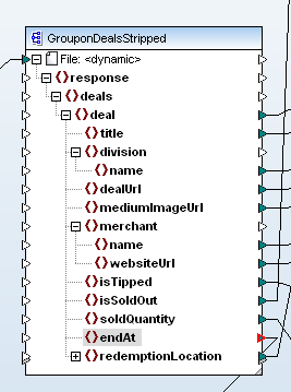
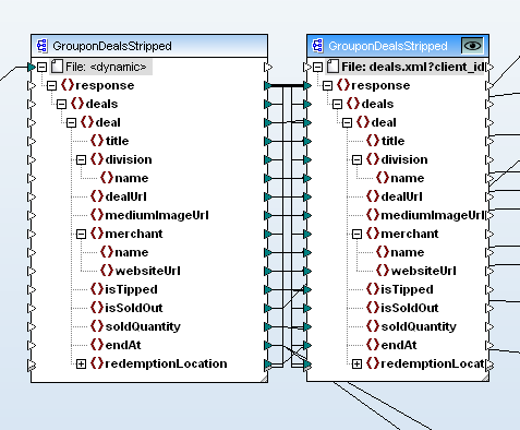
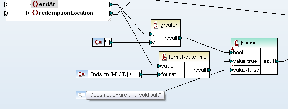
Rare edge cases can derail loosely coupled data mapping applications. This is especially true when you are consuming large datasets available over the Internet and have little or no influence over the source data. In this article we describe a debugging technique that lets developers working on data mapping and transformation projects quickly identify and accommodate unexpected data in a stream from a remote source. The Problem Last summer we wrote a series of blog posts describing how to work with the Groupon API to retrieve a subset of offers in all Groupon cities and format the list for a web browser or mobile device. MapForce output from the Groupn API, displayed on a mobile device We concluded with a command line to run a MapForce data mapping that calls the Groupon API over 150 times — once for each Groupon city, then filters the data to extract deals sold on the Internet instead of a physical location, and formats the results in HTML using StyleVision. Every morning we run the command line in a batch file that saves the HTML output on a local server so our colleagues can check it out with any Web browser to find interesting offers from all over the country. The mapping ran fine for more than two months until one day it failed with this error message: “Source-value “” of type dateTime could not be converted into target-type dateTime.” The specific explanation is that somewhere in the mapping where we expected a dateTime, we received an empty value. On a more abstract level, the error suggests a potential defect in the logic of our mapping strategy. Every time we call the Groupon API we receive a well-formed XML data stream enclosed in a <response> element, but the API specs do not include an XML Schema defining the data that may be returned. When we developed our mapping we needed to analyze the raw data and select the output we wanted, so our first step was to call the API to capture all the Groupon deals for one large metro area. We assumed we would get a large enough data sample to include every possible option in the API response. After our mapping ran successfully for two months, the API finally delivered a rare edge case that did not fit the pattern we expected. Debugging Tools MapForce provides debugging help. We can run our data mapping using the MapForce built in execution engine to see more details in the Messages window. MapForce Messages window siplays data mapping error The lines labeled Related location are hyperlinked back to components in the mapping where the error occurred. Clicking on the result error takes us to a format-dateTime function. format-dateTime function in MapForce We can either click the “” error or trace the value connector to identify the input element to the format-dateTime function. Either way, we locate the element that triggered the error. clip_image004 The suspect element resides in the input component that captures all the data returned by our calls to the Groupon API before any filtering or conversion takes place. When we designed the mapping, the endAt element in our sample data always reported the ending date and time for each Groupon offer, but for some reason we must have received an empty value in this field. If the error had occurred by running a local input file we could simply examine the file contents, but in this case the data came from multiple URLs, and is only held temporarily until it is mapped to the output component. Fortunately, we can apply a trick to easily modify the mapping and preserve all data received from the Groupon API. We simply copy the input component and paste a duplicate into the mapping. We can connect the response element from the original to the duplicate, which simultaneously maps all the child elements between the components. clip_image005 Our original input component is now connected to two output components. We can select which output component will be generated by the MapForce built-in execution engine by clicking the eye icon at the top right corner of any output component. The new output component simply saves a copy of everything in the input component. When we examine the raw data using XMLSpy, sure enough we find an empty element where we expected a date and time: clip_image006 The Solution Now that we know an offer might have no specific end time, we can plan for that possibility in the mapping. In the revised treatment of the endAt element, we do an if-test before the original format-dateTime function and provide an alternate output when the endAt element is empty. clip_image007 We had to work fast because all Groupon data is time sensitive. The edge case would eventually expire and disappear from the data stream. This experience showed us how important it is to have powerful debugging tools and to use them creatively, even after you think a data mapping project is running successfully! Altova MapForce is available in a free trial – the next edge case you solve could be your own. Editor’s Note: Our original series on mapping data from the Groupon API ran in three parts you can see by clicking the links here: Part 1 of Processing the Groupon API with Altova MapForce describes how to create dynamic input by collecting data from multiple URLs. Processing the Groupon API with MapForce – Part 2 describes how we filtered data from the API and defined the output to extract only the most interesting details. Processing the Groupon API – Part 3 describes formatting the output as a single HTML document optimized for desktop and mobile devices, and reviews ways to automate repeat execution.
Tags: , , , ,

Analyze Football Statistics using the Altova MissionKit


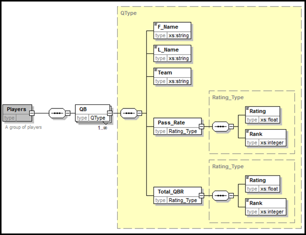
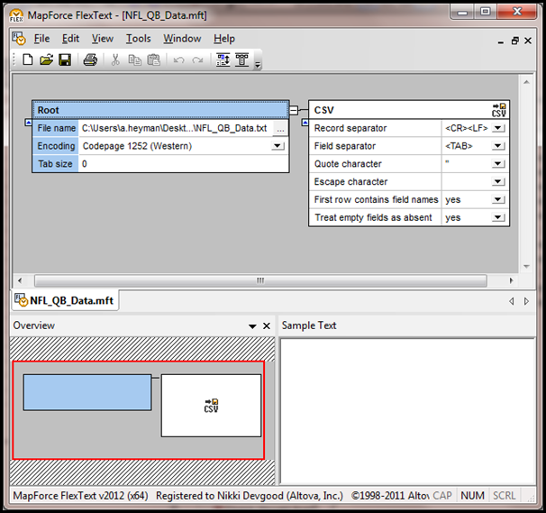
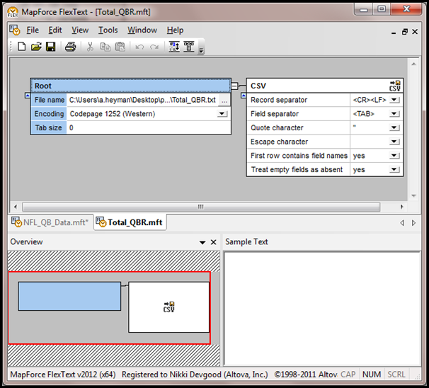
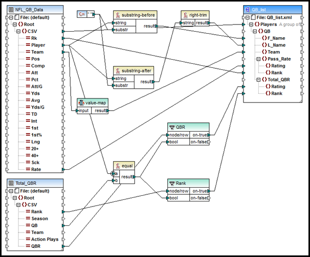
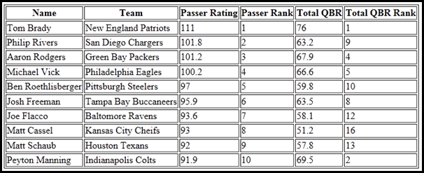
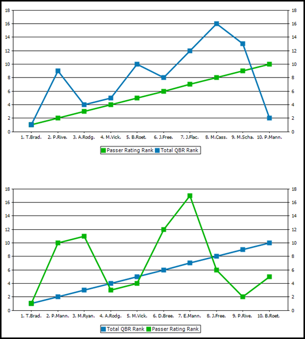
In this article we use stats from NFL.com and ESPN.com to show how easy it can be to process and analyze online data in new ways – even when it uses different metrics and is only available in textual format. We have seen in previous blog posts how easy it is to gather data from the Internet that is widely available in XML formats. But what about interesting data that is available online but not in an XML format, or data that is buried in legacy data processing systems and only available in textual report format? One such example involves quarterback ratings. The NFL has used a Passer Rating that rates quarterbacks solely based on a passer’s completions, attempts, touchdowns, and interceptions. ESPN introduced a new rating system this year called the Total QBR (Quarterback Rating). The Total QBR incorporates more data, including an expected points average and a clutch play index, that ESPN claims gives a more accurate measure of a quarterback’s performance. Let’s compare the rankings that these system produce to see if we can garner some useful information. For this example we’ll be using the data importing and analysis tools of the Altova MissionKit to compare the ratings. If you want to try this out yourself, the MissionKit is available to download for a 30 day free trial from the Altova web site. You can access the files used in this example here. The first thing we need is the raw data to analyze. Let’s use the entire 2010 season as a data source. We can get the table with Passer Ratings from NFL.com and then copy and paste it as a new text file. NFL.com_top5_passers_2010 We can access a similar table of Total Quarterback Ratings from the ESPN web site and create a second text file. ESPN_Total_QBR_Top5_2010 We now have two text files with tables of data in different orders. The next step is to combine the tables into one file and generate charts. First, we need a schema file for the destination of the data. In XMLSpy, we can create an XSD file quickly, and graphically, to contain a series of QB nodes with child nodes of first and last name, team, passer rating and rank, and total QBR and rank. QB_Schema.xsd Now, in MapForce, we open the text documents and use FlexText to parse the text and change it into a list of categories. NFL_QB_Data_FlexText Total_QBR We then build a mapping file in MapForce to map the data from the text files to the destination XML file. Built-in functions make it easy to extract the first and last names from the Player string, and a value-map will change the team abbreviation to a string (ARI is changed to Arizona Cardinals, ATL to Atlanta Falcons, etc.). We set the Priority Context in the test of our filters to make sure we get the correct set of data for each unique quarterback. QB_Schema Once we execute the mapping, we can save the resulting XML data file and use it as the source file in StyleVision to design a stylesheet. In this stylesheet, we create a table of the top ten ranked passers and charts showing the Passer Rating and the Total QBR graphically. QB_Charts1 QB_Charts2 Now that we have a visual representation of the rankings of the two rating systems, we can examine their differences and try to see which works better. For example, Peyton Manning was tenth in passer rating, but was second in Total QBR. This can be explained by the Total QBR taking clutch points into account and knowing that Peyton Manning had a few late game comebacks in the 2010 season. Since we now have a collection of files (the XSD file built in XMLSpy, the FlexText and mapping files from MapForce, and the stylesheet design created in StyleVision), we can update the text data files easily to analyze new sets of quarterback data. Later in the season, we can update the text tables with 2011 data, and allow the data to flow through the mappings and into the stylesheet to update the charts and see the rankings for the current season. This example focuses on numbers from the NFL, but this method can easily be adapted to other data sets and data sources that are accessed as text files as well as in other formats. You can learn more about how to use the products in the Altova MissionKit by taking our free online training courses.

Tags: , , , ,

Mastering Paid Keywords


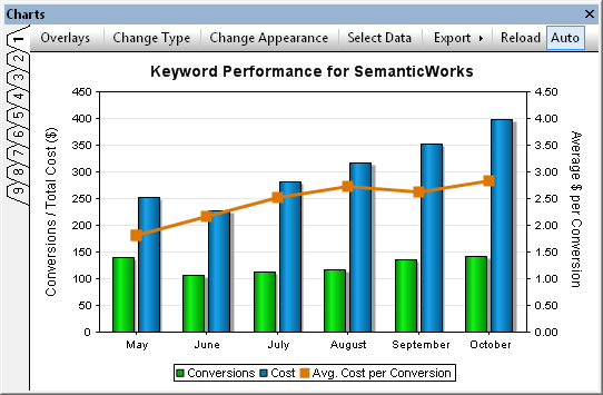
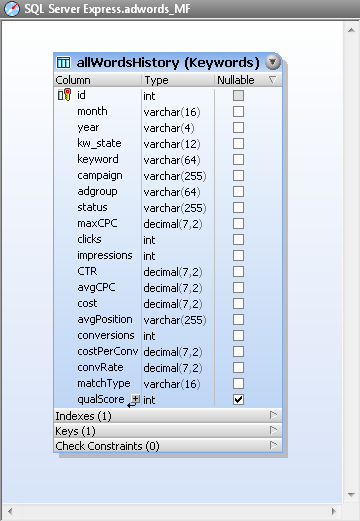
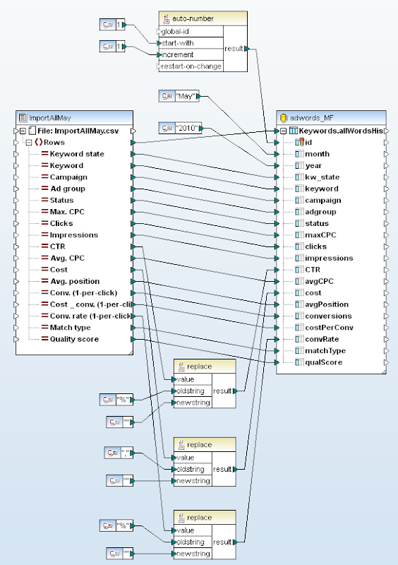
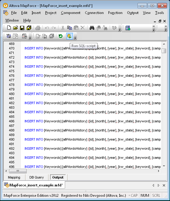
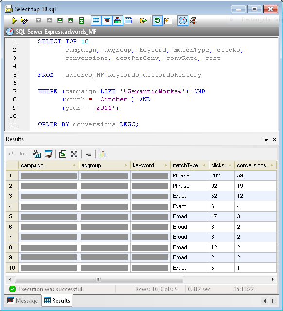
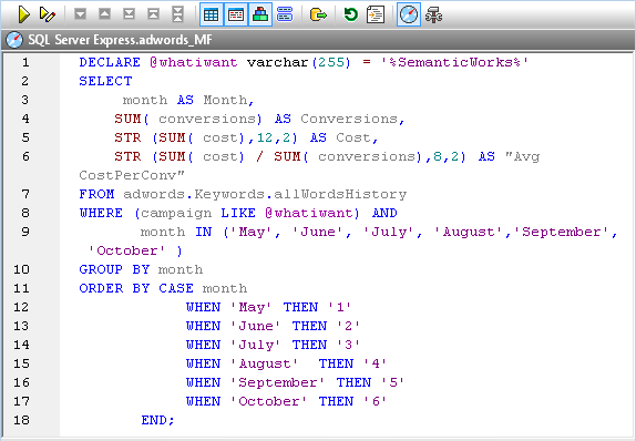
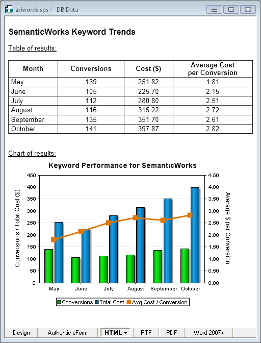
Anyone who manages paid keyword search knows it is hard work! You can look at vast reports of raw statistics and quickly get lost in trivia. At Altova we designed a better way to analyze and manage the performance data for our Google Adwords campaigns. We can creatively query the numbers to: · Quickly aggregate results for subcategories of campaigns, for instance by product, geographical region, or any other grouping · Easily identify trends over time The chart below illustrates these advantages by collecting data for a single Altova product – SemanticWorks – from multiple campaigns over six individual months. Keyword performance chart created with DatabaseSpy Starting Out Like many keyword advertisers, we were viewing statistics in Adwords, downloading CSV files, then spending hours massaging and manipulating the data in spreadsheets to identify and format the information we required. We wanted more immediate and in-depth reporting of keyword performance while retaining full control of the process and managing everything internally. SQL queries of a database of keyword statistics offer a powerful and flexible alternative. In the remainder of this post we explain how the database design, data mapping, and reporting features of the Altova MissionKit can be applied to create an architecture to efficiently track paid keyword performance. Database Design Our choices were to implement a keywords database on an existing database platform already running in the company, an express edition of a commercial database, or an open-source database, since the Altova MissionKit works with SQL Server®, MySQL®, Oracle®, IBM DB2®, PostgreSQL®, Sybase®, and Microsoft® Access®. We chose SQL Server for our database platform. We connected with DatabaseSpy and used the graphical database Design Editor to create the table shown below. DatabaseSpy graphical table design Most columns correspond to fields in a keywords report. In order to store multiple rows for each individual keyword – one row for every month of statistics – the table also includes columns for the month and year. Populating the Table The Google Adwords online interface lets users create reports of keyword statistics of specific date ranges and download them as CSV files. We downloaded individual CSV files containing our performance data for each unique month. We used MapForce to map values from the CSV files to columns in the database table and insert the month and year data for each row. Keyword report mapping in MapForce The string functions at the bottom center of the mapping diagram remove percent signs and commas from fields we want to treat as numerical data. By doing this in the mapping, we don’t have to massage the columns of data in the CSV files before importing them. Since the CSV files for each month all have the same structure, the mapping needs only minor revisions to import each new month’s data: update the constants at the top that define the starting row id, month, and year. MapForce processes the mapping with its built-in execution engine, reading the CSV input and generating SQL INSERT statements for each row of data. MapForce then allows users to execute the entire generated SQL script by clicking a toolbar icon or from a selection in the Output menu: MapForce database insert script Querying the Database Back in DatabaseSpy, we can query the database from the SQL Editor window. This query reports the top ten performing keywords for SemanticWorks in October 2011. For data privacy, some fields in the Results chart are hidden. Results with table To get additional interesting results, the SQL statement can be easily modified. For instance, the ORDER BY line can sort for highest cost, most clicks, or any other characteristic. The WHERE statement combines data from multiple campaigns. The LIKE keyword treats the percent signs around SemanticWorks as wildcard characters to match any campaign with SemanticWorks anywhere in its name. Other queries could add a geographic identifier such as US or EU, or match on an entirely different column such as adgroup. Of course, all these options depend on a consistent and predictable campaign and adgroup naming system. We created a DatabaseSpy Project to collect all our favorite SQL queries for sharing and convenient reuse. Here is the query we used to generate the chart right in DatabaseSpy that appears at the top of this post: ChartQueryCapture This query goes beyond simple SQL reporting to perform calculations on a subset of the data and format the results. Database Reports We designed reports for the executive team using Altova StyleVision, based on the queries and charts we had already designed in DatabaseSpy. We simply copied our queries from the DatabaseSpy SQL Editor window and added them as sources in the StyleVision Design Overview window. Saving our report design in a StyleVision SPS stylesheet makes it is easy to regenerate an updated version every month. Here is the HTML output for a SemanticWorks Keyword Trends report based on the query above, displayed in the StyleVision Preview window: clip_image009 If you follow the conventional wisdom for building your own paid keyword campaigns, you will develop segmented campaigns with many small, highly specialized ad groups, and you may also find yourself overwhelmed by the data in Adwords reports. If you’d like to try managing your own keywords the way we describe here, a fully functional trial of the Altova MissionKit is available.

Tags: , , , , ,

DiffDog Takes to the Cloud


Techy folks generally have a good diff tool they rely on to compare and sync files and directories. But what happens when, as more and more info is bound for the cloud, your data lives on servers accessed via URL? DiffDog diff/merge tool There are myriad applications today that live on servers accessed via HTPP – but let’s take a look at a common example: SVN. Subversion (SVN) repositories include WebDAV as a commonly used server option. WebDAV is a natural protocol for SVN because its concern is hierarchy, structured metadata, and versions. Since WebDAV is an extension of HTTP it gives easy access to basic information about files and folders to any HTTP-aware client, including DiffDog – Altova’s diff/merge tool for files, directories, and databases. However, DiffDog knows a few tricks that set it apart from the other breeds.

Diff/Merge via WebDAV

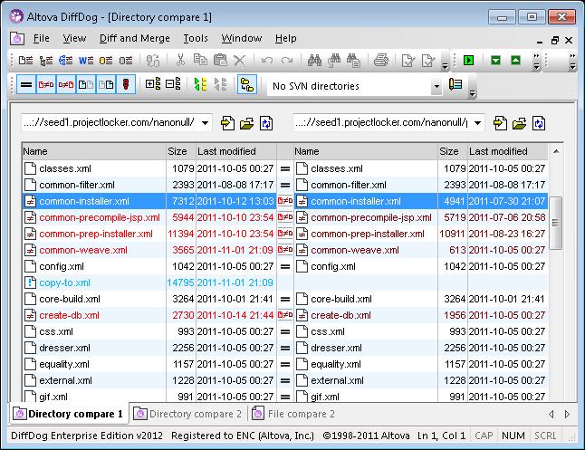
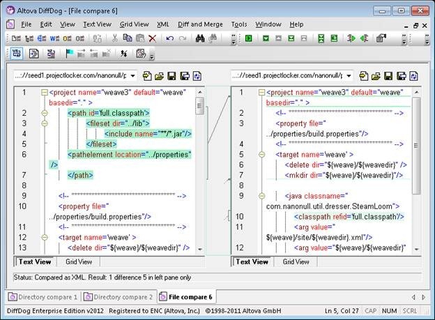
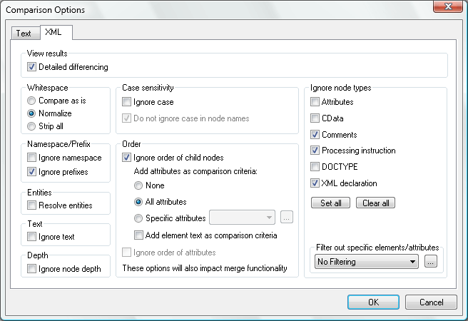
SVN clients typically support command line differencing; however, a text-only representation of the changes in even one file can be hard to read and use. When you want to compare the trunk against a tagged version, the problem is magnified.  There are several visual differencing tools available that can help with analyzing version changes in SVN. They have varying degrees of compatibility with how SVN works. Some tools are well integrated with the SVN command line. DiffDog includes all the common comparison options for a tool that is tightly integrated with SVN clients.  Where it excels is its ability to talk to SVN servers.  Accessing an SVN repository with DiffDog using WebDAV is simple. The easiest starting point is to open Directory Comparison View and paste in the URLs of the folders you want to compare. In this case we’re comparing SVN branches on Projectlocker.com. The two sets of files open, and DiffDog provides a color-coded, browsable view of the differences between the two directories. Directory Comparison in DiffDog   Clicking on either one of a pair of files opens a detailed file comparison.   File comparison in DiffDog DiffDog’s ability to distinguish between changes to XML and meaningful changes is key in this situation – most development trees have some amount of XML in them.  DiffDog also supports comparing Word docs and databases – so all bases are covered. XML-aware diff options Of course, folders you compare do not have to both be WebDAV SVN folders.  It is equally straightforward to compare the SVN server with a local directory. DiffDog’s ability to access servers via HTTP (or FTP) opens a world of possibilities: comparing a local directory with a Google Docs directory, or diffing a local Web server against files hosted on the Amazon CloudFront , or even just synching photos between your local drive and your chosen back- up service.   If you’d like to try DiffDog, it’s available for a 30-day trial over on the Altova Web site.

Tags: , , ,

Digging deeper with the Twitter API: iPhone 4S vs. Galaxy Nexus


We found some interesting data when we dug below the surface of the iPhone 4S vs. Galaxy Nexus debate using the Twitter Search API.In today’s world there is a vast quantity of data available online that can be used for research, market analysis, and competitive intelligence. While “Big Data” can be a problem for those who produce it, store it, and compile it, it is highly beneficial for those of us who are looking for answers.Some of that data is fortunately available to be queried online, and, in particular, there is a vast quantity of data on social media interactions out there.TweetsQueryingSearchAPIIn this article we will explore how to use the Twitter Search API from MapForce, Altova’s data mapping/conversion/integration tool, to aggregate data on recent user submissions (“tweets”) on two highly popular topics – the Apple “iPhone 4S” vs. the “Galaxy Nexus” as the latest hot Android phone – and extract some statistical data about the users engaged in those discussions. One of the benefits of this abundance of data available to us today is that we can query it in interesting ways and extract new meaning from it. While there are undoubtedly many existing services that already provide trends over Twitter topics (e.g., Trendistic), those services only offer very simple trends and do not allow us to query any deeper.But all of the underlying data is available for grabs if you are just willing to learn a tiny bit about web service APIs and how to use them to extract XML data for further processing. As a starting point, let’s use the Twitter Search API to query the stream of recent tweets for the last 100 postings that are about the “Galaxy Nexus”. The Usage Guidelines for Twitter Search tell us that using both words in a query will result in the use of the default operator, which is AND, so we are going to search for posts that contain “Galaxy AND Nexus”. So let’s try that and request the most recent 100 items:

http://search.twitter.com/search.atom?q=galaxy+nexus&rpp=100

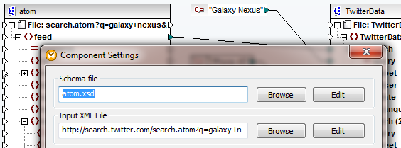
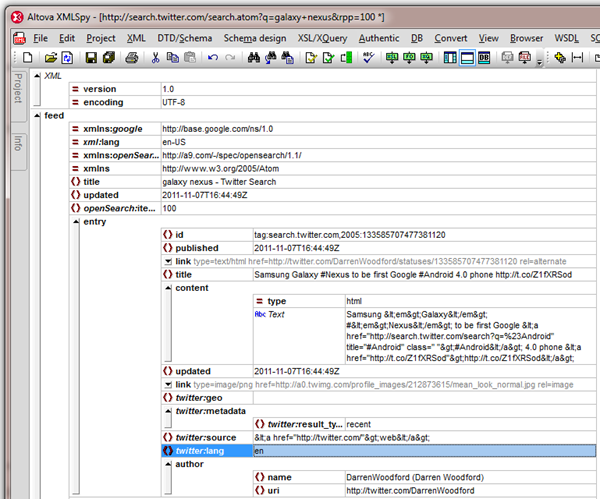
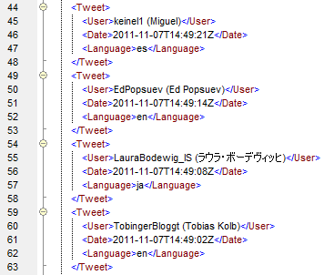
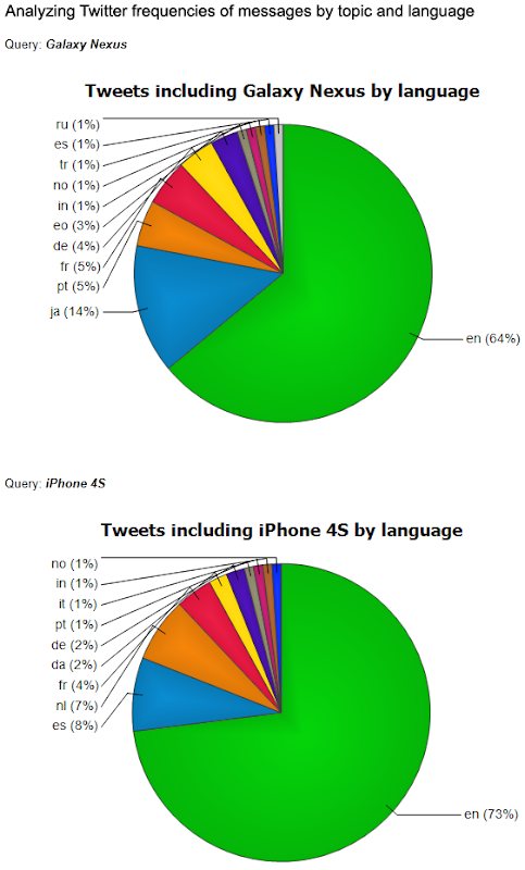
If you follow this link, you will get a second window with a lot of raw XML data that is formatted according to the Atom Syndication Format specifications. Alternatively, you could request the data in JSON format, if you wanted to directly process it via JavaScript code by hand, but we will use the XML-based Atom format so that we can easily analyze the data and extract the information we want.Viewing the above search result in a browser is not very user-friendly, so we can take a quick peek at the XML data in our favorite XML Editor using the Open from URL function:TweetsAtomGridAs you can see, the data for each entry includes a language code, so for this example we will extract data from this Twitter feed as well as from a second search result on the “iPhone 4S” and combine them into one intermediate XML file for further analysis.Extracting XML data is really easy in MapForce: using the “Insert XML File” option to drop in an XML source, we can again specify the same URL as before. If needed, MapForce will automatically create an XML Schema for the supplied data so we can visualize it and extract information from it:TweetAtomMappingIn our mapping we have dropped in two sources on the left side – one using a query string to search for “Galaxy Nexus” and the other to search for “iPhone 4S” – and on the right side we have dropped in a simple XML Schema that will allow us to aggregate our data and analyze it more conveniently going forward. In this case the mapping between the two sides is straight-forward as we are only extracting basic information about the user, the date, and the language of the tweet, but in other applications the mapping could be more complicated and include functions as well as queries to other data sources, databases, or web services…Previewing the resulting XML data can be done directly inside MapForce using the output tab, and this is what we see as a result of our data transformation:TweetsRawDataNow we can easily use the reporting capabilities of StyleVision to group this data by language within each topic and count the number of posts in each language. We can then report this data in the form of pie charts, which produces the following interesting results:TweetsByLanguageObviously, this data is highly dependent on the date of execution and time of day, as well as the particular announcements happening about these products, so the numbers will fluctuate quite a bit, but it can be used as a nice monitoring for seeing different language-specific trends. And once this has been set up, the report can be refreshed easily with the click of a button to get a snapshot at that point in time. For more long-term analysis it would of course be necessary to modify the mapping a bit to query more than 100 recent tweets.In this article we have used Twitter’s Search API as one example data source and only looked at language as one unique data point, but there are many more interesting sources of data available online today, and this approach can be used on all of them in a similar fashion.If you want to experiment with other data sources and other kinds of information that you want to extract, we invite you to try for yourself. A free 30-day evaluation version of MapForce is available, and there are no limits on how you can use the other features of Altova’s data mapping and conversion tool for data processing tasks that go beyond analyzing social media trends…

Tags: , , , ,

Case Study: Altova Customer Succeeds with XBRL


XBRL is mandated for most public companies. So why are private organizations and non-profits jumping on the bandwagon? This case study examines a real-world success story. clip_image002   We were really excited when the folks at MACPA told us about their success working with XBRL. They set out to discover if XBRL could be used successfully (without a huge upfront investment) by small businesses and NPOs and ended up confirming not only that, but realizing benefits to their internal financial processes, as well.

Toward Ubiquitous XBRL

With close to 10,000 members, the Maryland Association of Certified Public Accountants (MACPA) is often looked to for their expertise on issues relevant to the field of accounting. The US Securities and Exchange Commission’s (SEC) mandate that public companies submit financial data in XBRL is one of those issues. Despite the potential of XBRL for reducing costs and increasing efficiency, many organizations are concerned about the time and expense that will be required to convert all of their financial data into XBRL, a process that can be further complicated when financial data is housed in multiple systems. MACPA set out to prove that these obstacles are easily surmountable: with the right tools, it’s possible to bring XBRL transformation in-house to not only comply with mandates, but realize greater efficiencies and transparency in various scenarios. In the process they discovered that tagging data in XBRL is valuable to private entities and non-profits as well as public companies facing a mandate. They took advantage of widely available XBRL software tools including the Altova MissionKit, which interfaces with multiple relational databases for XBRL mapping, tagging, and reporting.   clip_image003   In the end, the project turned MACPA’s financial data into a force for driving efficiencies and accountability. Once their internal accounting data was mapped to XBRL, they were able to automate burdensome data collection, transformation, and analysis tasks to gain more insight into their financial data. For instance, MACPA used their XBRL data to populate their financial Key Performance Indicator (KPI) system, significantly reducing the amount of time and effort required to prepare the KPI documentation. This in turn enables them to run the system at more frequent intervals. They are also now able to automate previously onerous tax filing tasks by mapping the association’s financial data in XBRL to the 990 tax return. (With almost 1.5 million exempt organizations in the US filing hundreds of thousands of Form 990s each year, the efficiency gained by using XBRL could be significant.)

“Ubiquitous XBRL could do for accounting/taxation what barcodes did for retail.” – Skip Falatko, MACPA Director of Finance and Administration

This project not only enabled MACPA to learn about XBRL and advise their members, but also to automate and enhance the way they dealt with their own financial data. And utilizing affordable tools like the Altova MissionKit confirmed that handling XBRL in-house is the way to go.

“Why outsource tagging [your data in XBRL]? If you tag it in house, then you own the data and can use it in myriad different ways as a productivity tool.” – Tom Hood, MACPA CEO and Executive Director  

Check out the complete case study to learn how MACPA brought XBRL transformation in-house to effect changes in efficiency and transparency. If you’re an accounting or technical professional who needs to learn more about XBRL, Altova offers free, self-paced online training and an educational XBRL whitepaper.

Tags: , , ,