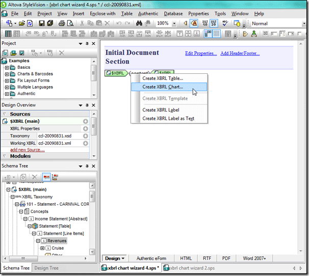
Extensible Business Reporting Language (XBRL), an XML-based language for financial data, is increasingly being used by both public and private organizations across the globe – in fact it is mandated for some companies in countries including the United Kingdom and the United States. Altova provides comprehensive support for XBRL tagging and XBRL reporting with the MissionKit, a suite of our most popular software. Among the MissionKit tools is StyleVision, a graphical stylesheet designer and report builder, which can be used to support a host of internal reporting and analysis activities for companies that use XBRL.  In the next post we’ll focus on StyleVision’s XBRL Chart Wizard, a powerful XBRL visualization tool that can turn your XBRL-tagged financial data into powerful charts and graphs – if a picture is worth 1,000 words then StyleVision is worth its weight in gold. Calling the XBRL Chart Wizard You invoke the XBRL Chart Wizard as you do the XBRL Table Wizard and other StyleVision capabilities. Once you’ve started a design by selecting New – New from XBRL Taxonomy from the File menu and selected a taxonomy and working XBRL file, all concepts are populated to the Schema Tree. From here you simply select a concept from the XBRL taxonomy in the Schema Tree and drag it into the design window. For this example we’ll be using the Carnival Corporation quarterly report for 2009 that they have published with the SEC, but you can apply the same techniques to any XBRL instance document – be it a publicly available filing with the SEC or an internally generated XBRL file. As a first step, we will look at how the revenues are composed by creating a pie chart that shows the revenue breakdown. Here we’ve dragged the Revenues concept (highlighted in the Schema Tree in the left sidebar) into the design window and selected Create XBRL Chart.
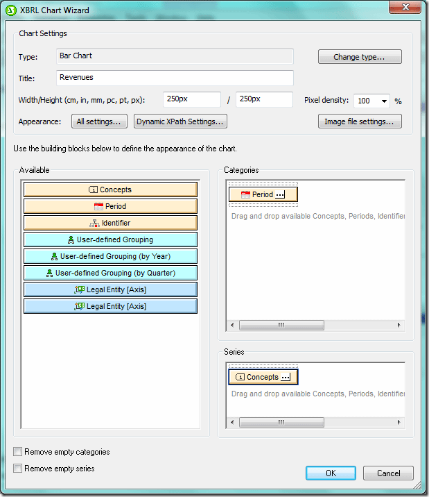
  Once you select Create XBRL Chart the XBRL Chart Wizard dialog box will open automatically.
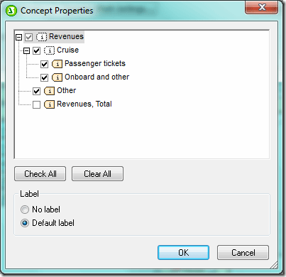
  Once you click the ellipses in the corner of the Concepts tab in the Series pane, the Concept Properties dialog box (below) will open and you can select concepts to appear in the chart. Carnival Corp breaks out revenues for their cruises between Passenger tickets and the Onboard and other. We will select those two concepts, and also the Other category to capture all elements that make up the total revenues.
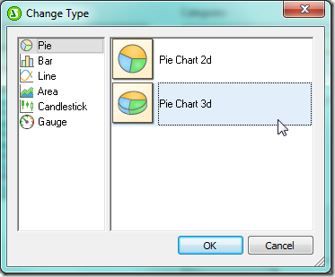
  Pie Charts Pie charts are useful when you wish to see the relative contribution of individual elements to the whole. Placing Onboard and other, Other Sales Revenue Net, and Passenger Tickets in a pie chart provides us with a visual representation of the relative contributions of each source of income to total revenue. We are now ready to make changes in the XBRL Chart Wizard dialog box so that our pie chart reflects the information we need in a format conducive to strategic decision making. First we must change the chart type under Chart Settings from Bar Chart to Pie Chart 3D via the Change type… button, which brings up the Change Type dialog box (below).
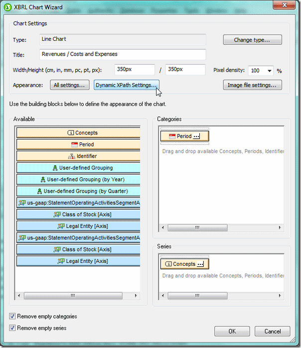
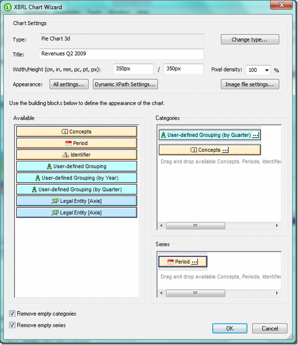
  In pie charts, the concepts that will form the segments of the pie (in this instance the Onboard and other, Other Sales Revenue Net, and Passenger Tickets concepts that we selected above) are placed in the Categories pane and the values in the Series pane. Therefore we will need to move the Concepts tab to the Categories pane and the Period tab to the Series pane. We’d like to segment the revenue data from the XBRL file based on quarter. We do this by dragging the User-Defined Grouping (by Quarter) tab from the Available pane to the Categories pane. We’ll make the necessary changes in this tab in the next step. We will also check the Remove empty categories and Remove empty series boxes so that a value or label will not be generated if no data exists and change the size of the chart to 350 pixels x 350 pixels in the Chart Settings section of the XBRL Chart Wizard dialog box. After we make these changes, the dialog box looks like this:
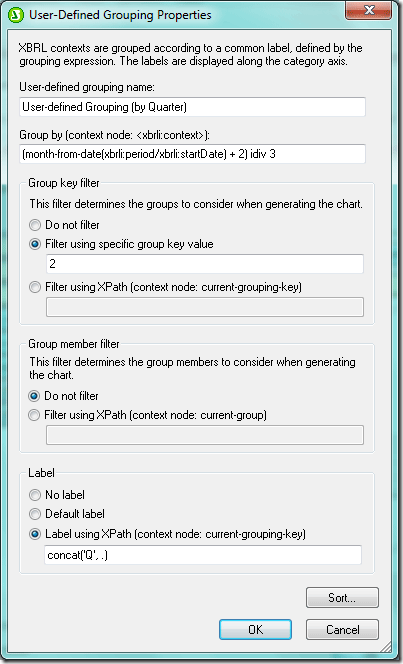
  Now we are ready to select the data that appears in the chart. First we’ll segment the data by quarter. We invoke the User-defined Grouping Properties dialog box pictured below by clicking the ellipses in the corner of the User-defined Grouping (by quarter) tab in the Categories pane. The grouping feature provides you with maximum flexibility by allowing you to segment data based on variables identified in the taxonomy (e.g., reporting period, geographical area, division). Now we can use XPath in the Group By field to group the data by quarter, filter it based on the group we created (in this example only the second quarters will appear in the chart), and add a dynamic label. We want the chart to reflect all second quarter data for each of the revenue concepts we selected so we toggle Do not filter under Group key filter.
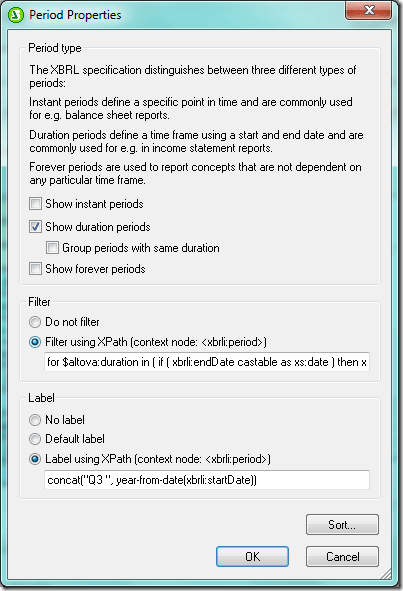
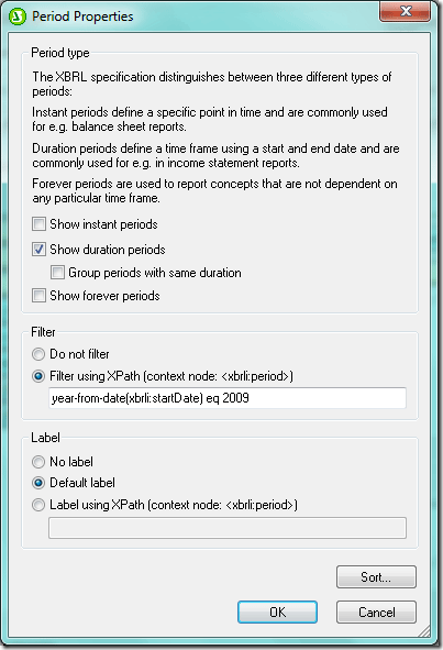
  We can further filter the data by clicking on the ellipses on the Period tab in the Series pane to bring up the Period Properties dialog box. Here we’ve selected only duration periods (i.e., those with a start date and end date – instant periods have a single date reflecting the date that the “snapshot” was taken) and filtered based on year. In this example only data from the second quarter of 2009 will appear in the chart.
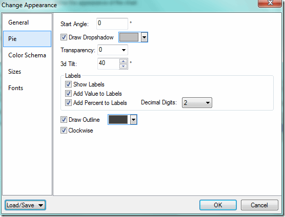
  Finally we can fine tune the chart’s appearance by clicking on the All Settings tab under Chart Settings, which brings up the Change Appearance dialog box. Here we’ve opted to show the concept labels, values, and percent of total. We can also select color schema, chart size, font types and sizes for each section of the chart (e.g., chart title, labels, legend), and background colors.
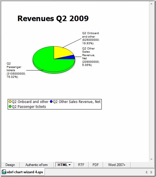
  After making all of these changes we hit OK in the XBRL Chart Wizard dialog box and the pie chart reflecting these changes is created. Please note that after the chart is created you can go back and edit the chart settings.
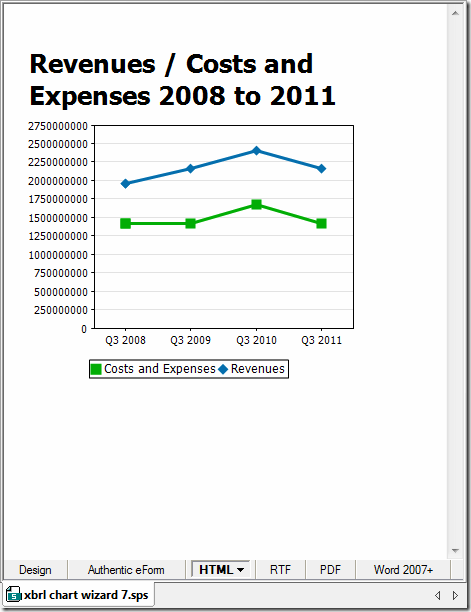
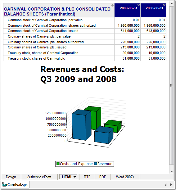
  As you can see, the biggest source of revenues is Passenger tickets, which produced 75.02% of total revenues for Carnival Corp in the second quarter of 2009. As is the case with all StyleVision designs, output can be rendered in HTML, RTF, PDF, and Word 2007+ formats and an XSLT stylesheet for each format is automatically generated. And this was just one example of what kind of data you can extract from an XBRL filing and visualize in a chart. Next week we’ll look at creating bar charts and line charts from XBRL financial data.
  Have you created something really great with the XBRL Chart Wizard? Or developed an interesting project using StyleVision or another of our tools? Please share your story with other Altova users by commenting on this blog post. Think it would make a great case study? Email us at marketing@altova.com – if we choose to use your story you’ll receive a $200 Amazon gift card as well as some free press for you and your organization. We’d love to hear from you!
 Some people say early October brings the most enjoyable weather to San Francisco, and Oracle OpenWorld and JavaOne will make things even better this year from Oct. 2 – 6. If you’re traveling to the City by the Bay for either event, plan to visit the Altova team at booth 106 in the Moscone South Oracle OpenWorld exhibit hall. We’ll be demonstrating all the tools in the Altova MissionKit with special emphasis on multi-database support, tools for working with XML in databases, and solutions for compliance with XBRL, NIEM, HL7, EDI, QR codes, and many other industry standards. Here’s your chance for a personal tour of that Altova tool or feature you’ve been curious to see – whether it’s advanced charting in StyleVision, Java code generation from UML in UModel, or refactoring XML Schemas in XMLSpy. We always enjoy meeting users face to face and hearing about the projects you’re working on too! You can also enter our Altova product raffle for a chance to win a license for Altova MapForce 2011 Basic Edition. We hope to see you there!


